
Trekking CSS Templates
Mountain routes combine dense trip facts with strong outdoor imagery. These trekking CSS templates help control spacing, route cards, responsive compositions, and visual hierarchy while leaving room for page-specific style adjustments.


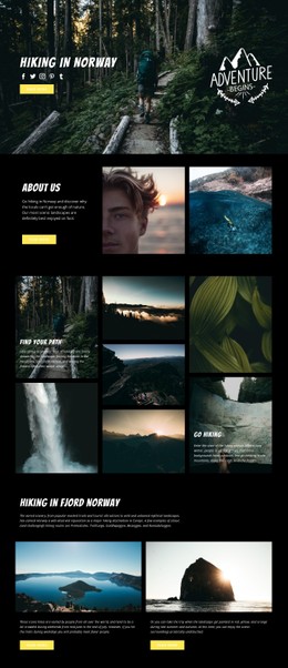
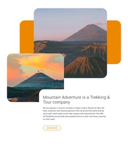
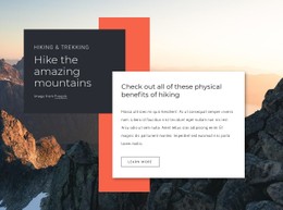

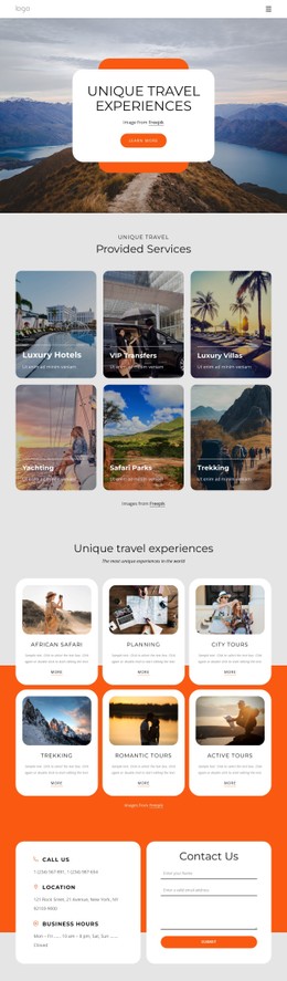
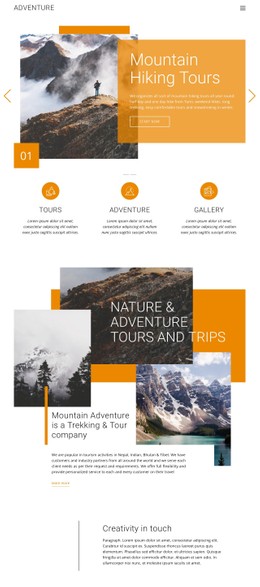
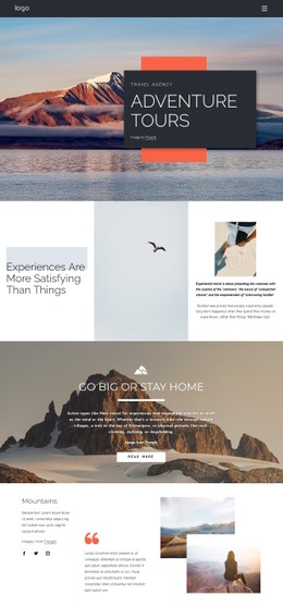
More Website & HTML Templates for Trekking
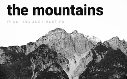
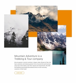





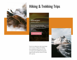
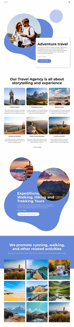
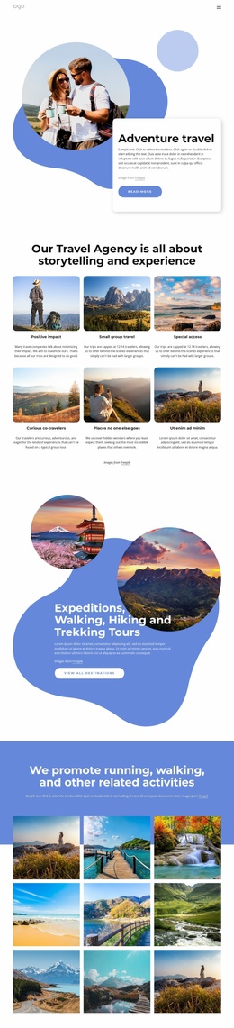
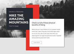
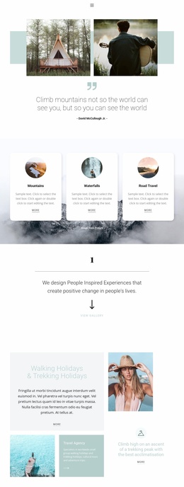
More CSS Templates from Travel & Hotels Category
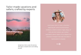
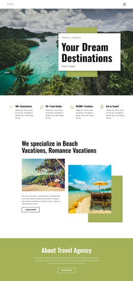
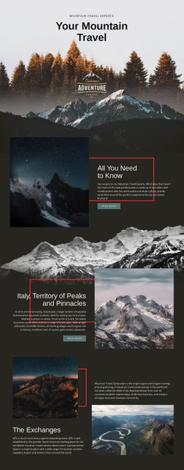
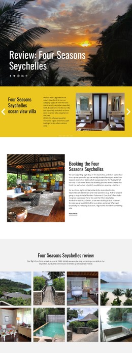
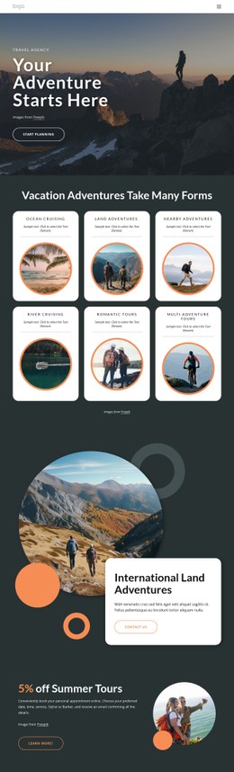
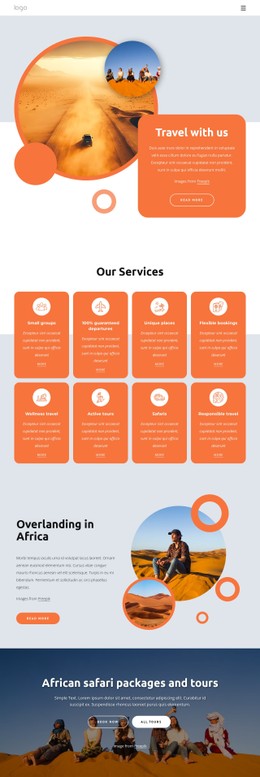




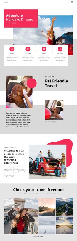
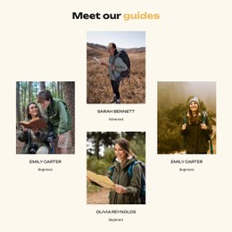
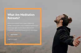



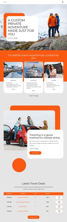
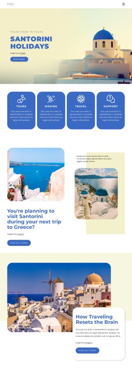
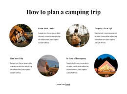
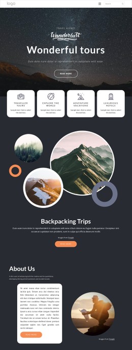


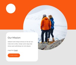



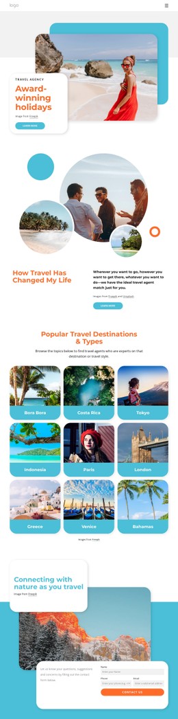
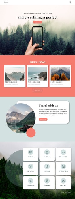
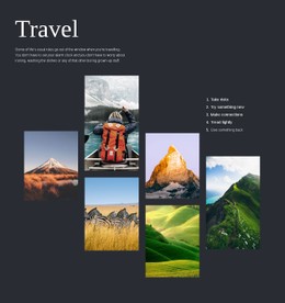

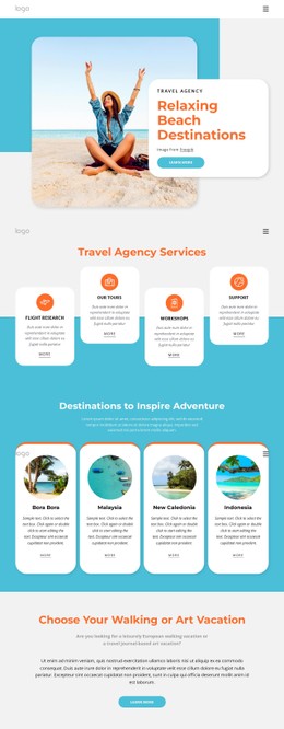
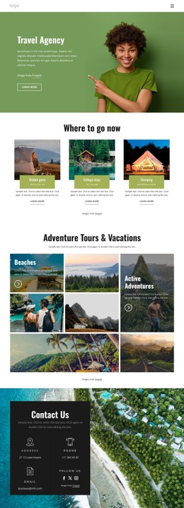

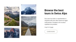
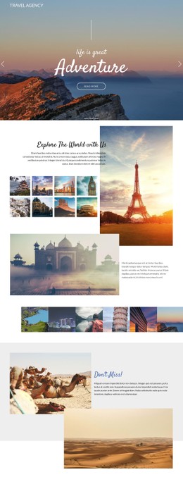

Other Travel & Hotels CSS Templates
Flexible Trekking CSS Templates
A trekking CSS template works on the presentation layer of a trail site. Spacing, typography, and color determine how route information reads, and responsive rules determine whether it still reads that way on a phone. Dense trip data sits next to large mountain photography, and styling decides which the visitor takes in first.
Giving Route Facts Visual Priority
Two conflicts run through almost every trek page. A wide landscape image earns attention and delays difficulty and duration. A notice about a closed pass has to look different from the paragraph above it, or nobody registers it.
The styling decisions that settle those conflicts are few:
- Fact panels where difficulty, distance, and elevation gain outweigh the text around them.
- Difficulty badges that tell an easy route from a demanding one at a glance.
- Trail closures and weather warnings marked by their own background and border.
- Itinerary stages separated by spacing and heading weight, so one day never blurs into the next.
Route cards are where a Grid or Flexbox arrangement earns its keep, holding heights even and gaps regular when one trek has a two-line name, and the next has five. A forest walk and a two-week expedition need different densities, and a system that carries both beats a single-length tune.
Layout Behavior Across Narrow Screens
Screen width changes more than column counts. Breakpoints determine where a three-column row of route cards collapses to one, how much the type scales, and how tight the gaps get. The desktop fact row is the interesting case: stacked into a compact panel, it can still show difficulty and elevation ahead of the photographs. Nicepage documentation on Responsive Design Tips helps while reviewing those states.
Fitting a ready design to one operator comes down to three things:
- A color set that survives next to strong landscape photography.
- Line height and heading weight that keep a long itinerary readable on a narrow screen.
- Spacing around fact blocks so altitude and distance figures do not run together.
Custom CSS Code covers what the visual controls leave out, at element, page, or site level. Trek-card spacing and the emphasis on a seasonal trail alert usually land there.
Judging Design Quality Quickly
Scroll the demo past the hero and watch what happens as content gets long. Trekking designs look their best on the first screen and lose their composure as the itinerary unfolds, where headings, stages, and practical notes compete for attention. Then narrow the window and see whether difficulty, elevation, and the trail alert keep their emphasis at tablet width and again on a phone. A system that holds that order everywhere will carry the quieter pages too.