
Swiss Website Templates
Swiss style depends on disciplined typography, generous space, and clear visual order. These website templates extend that system across a coordinated set of pages, rather than limiting the concept to a single composition.

More Website Templates from Travel & Hotels Category



















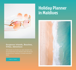

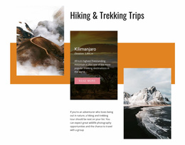
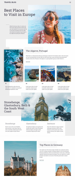
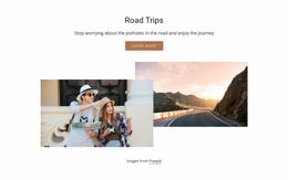
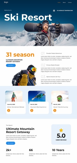
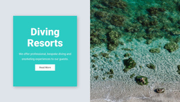

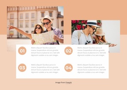
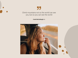
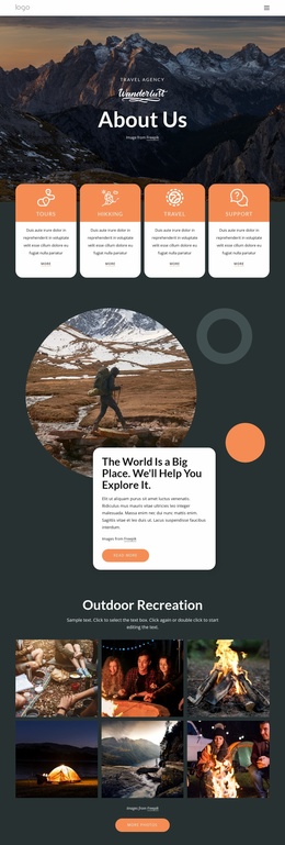


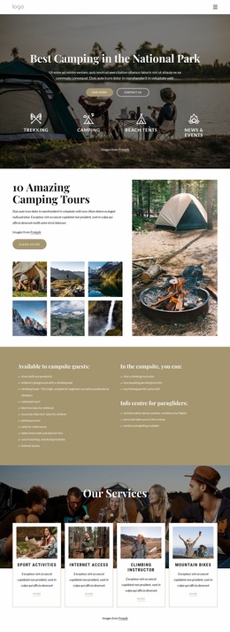

Other Travel & Hotels Website Templates
Minimal Swiss Website Templates
Most people recognize a Swiss website template before they can name the style behind it. Content sits on a modular grid, type is set in a crisp sans-serif, and layouts are often asymmetric, with part of the screen left intentionally empty. Large headlines stand beside small captions, and that contrast alone tells the reader what matters first.
One Grid From Index to Contact
The grid does most of the work, and a typical portfolio site shows how far it can stretch:
- The index lines up projects in strict rows, each labeled with a number, a title, and a year.
- A project page reuses those columns asymmetrically, giving large images most of the width and text a narrow column beside them.
- The About page lowers the density, so studio text gets more air within the same margins.
- The contact page shrinks to a few lines of type anchored to the left edge.
Density changes from screen to screen, yet the column edges stay put, so four very different pages still read as one site.
Sans-Serif Levels and a Signal Color
Swiss typography relies on sans-serif families set flush left with a ragged right edge, and hierarchy comes from a few clearly separated levels:
- Oversized headings that work almost like images.
- Body copy in the same family, kept to a comfortable column width.
- Small captions, dates, and project numbers that label content quietly.
Nicepage's Typography settings let you define these text styles once and reuse them throughout a project. The palette is just as strict, usually black and white plus one signal color, often red, that marks the calls to action.
Judging Inner Layouts Before You Commit
A striking homepage is the easy part of a Swiss design, and weaker templates tend to fall apart on the inner layouts. The case-study layout matters most, since you will repeat it for every project. A good one has fixed places for the title, the facts, and the images, so the tenth project looks as deliberate as the first. Some variety helps too, such as a wide gallery or a text-led story built on the same columns.
Then decide which way your content leans. Image-led portfolio templates hand most of the grid to photography, which suits an interior designer with a strong photo archive. Text-heavy studio and editorial templates make room for longer copy and numbered sections, a better fit for an agency that explains its process in writing. Getting that balance right early saves a lot of rework.