570 Wide CSS Templates













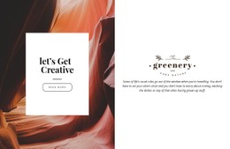







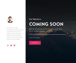











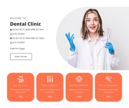





























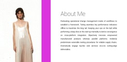








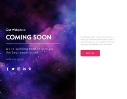















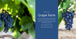
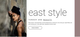
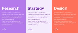












Customizable Wide CSS Templates for Styling Broad Sections
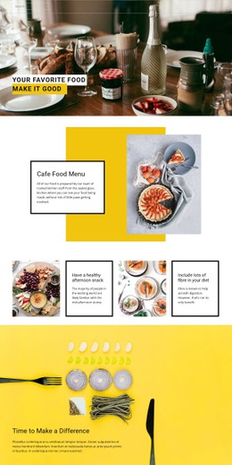
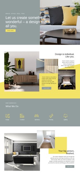
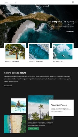
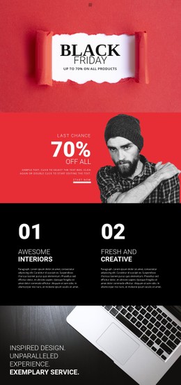
Wide CSS Templates focus on how an existing section is presented. The structure is already there; the work happens at the styling layer through backgrounds, padding, typography, alignment, and responsive rules.
This makes CSS the right context when the content and structure are largely settled, but the section still needs visual refinement.
Style Backgrounds for a Broad Section
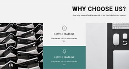
Because a Wide section occupies a large horizontal field, background treatment strongly affects the result.
You can refine:
- background color;
- photographic or graphic backgrounds;
- gradients;
- background positioning and sizing;
- contrast between foreground content and the background.
For image-based sections, Nicepage can turn a standard image into a background with Expand Image. From there, the CSS-oriented question is how that background should behave across the section and at different viewport widths.
Control Padding and Internal Spacing
Padding changes the open space around content without changing the underlying structure.
You may adjust:
- top and bottom padding;
- horizontal padding;
- margins around individual elements;
- spacing between heading, text, and controls.
Larger values create a more open treatment, while tighter values make the section more compact. The important point is that CSS controls the presentation, not the content hierarchy.
Refine Typography and Alignment
You can adjust typography without changing the semantic role of the elements.
Useful styling controls include:
- heading size and weight;
- line-height;
- text width;
- text alignment;
- emphasis styles;
- alignment of text and media inside the section.
These refinements help the Wide section fit the project's visual rules while keeping its existing structure intact.
Adjust Responsive Styling
Responsive behavior belongs naturally to the CSS layer.
On tablets and phones, a Wide section may need:
- reduced padding;
- smaller heading sizes;
- different text alignment;
- stacked content;
- adjusted background positioning or sizing.
The goal is to keep the section visually balanced at narrower widths without rebuilding its markup.
Use Custom CSS as an Additional Layer
Nicepage supports Custom CSS for styling requirements not covered by the built-in controls.
Custom CSS can help with project-specific selectors, special states, or precise adjustments. It should remain an extra implementation layer after the main background, spacing, typography, and responsive settings are defined.
Wide CSS Template FAQ
Which properties matter most in a Wide CSS section?
Background treatment, padding, typography, alignment, and responsive behavior usually have the strongest effect on the final presentation.
How does padding affect a Wide section?
Padding controls the amount of open space around the content. Larger values create a more spacious presentation, while smaller values make the section denser.
What should change on smaller screens?
Padding, heading size, alignment, stacking, and background positioning may need adjustment as the viewport narrows.
Can I add Custom CSS?
Yes. Nicepage supports Custom CSS when built-in controls do not cover a project-specific styling requirement.
Does CSS change the content structure of the section?
Not necessarily. In this context, CSS primarily handles presentation, while the section's elements and hierarchy remain the same.
Finish the Wide Section at the Styling Layer
Use CSS to style, adjust, refine, and control the presentation: background, padding, typography, alignment, and responsive behavior. The result should be technically and visually aligned with the project's styling rules without changing the section's structural role.