350 Nature CSS Templates

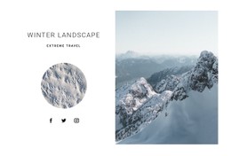




















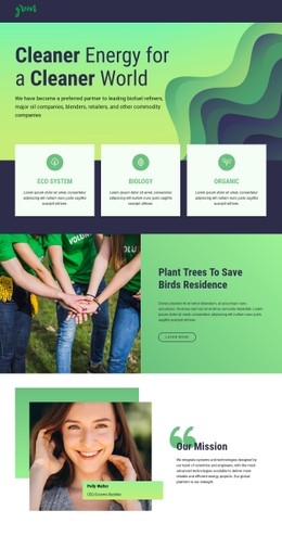
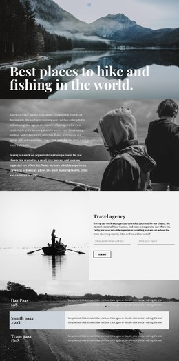

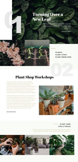
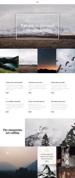






















Fast-Loading Nature CSS Templates for Reusable Styling
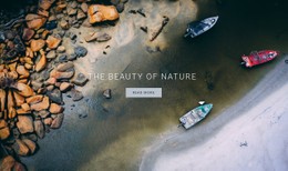
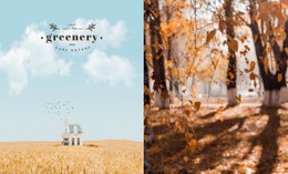
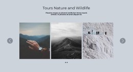
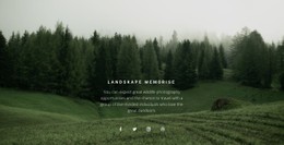
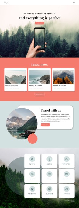
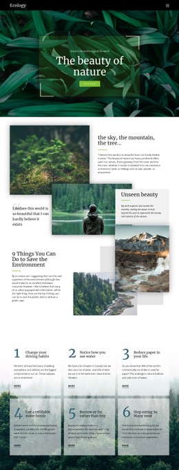
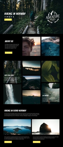
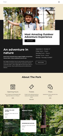
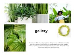
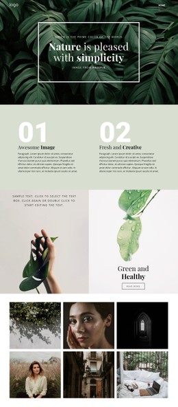
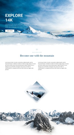
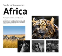
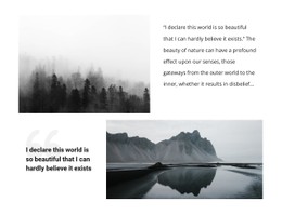
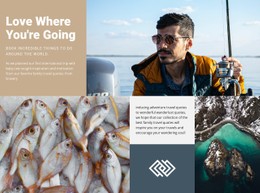
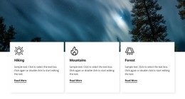
Nature CSS templates are most useful when the design depends on repeatable styling rules rather than one-off adjustments. A botanical gallery may need consistent image spacing and captions. A cloud or water project may rely on overlays and contrast rules. Outdoor pages often need predictable breakpoint behavior so text remains readable over large photographs.
Nicepage provides visual controls for common styling tasks and also leaves room for custom CSS when the project needs selectors, classes, or page-specific rules.
What Makes a Strong Nature CSS System?
A good nature CSS design keeps recurring visual decisions consistent. Instead of manually changing every gallery item, button, or image caption, define reusable patterns for spacing, contrast, text treatment, and responsive behavior.
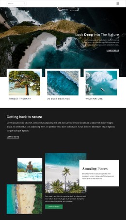
A water-focused project can use wave website ideas to inspire curved compositions or a flowing rhythm of images. At the same time, CSS rules can handle the practical layer: overlay opacity, text contrast, repeated margins, and layout changes at smaller breakpoints.
Useful CSS concerns for image-led nature pages include:
- selectors and classes for repeated components
- responsive rules at important breakpoints
- gallery gaps and image ratios
- background overlays for readable text
- controlled palette variables or reusable color choices
- stylesheet size and page-specific output
Styling Features for Nature Websites
Reusable Layout Rules
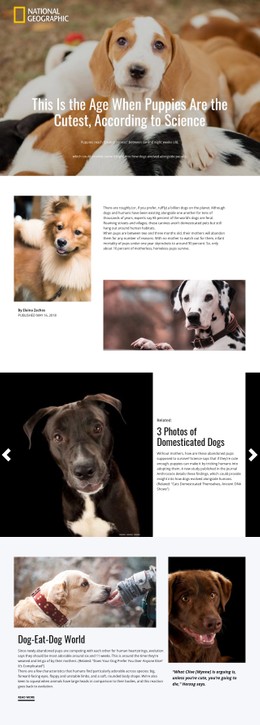
Grid Element places content in cells that can reorganize on smaller screens. Grid For Mobile Devices controls how those cells adapt, while the responsive Grid workflow explains alignment, spacing, and sizing for responsive layouts.
The key CSS value here is not merely “mobile editing.” It is the ability to keep a repeatable layout rule and adjust its behavior where the design actually changes. A gallery can keep even gaps on desktop, reduce spacing on tablets, and stack content cleanly on phones.
Custom Selectors and Page Styling
Custom CSS Code can add project-specific rules when the standard controls are not enough. A nature site might use a class for:
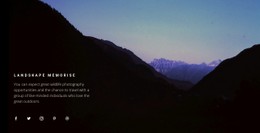
- dark overlays on bright landscape images
- softer borders around botanical cards
- fixed gallery spacing
- special labels for trails or conservation status
- breakpoint-specific typography adjustments
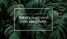
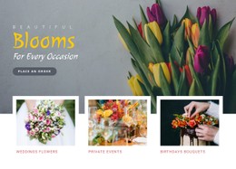
For botanical projects, flowers website references can help define a softer image and color treatment while CSS keeps those choices consistent.
Lean Stylesheet Output
Nicepage supports Export Minimal CSS Per Page, which can create a stylesheet containing only the rules required for that page. The Export Minimal CSS Per Page option is useful when stylesheet size matters and a project does not need the full set of shared rules.
Color Presets and the Background Property can also support organic palettes, gradients, image backgrounds, and overlays without requiring every value to be written manually.
CSS Practices for Image-Led Nature Pages
Common Mistake: relying on beautiful photography while spacing, contrast, and breakpoint behavior remain inconsistent. The Fix: define repeatable rules for gallery gaps, text overlays, section spacing, and small-screen behavior before adding more visual effects.
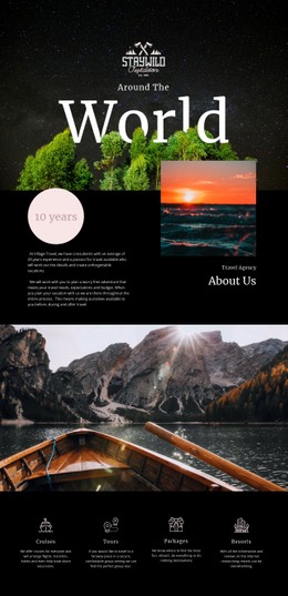
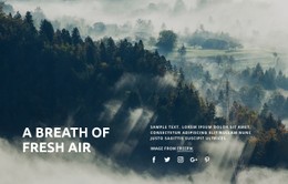
Cloud website ideas can inspire atmospheric compositions, but the final CSS should still keep labels and body text readable when the background changes from light sky to darker landscape imagery.
Easy-to-use Nature Styling Questions
Can I add custom CSS classes to a nature page?
Yes. Nicepage provides Custom CSS controls that can be used for element-, page-, or site-level styling when standard options do not cover the required rule.
Can I reduce the amount of CSS exported for an individual page?
Yes. Export Minimal CSS Per Page can create a stylesheet containing only the rules used on that page.
How can I keep text readable amid the changing nature of photography?
Use consistent overlay, contrast, and text-color rules, then check them at the breakpoints where the image crop or layout changes.
Keep Nature Styling Consistent and Lightweight
Start with the repeated style decisions: spacing, image treatment, overlays, gallery gaps, and breakpoint behavior. Refine those rules in the visual editor, add custom CSS only where needed, and use minimal per-page CSS when that output fits the project.