15,000+ Best Homepage Designs 2026


Homepage Design for Your Company
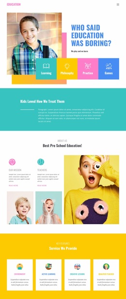
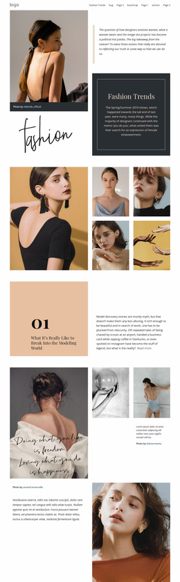
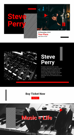
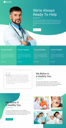
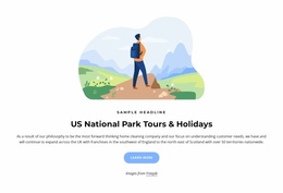
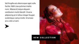
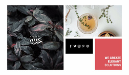
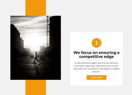
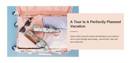
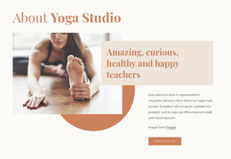
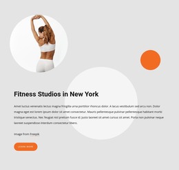
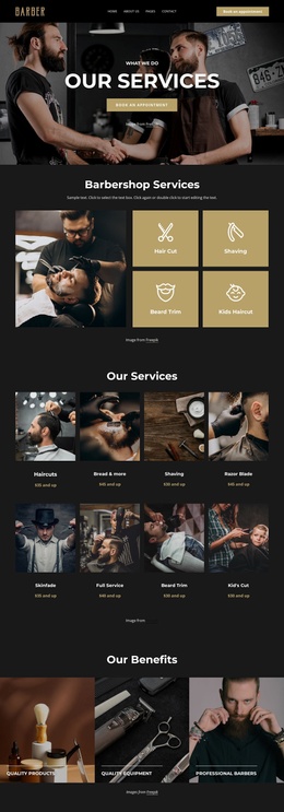
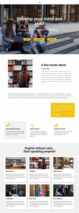
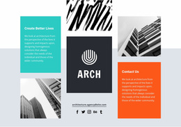
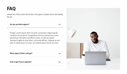
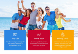
The website's good homepage design is one of the essential elements responsible for everything: whether the user stays on the website, whether they like the website, whether they are interested in the company's offer and the company itself. Website Home page with free landing page and spectacular video and photography in the first screen, aimed at the VIP customer capturing the emotions that trigger action. Great use of video and photography, particularly in capturing emotion, which entails taking action. For any company, the homepage is a kind of virtual front door. There is a great deal of responsibility on designs. The essential requirement for the best homepage design is to have informative, textual, and graphical content management.
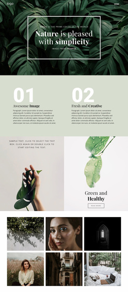
A beautifully designed homepage bring love and help visitors feel safe. It would help if you used the chance for a solid first impression when users visit the homepage and most crucial web pages. For best user experience design, consider such elements as layout, color scheme, popular design trend, contrasting colors, and customer-centric innovation. Display social proof and best practices homepage design will ensure user, call-to-action, and sign up on the website. White space, contrasting color, simple design, and branding strong no-jargon headline and sub-headline and super simple design are in trend today. Undoubtedly one of the most important web pages on your website is the homepage and you must try to make the best homepage design. You can choose a more blog-like homepage (or single page) to make an excellent website for users.
Positive and Friendly User Experience
Essentially, a brilliant homepage design performs the function of a landing page. Perfect and the best designs are a kind of business card for an online resource. The interactive design makes the first impression. That's why your visitors feel good and stay on your website. Excellent homepage design has primary calls to action and constantly changing to reflect visitors depending on the case studies. You must be able to improve the conversion rate of the designed homepage. Increasing your conversion rate is easy to scan and ensures lead generation. The most traffic to your site is converted into meaningful actions that drive your small business. A high-level website's homepage helps you use internet marketing tools such as SEO, email marketing, etc. Maybe your visitors are overwhelmed or lost, and importantly CTAs turn them down, but an excellent homepage design can handle it.
The best website designs use secondary calls-to-action to direct visitors to the next step to sign up on the website. If visitors scroll halfway down the page and start reading information on the website, it means we choose an excellent homepage design through a free template. There are many reasons why the most brilliant homepages make your entire design attractive. Basecamp offers us brilliant homepages, and every element is usable, meaning they are easy to navigate. Basecamp attracts the visitor with modern homepages design and that’s why company's homepage is undoubtedly one of the most important elements for this firm. Also, there are no unnecessary components, and an apparent design has all pages. Companies try to take into account the opinions of their visitors; some homepages can change designer because clients don't like it.
Creating Website Design
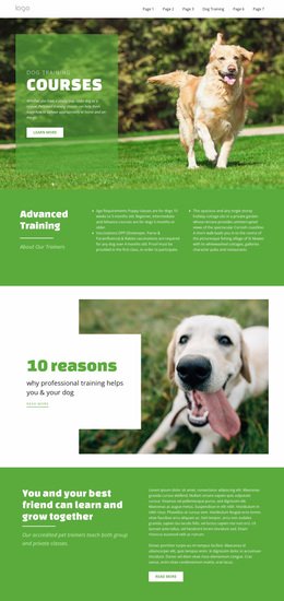
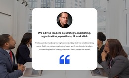
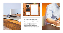
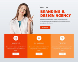
Make the first impression with the homepage design is an important part of the relationship with users. Maybe perfect and best homepage designs shown for many sectors have a simple design, for example, rivers smokehouse site. The headline and sub-headline should be such that it communicates your message to the direct visitors. Try to put the entire essence into a few words, solve the visitor's problem immediately. Text or other content that clearly explains who you are, what you offer, what the user can do on this site, your unique selling proposition (USP) describes how you are different from other similar companies. You must call to action (CTA) people. It can be a lead form, a CTA button sending to a page with more information, etc. Great social proof is also essential for a good reputation. It can be customer testimonials (e.g., monitored with social media tools) or a list of companies you have worked with.
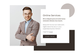
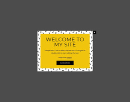
The homepage is a prime place to get your unique value proposition, so the prospects choose your site and are not targeting your competitors. It will be enough if your site contains even one compelling call-to-action copy: "Sign up free". The CTA design must have many elements because if visitors view the entire website, every component should attract their attention. Use social proof and get good resonates with the target audience. Using white space, contrasting colors, and plugins in design is a great way to capture user's attention. Hero image homepages are very nice, build trust, communicating value, and navigating visitors to all pages. The landing page is the best place to nail your value and so that prospects stay on your website and not navigate to other web resources.
Homepage for Target Audience
Company news or articles from the blog is another element that invites the visitor to take a journey around the site. Homepage, why it's brilliant, is that it increases brand awareness, marketing sales, investor relations, marketing services, and so on. Get design inspiration after downloading website homepage design examples, create perfect and best website homepage design. In headline and sub-headline, use clear text, especially for online stores. One primary call-to-action can attract many visitors, and with conversion rate optimization, watch the traffic on your website. Homepage design's most important aspects are making visitors feel welcome and aware that they are dealing with real people. Many companies use unique value propositions to attract their target audience. For businesses organization's target audience are critical of many elements of firm design. For example, their homepage directly can influence the visors of the site.
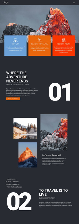
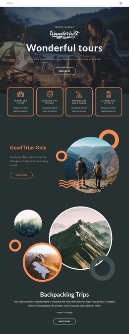
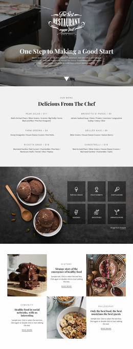
A great example of providing social proof of why you should log on to this site will help your company's templates. Carryover homepage simple design with information hierarchy, making it easy to scan and understand the page rapidly. Your web page design should be more modern than the competitors' design and their homepage design. We can ask questions to the visitors about some homepages, what elements of design they like. For example, a website for 4 Rivers Smokehouse meets excellent photography on the homepage, which gives a nice look to the site. There's no need to make an overloaded design, but the company 4 rivers. Smokehouse combined all the design elements so that the site looked very cool. Combined with fantastic photography, the headline "Brisket. 18 years to master." The homepage is a virtual front door for visitors, letting them know more about the company. The design of a website is the ultimate example of simplicity and limits web pages, showing only several.
Excellent Homepage Design Examples
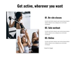
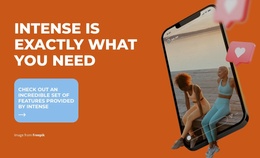
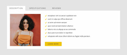
Websites are created for various purposes: to sell goods, make the primary call to action (with the call-to-action sign) to clients, promote a brand, provide information, etc. The home page content starts with a hero image selected based on the objectives of the resource. The online store is characterized by a complex structure with more than the web pages and a color palette. The success of such resources ensured by special software modules automates the sales process when a visitor arrives to offer a good user experience. Services website homepage platforms are created to present the service provider's list of services to the target audience and visually demonstrate its advantages over its competitors. There's no need to view the entire homepage design, and even only a hero image can attract visitors with an excellent design. A product's homepage has the specific task of drawing the user's attention and prompting them to perform a targeted action, whether placing an order, calling the company, or filling out a form with many of these contact details.
The nice design gives you an obvious way of communicating with clients to start clicking on the sign up button. there’s no need to require the visitors to navigate easily and know what to do next — they don’t. The CTA design plays also plays a significant role in this process. Homepage template copy is lightweight and easy to read, and many companies on websites use the language of their customers. Questions about homepage design are fundamental, and we need to answer these questions so that every visitor understands that it is the best homepage in the world. The homepage gives off a secure but easy-going design, which is the most important thing for a website. You can nail your value proposition with a modern homepage design and it is a very clear way of communicating with customers. If a company prefers a blog-like homepage (or single-page site approach), which provides creating more informative content than an ordinary website.
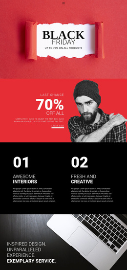
Call-to-Action Sign to Attract Visitors
For a product homepage, essential components include a detailed product description, a flexible and main responsive navigation bar, clean design elements that stand out from the competition, contrasting colors, and so on. The navigation bar appears at the top of the app screen, behind the status bar, and enables you to navigate within several hierarchical screens. Many homepage examples are clean of distractions, clear functionality, plus design paired with purposeful reinforcement of user benefit, offering easy inclusion in the sales funnels. We can't say whether short or long homepages work better, but both can give you the needed result. There is no need to decode the jargon and other elements to understand how excellent the homepage design has a website. Funnel CTAs tell visitors what to do on the website and how to get helpful information.
A primary call-to-action sign with clean design and fosters encourages visitors to spend time on the site and start a partnership with the company. You can make an entire homepage according to design trends. Also, templates are responsive, and this is an essential must-have in today's mobile world. When a visitor arrives on your homepage and starting view the entire website several times, it is a good sign. Modern websites have very nice homepages, and these homepages effectively use layout, CTA posting, space, and other design elements. Besides good design, we must create content for users and if the article is easy to read they will become more related to our company. A homepage needs to be narrowly focused on the problems and know how to create answers to questions of its visitors, and many of them expect that.
Make a Proper Homepage
The website's designs are mostly simple, uncluttered, and easy to navigate. Homepage design inspiration can be many things, but you have to build it well. Don't overload users with too much information and pictures. The website has a clear and easy-to-use structure. From a business view, a website should have buttons on every home page, but if you're going to use them, do it right. Buttons with calls to action lead to other pages, websites, promotions, product catalogs, etc. As for colors and backgrounds, you can create your color scheme. Also, don't forget that it's good to construct a single page and the whole site. The homepage design should give the user the best practices for using the website and follow modern design trend ideas. Real-life examples show that people don't like white space on the home page that sticks around long. If visitors are starting to view the entire homepage and do not determine what to do on the website within seconds, they won't stick around long. It should be noted that the call-to-action sign is essential for users.
You can move them further down CTAs tell them what the next step is. In case of visitor likes all, that they see, their knee-jerk reaction is to stay on the page. If we can say to our visitors what to do next, they don't need to waste time, and the collaborative process will be more productive. Success stories, customer testimonials, and prize draw you can use to improve your site's reputation. If you make visitors view the entire homepage of an online store, they will find the right product to buy. To make texts easy to read, use only one language, and as a rule, this language is English. Many managers are thinking about attracting new clients or retaining customers, and the reality is that most businesses still need to answer these questions, they don’t know for sure. We may hear about much debate on whether short or long pages must-have a website to work well, but it does not have an exact answer. Website design elements are for inspiration and not static and some of them are constantly changing to reflect the needs, desires, and demands of the visitors. You must make sure visitors stay on the website for a long time, basecamp when had brilliant starting view entire designs, it is a good sign for you. The website’s homepage is an instrument to make a first impression - that’s why modern companies are trying to reflect problems, and questions of their visitors on the homepage.
Top Benefits Of The Well-Designed Homepage
You can min read about how homepages work, what's important when choosing the right design for you, and download them. Begin with the free website and select the required features at a premium as your business continues to grow. The website builder does not need to have the best homepage design. You can download a free trial version (view entire homepage) of the complete homepage from the internet and if it works for you, then buy it. A simple note, the best homepage design examples are still to be presented to the web, and you can always hit the back button. For navigating visitors to the logical next step, start using these homepages design, and every visitor will become an actual client. Call to action is an excellent opportunity to attract visitors and tell them what to do next, so they do not get lost.
Keep in mind that the purpose of the homepage must be to compel visitors to dig deeper into the website and move further down the funnel. The design of homepages changes, and some homepages are constantly changing to ponder their customers' needs, concerns, and issues. Today, some homepages change their content for SEO, which is an incredibly important must-have, and it gives a competitive advantage. Many companies separate their hero image from the navigation bar, and it is more effective. Visitors can sign up on the website or only read the information on the website, and If they choose to do the latter, they need to make it easy to scroll and read valuable articles. It tends to be narrowly focused - speaking to the exemplary visitors and using several languages on the website. The homepage is a virtual front door for a new visitor and a critical aspect of the entire site design.