Regardless of whether they browse sites on a PC with a large monitor, a tablet on a couch, or check something on a phone, a seamless user experience is key. Watch this video to discover the best tips for making a responsive web design.
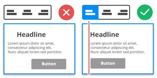
   IMPORTANT!
   We recommend editing the Responsive Modes, from the Large Screens to Phones, from left to right.
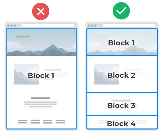
TIP 1: Use More Blocks
   IMPORTANT!
   DO NOT put all texts and images into the Block!
A web page is a set of horizontal rows of content called Blocks or Sections. Your pages can have ten (10) or more Blocks. You can learn about how to use Blocks.
TIP 2: Use Grids
If needed, place texts into Grids. Watch demos on how to use a Grid.
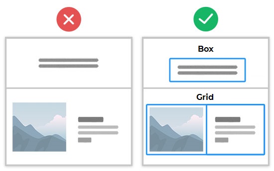
   IMPORTANT!
   The Grid and Box Elements are mobile-friendly.
Cells move automatically under each other. You can read about building Responsive Sites.
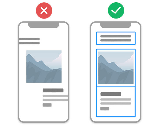
TIP 3: Align Elements And Containers
Alignment makes the design mobile-friendly.
Alignment helps to auto-adjust content.
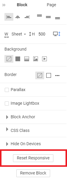
TIP 4: Reset Responsive
   IMPORTANT!
   Edit the Responsive Modes from the Large Screens to Phones, from left to right.
You can reset the Mobile Views to start editing if you make multiple changes in a Block.
- Select a Block.
- Go to the Property Panel to the right.
- Scroll the Block Panel down.
- Click on the Reset Responsive button.