900 Features CSS Templates




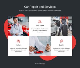
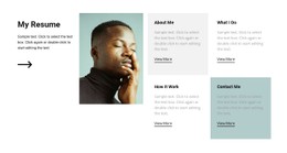



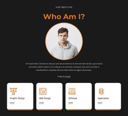
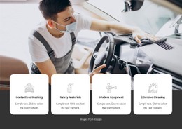









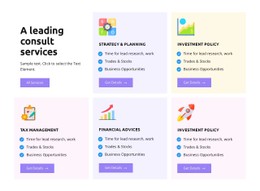

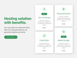
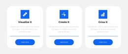
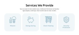


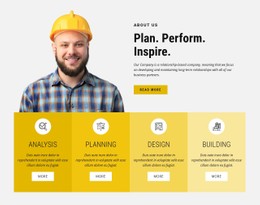
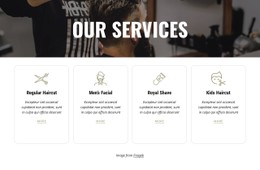
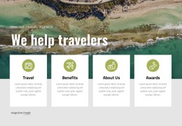
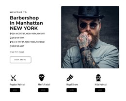























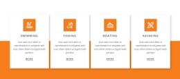
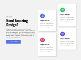
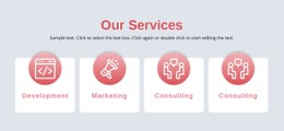

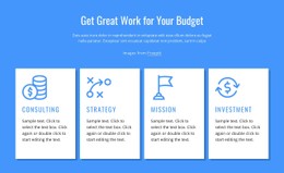

Professional Features CSS Templates for Flexible Section Styling
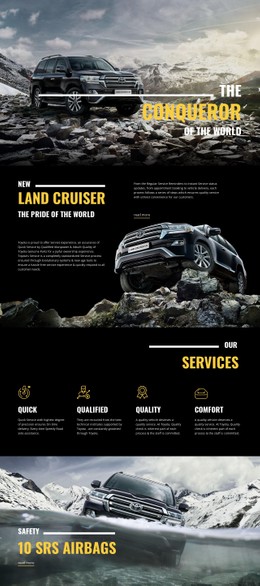
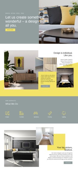
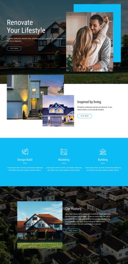
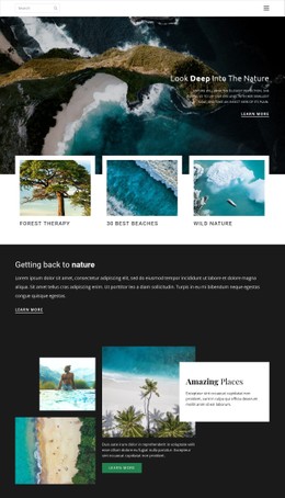
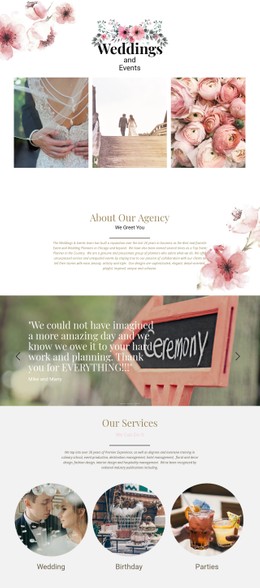
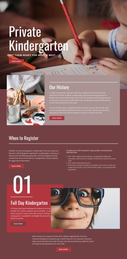
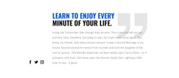
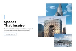
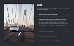
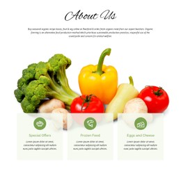
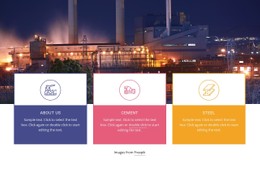
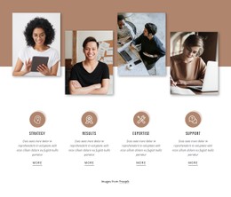
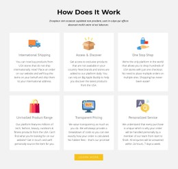
Features CSS Templates combine ready-made feature-section layouts with styling you can adapt to the project. They are useful when you want a prepared design for product or service benefits but still need control over typography, spacing, borders, backgrounds, alignment, and responsive presentation.
Rather than treating CSS as an add-on after the section is built, start by choosing a template whose visual system already suits the content. The closer the initial card or column pattern is to the final design, the easier it is to customize without losing clarity.
Compare Features CSS Templates by Visual Structure
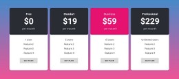
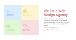
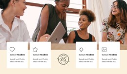
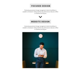
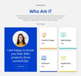
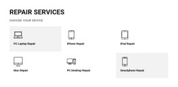
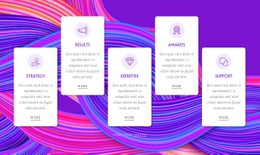
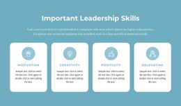
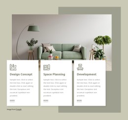
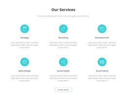
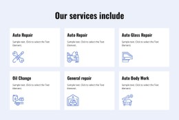
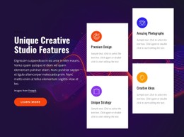
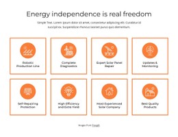
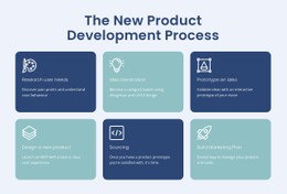
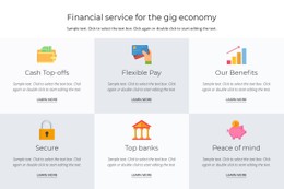
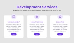
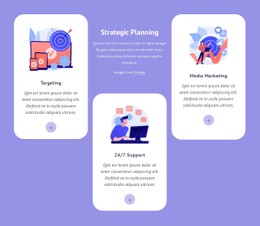
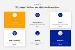
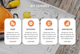
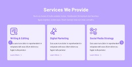
CSS-oriented feature designs can differ significantly even when they present the same number of items. Look at how each template handles:
- card and column proportions;
- title and description hierarchy;
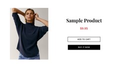
- icon, image, or screenshot placement;
- borders, fills, and background contrast;
- spacing between repeated items;
- responsive rearrangement on narrower screens.
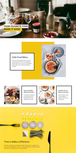
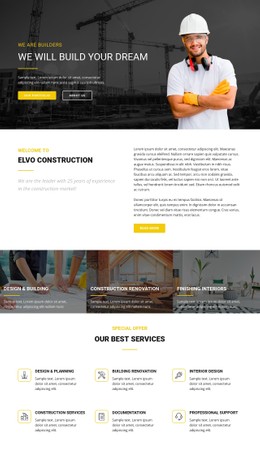
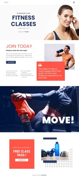
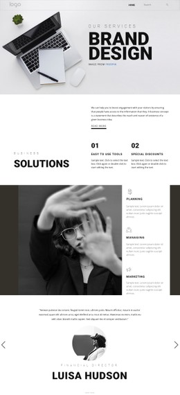
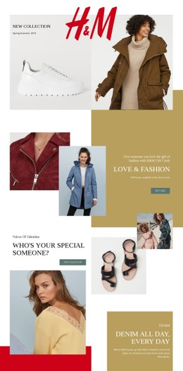
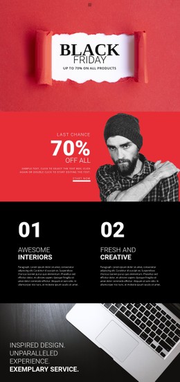
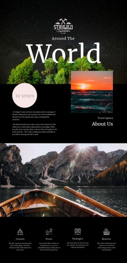
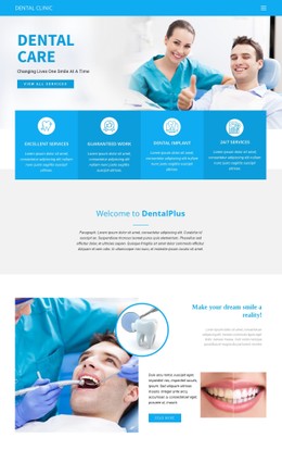
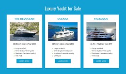
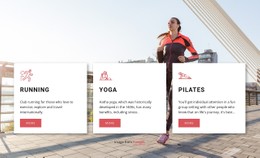
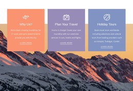
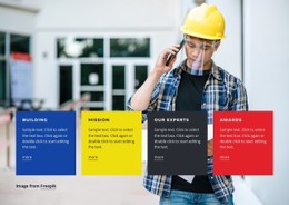
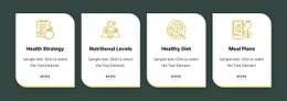
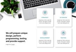
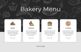
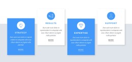
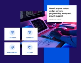
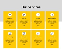
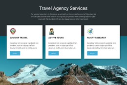
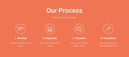
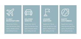
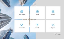
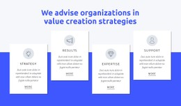
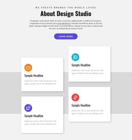
A compact four-column block may suit short benefit statements, while larger cards with supporting imagery need more space and often fewer items per row.
Use Reusable Styling Across Repeated Feature Items
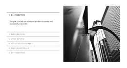
A good Features template keeps the visual treatment coherent across all repeated items. That does not mean every card has to look identical, but the section should share enough rules that visitors recognize one connected group.
The Grid Repeater element is useful when several feature items need the same underlying structure while their content changes. It can support a repeated pattern for titles, descriptions, images, and actions, while the template styling controls how that pattern appears.
Typography and spacing usually do most of the work. Clear title emphasis, comfortable text width, and predictable gaps help visitors scan the section more effectively than adding unnecessary decoration.
Adapt Borders, Backgrounds, and Responsive Behavior
Ready-made CSS templates can use subtle borders, filled cards, alternating backgrounds, accent colors, or minimal open layouts. Choose the treatment according to the surrounding page rather than isolating the Features section as a separate visual system.
Responsive behavior is equally important. A wide multi-column feature group may need to move into fewer columns or a stacked layout on tablets and phones. The goal is to keep the same content hierarchy and comfortable reading order as the available width changes.
A repeater-oriented layout can offer a related structural direction when repeated cards are central to the page. For Features, however, the styling should continue to support benefit- or capability-focused content.
Customize a Prepared Design Instead of Starting From CSS Alone
The main value of a Features CSS Template is the ready-made combination of layout and presentation. Start with the design that best matches your item count, content density, and visual tone, then refine only the CSS details where the project needs a different result.
Useful adjustments may include:
- changing font scale or weight for feature titles;
- increasing or reducing spacing between items;
- refining border radius, borders, or background fills;
- adjusting image or icon sizing;
- improving the layout at tablet and phone widths.
Custom CSS can be used when the prepared settings are not enough, but it should remain one customization option rather than the central purpose of the template.
Features CSS Template Questions
What Makes a Features CSS Template Useful?
It gives you a ready-made feature-section structure with a visual system you can adapt through typography, spacing, borders, backgrounds, alignment, and responsive layout changes.
Can I Add Custom CSS to a Features Template?
Yes. Nicepage supports Custom CSS when the prepared design needs additional project-specific styling beyond the available visual settings.
What Should Stay Consistent Across Feature Cards?
Keep the title hierarchy, description treatment, spacing logic, and supporting visual style consistent enough that the items read as one section. The exact content can still vary from card to card.
How Should a Features Layout Change on Smaller Screens?
Reduce the number of items per row or stack the cards when necessary. Preserve readable text widths, clear spacing, and the intended order of the feature content as the layout narrows.
Do I Need to Write CSS From Scratch?
No. Start with a ready-made Features CSS Template and customize the existing layout and visual treatment. Only add extra CSS when the project needs more specific styling.
Refine the Template Around the Feature Content
Choose a design with the right card pattern, content density, and responsive direction, open it in the Nicepage editor, replace the example benefits, and adapt the visual system. Use additional CSS only where the prepared template needs more precise control.