
Vacation CSS Templates
For resort promotions and tour pages, visual hierarchy must stay clear from wide destination galleries to compact mobile offer cards. Vacation CSS templates provide styling patterns for spacing, typography, grids, and responsive behavior without redefining the travel content itself.















































Other Travel & Hotels CSS Templates
Vacation CSS Templates for Responsive Travel Pages
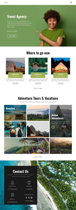
A vacation CSS template gives you a ready-made travel layout plus the styling system behind it: the grid that holds the offer cards, the typographic scale, image treatment, spacing, and breakpoints. Two can look identical as screenshots and behave differently the moment a destination name runs to two lines.
See How One Offer Card Changes Across Screens
The quickest way to compare vacation CSS templates is to follow one package card through the breakpoints:
- On a wide desktop, several offers share a grid row and need one hierarchy across all of them: image, name, dates, price, action.
- On a tablet,t the column count drops, putting pressure on image cropping, spacing, and text length rather than on the grid alone.
- On a phone, the card runs near full width, and the better templates recompose it rather than scale it down.
Grid and Flexbox rules, breakpoint spacing, and a type scale that steps down without losing contrast are what make that work. A template that shrinks the desktop composition was built for a design tool, not for someone comparing offers on a train.
Check the States a Demo Usually Hides
Screenshots show every component at its cleanest, so look for the styling that covers everything else:
- Hover and keyboard focus, with a focus ring visible enough to follow down a long list.
- Sold out or limited availability, where a card reads as inactive while its dates and price stay legible.
- Images in unexpected proportions, held by a fixed aspect ratio and object-fit rather than a shifting row height.
- Discount emphasis, where the current amount and the original keep enough contrast to both stay readable.
Those are the rules a designer writes last and a template most often skips.
Stress Your Styling With Real Inventory
Sample content is picked to suit the design; real inventory is not. One destination fits on a single line; the next is All-Inclusive Seven-Night Santorini Escape, and photos arrive in whatever proportions they were shot in.
Paste some of it into the demo and watch the seams: alignment breaking when a heading wraps, a taller card dragging its row, a price sliding below the fold.
Nicepage supports Responsive Modes for Large Screens, Desktops, Laptops, Tablets, and Horizontal or Vertical Phones. Custom CSS handles targeted exceptions when the standard design settings do not cover a particular component or state.
So compare the styling, not the screenshots. A demo shows the visual rules at their best; your own offers show the rest.