1240 Split CSS Templates































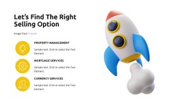
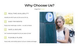
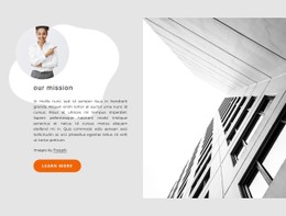
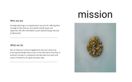
























Flexible Split CSS Templates for Responsive Two-Part Styling
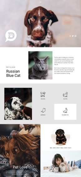
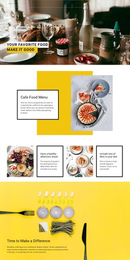
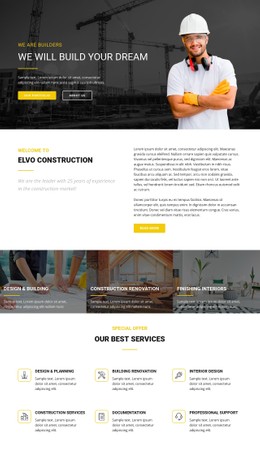
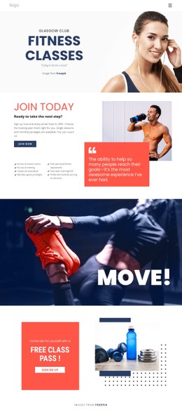
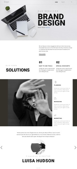
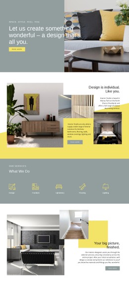
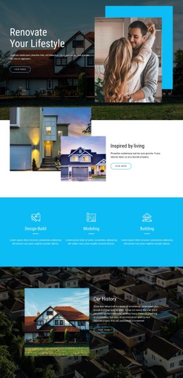
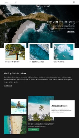
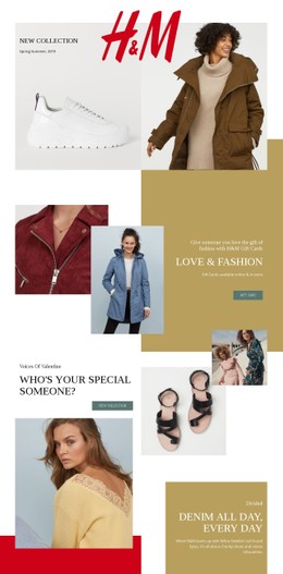
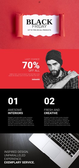
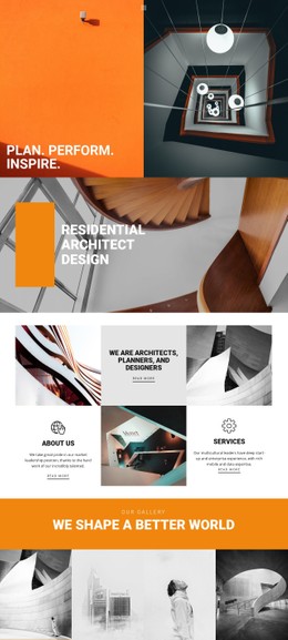
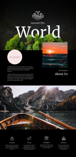
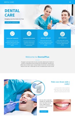
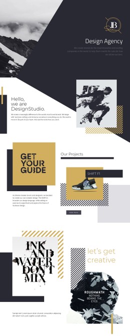
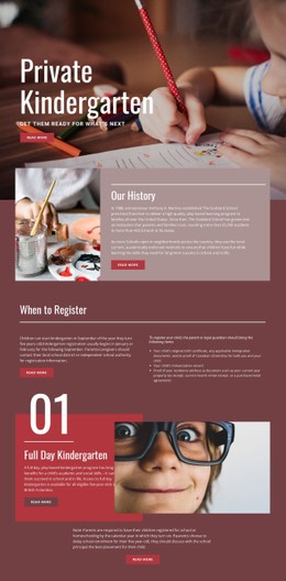
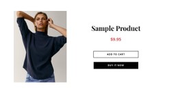
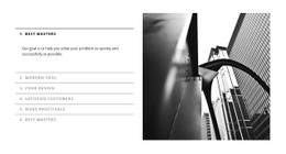
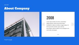
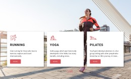
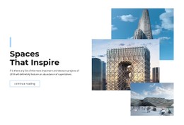
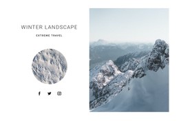
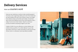
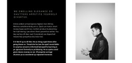
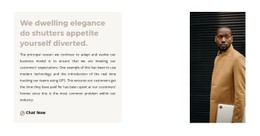
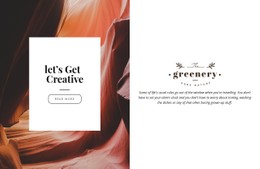
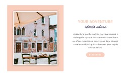
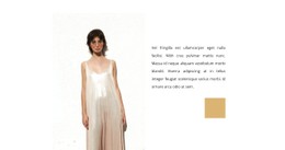
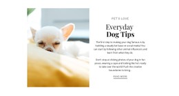
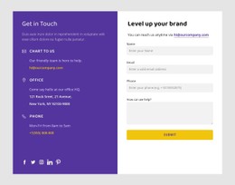
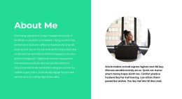
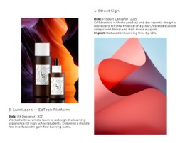
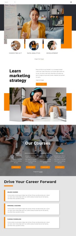
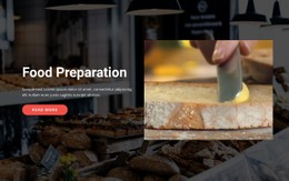
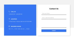
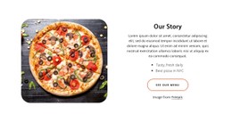
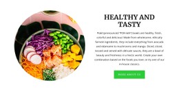
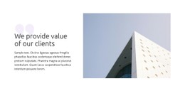
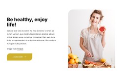
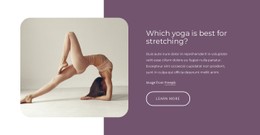
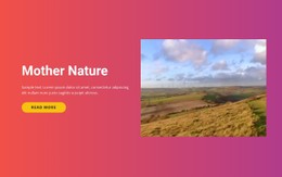
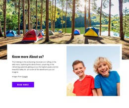
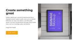
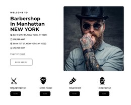
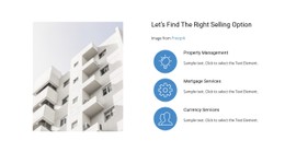
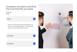
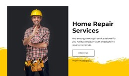
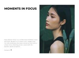
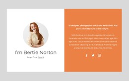
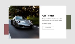
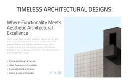
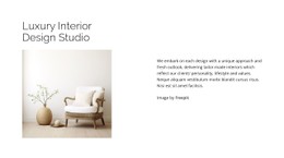
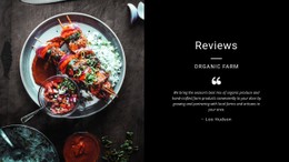
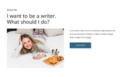
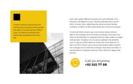
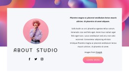
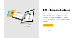
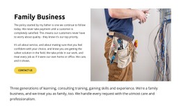
Split CSS Templates focus on how two connected halves of one section behave visually. A common layout places an image on one side and text with a heading and button on the other, while CSS-oriented styling controls the balance between them.
The key questions are practical: how wide each half should be, how the image fills its area, how the text aligns, and what happens when the section becomes too narrow to stay side by side.
Style Equal and Unequal Section Proportions
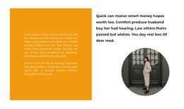
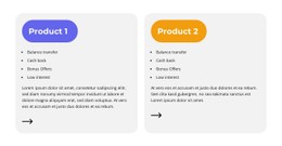
The two halves do not have to share the same width. Equal 50/50 proportions create a balanced image-and-content composition, while a 60/40 or similar split can make either the visual or the text side more dominant.
The Nicepage Grid Element provides a column-and-row framework for arranging the main areas. Within that structure, spacing, alignment, backgrounds, borders, and image treatment can reinforce the division without making the two sides feel unrelated.
Broader Split layout ideas can provide visual directions before a specific CSS treatment is refined.
Control Image Fit and Content Alignment
Because one half is often image-led, image behavior matters most. The visual may need to fill its area, use a controlled crop, or keep a focal subject visible as the section changes width.
The content side can use vertical alignment, padding, text width, and button spacing to maintain a clear hierarchy. These choices should support the section as one composition rather than style each half independently.
Plan the Breakpoint Transition
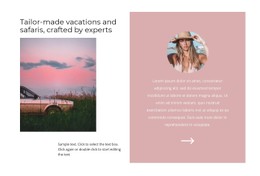
On wide screens, the image and content halves can remain side by side. At smaller breakpoints, they may stack vertically.
The order matters. Text can appear first when the message should lead, while an image-first sequence can work when the visual establishes the subject. Responsive styling should preserve the relationship between both halves, not simply compress the desktop layout.
Add Project-Specific CSS Only Where It Helps
Nicepage supports Custom CSS when the standard visual controls are not enough for a particular project.
Custom rules can refine:
- spacing and padding;
- section proportions;
- image sizing or positioning;
- backgrounds and borders;
- alignment and other visual details.
Add hover or transition effects where appropriate, but keep interaction secondary to the clarity of the two-part layout.
Keep the CSS Focus on the Split Section
Typography and color still matter, but the distinctive CSS questions are the relationship between the two halves: width, height, image fit, alignment, spacing, contrast, and responsive stacking.
The section should still read as one coordinated image-and-content block after styling, not as two disconnected panels.
Split CSS Templates FAQ
Can I Add Custom CSS When a Split Layout Needs Extra Styling?
Yes. Nicepage supports custom CSS for project-specific styling when you need more control than the standard design settings provide.
Can the Two Halves Use Unequal Widths?
Yes. Unequal proportions can give more room to imagery or content while preserving the same two-part section structure.
Should a Split Layout Stack on Smaller Screens?
It often can. Adjust the responsive layout so the image and content remain readable and appear in a logical order when there isn't enough width for the desktop composition.
Refine the Behavior of the Two Halves
Start with the right Split design, then adjust width, height, image treatment, alignment, spacing, and responsive order in the Nicepage editor. Use Custom CSS only when the project needs more specific control than the visual settings provide.