
Journey CSS Templates
Complex trips need clear visual cues for stages, stops, dates, and destination details. Journey CSS templates provide a styled foundation you can refine with targeted classes and responsive rules for dense route content.
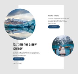




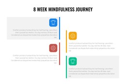


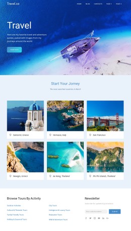

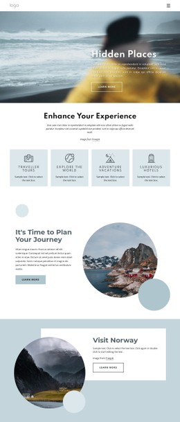
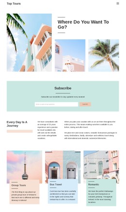


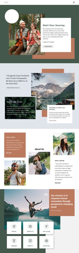
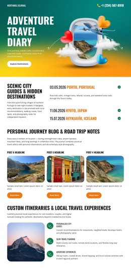




























































Other Travel & Hotels CSS Templates
Customizable Journey CSS Templates for Route and Itinerary Styling
A journey CSS template includes a travel layout's visual layer: card styling, spacing rules, and a type scale that holds up against long place names. State classes usually come with it so that the current stop can look different from the twelve behind it. Destination cards and itinerary stages share the same classes, so a two-week trip looks like a single design.
Cards, Badges, and Date Labels Come Styled
Repeated blocks are where hand styling gets expensive. Ten destination cards have to agree on padding, corner radius, and image ratio, and a template settles that once and for all.
Styling that a journey template can cover:
- shared classes for itinerary cards and stage blocks
- spacing that keeps a dense day-by-day schedule readable
- badge styling through background, border, and type weight
- date labels tied to the same type scale as the headings
Many templates add state classes on top of that to mark a finished leg or the current stop. Check whether the demo shows them, since cards of equal visual weight are slower to scan.
Where One Custom Rule Beats a Global Edit
Shared styling stops helping the moment one element breaks the pattern. A sold-out departure is one exception in a uniform set of cards, and editing the shared class would change every card.
The usual answer is a second class on top of the base one, so the card keeps its shared rules and picks up a narrow override for color or weight.
Nicepage keeps Custom CSS Code for exactly that. The Custom CSS documentation explains how to write and apply a rule to a single element. Colors, fonts, and spacing rarely need that step, since the visual controls already reach them; a marker on today's stop does.
Narrow Screens Change What Fits
Open a demo on a phone and go straight to the itinerary. Long destination names wrap first, and the date beside them loses its line. Breakpoint rules answer that with smaller type in the schedule column, tighter gaps, and a width limit on the card itself. Grid sections handle column collapsing, and targeted overrides handle cards with long labels.
Three checks tell you most of what you need. State styling comes first, since a stock demo often skips it. Then drop your longest place name into a card and watch where it breaks. Last is the override question: how far visual controls go before you need a custom rule.