1000 Architecture & Building CSS Templates




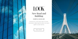





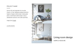

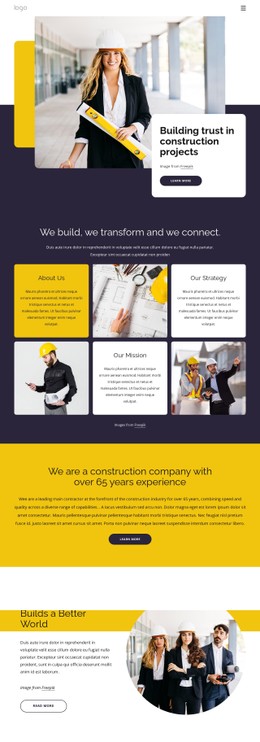

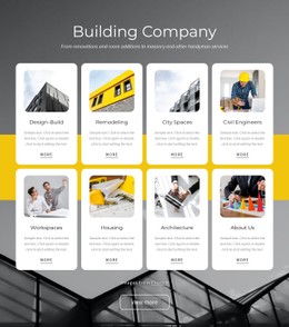









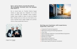
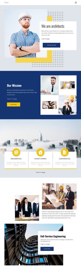
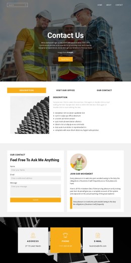

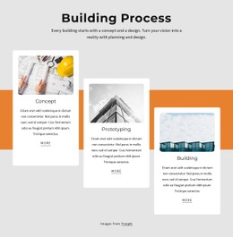
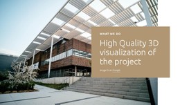

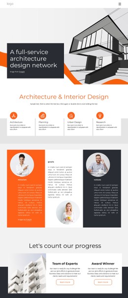
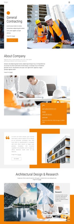
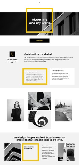
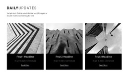
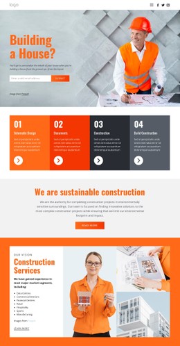
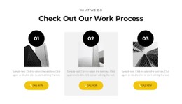
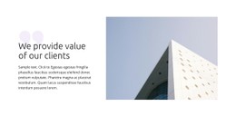








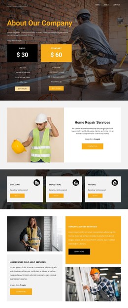

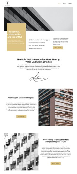



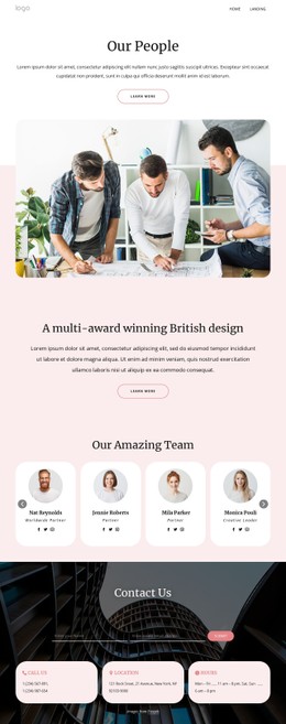

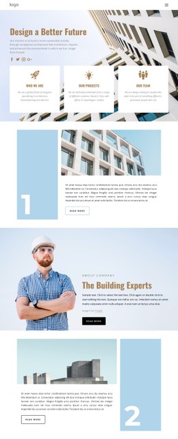
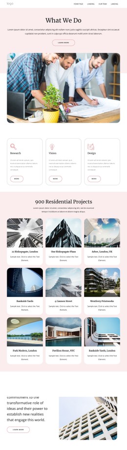

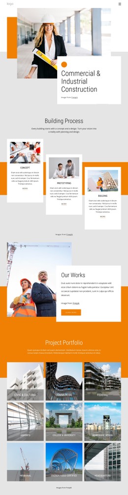



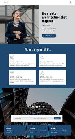

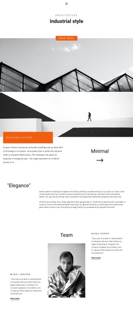
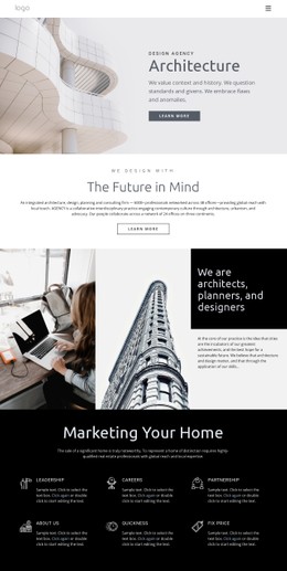




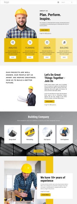
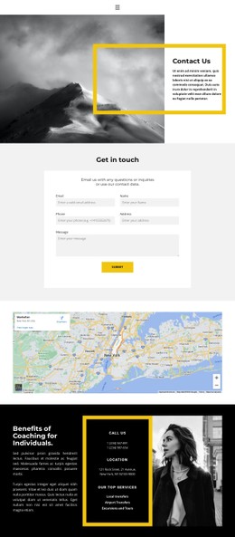
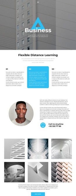
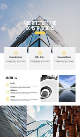
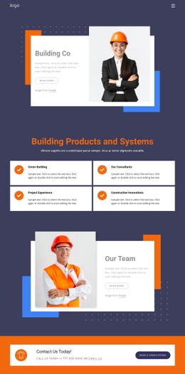

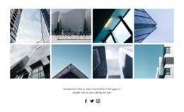
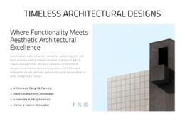


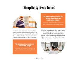
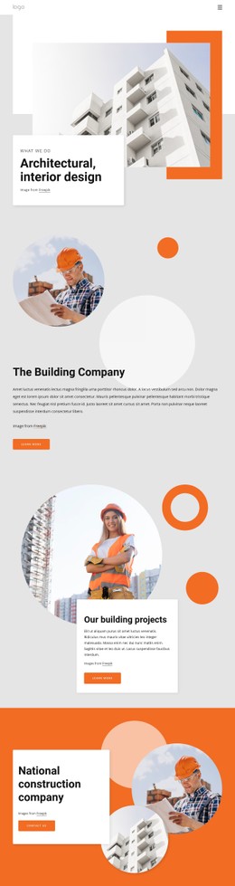

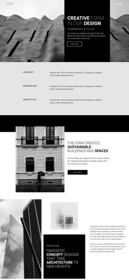
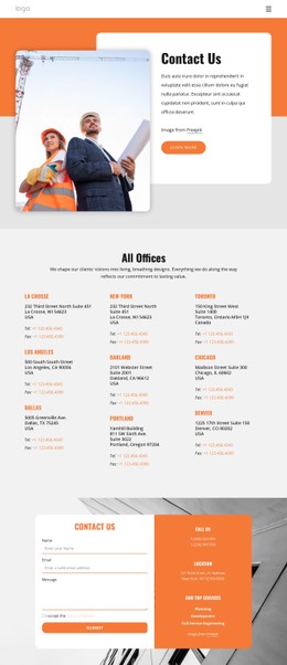


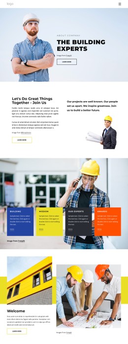
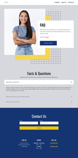
Responsive Architecture & Building CSS Templates
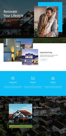
Architecture & building CSS templates provide a ready styling system for architecture layouts that need careful control over typography, spacing, image treatment, alignment, and responsive behavior. They are especially useful when the content structure is already suitable, but the visual treatment needs to match a particular studio, project type, or presentation style. You can refine plans, photographs, captions, project metadata, and service content through the same style layer without rebuilding the underlying page content.
Adapt the Visual Style to Real Architecture Content
The value of a CSS template becomes clear in the adjustments you make after choosing it. A studio may want to increase the gap between project cards, narrow the maximum content width for text-heavy case studies, enlarge landscape photography, reduce the prominence of location and year metadata, or give plan captions a quieter typographic treatment. These are small changes individually, but together they determine whether the layout feels appropriate for architecture work.
Image-heavy pages often need different treatment from drawing-heavy ones. A photography grid may benefit from larger crops and generous spacing. At the same time, the plans and sections usually need cleaner alignment, more neutral spacing, and captions that remain legible without competing with the drawings. Project page concepts can help identify which visual rules should stay consistent across different case-study formats.
Reusable classes help with recurring elements such as project labels, metadata rows, technical notes, featured cards, links, and hover treatments. They let you restyle similar elements across multiple pages without manually repeating the same adjustment.
Refine the Parts Visitors Actually Notice
When adapting a ready-made architecture CSS template, focus on the visual properties that affect how real content is read:
- Space and width: adjust section padding, card gaps, maximum content width, and white space around plans or image sequences.
- Image treatment: resize crops, refine proportions, align mixed landscape and portrait images, and control how image-heavy grids behave.
- Typography: style project titles, plan captions, service copy, and metadata so primary and secondary information are easy to distinguish.
- Interaction: refine link and button states, subtle hover treatments, and emphasis for featured projects without adding unnecessary effects.
- Mobile adaptation: restack grids, change image order, reduce gaps, and simplify metadata where smaller screens need a different presentation.
Nicepage lets individual elements receive Custom CSS classes, while Responsive Modes provide a visual way to review those refinements at different screen sizes. That makes it practical to adapt a template that is already close to the required architectural style rather than redesigning each section from scratch.
The Export Minimal CSS Per Page option creates a stylesheet containing only the rules required for that page. The minimal CSS export option is useful when different portfolio pages use different combinations of galleries, drawings, text, and service content. Still, it should remain a supporting optimization rather than the reason for choosing the design.
For construction progress or field-report content, construction-site content patterns can reveal additional styling needs: documentary image sequences, denser captions, status labels, mixed text-image blocks, or project updates that should remain visually related to the main portfolio.
Architecture CSS Template Questions
What is the difference between an architecture CSS template and an HTML template?
A CSS template focuses on presentation: typography, spacing, image treatment, responsive behavior, classes, and visual states. An HTML template provides the page structure and site files. The CSS layer handles most visual customization once the content structure is in place.
Can I add reusable custom CSS classes to architecture elements?
Yes. Reusable classes work well for project labels, plan captions, metadata rows, featured cards, technical notes, and special image treatments. They keep the same visual rules consistent across pages while still allowing individual content to change.
How should I adapt an image-heavy architecture layout for smaller screens?
Review more than just the number of columns. You may need to change image order, reduce card gaps, use different crops, shorten caption lines, or simplify project metadata. The goal is to preserve the project's reading sequence rather than shrink the desktop layout.
Can I restyle a drawing-heavy project page without changing its content structure?
Yes. You can refine spacing around plans, adjust caption typography, change grid proportions, reduce competing visual emphasis, and adapt the mobile arrangement while keeping the underlying project content and page structure intact.
Make the Chosen Template Fit the Studio
Start with a visual direction that is already close to the practice, then refine the properties that make architecture content feel specific: image scale, plan captions, project metadata, spacing, typography, hover treatment, and mobile order. A useful CSS template should reduce the amount of restyling required while still leaving enough control to give the finished layout its own character.