
Client CSS Templates
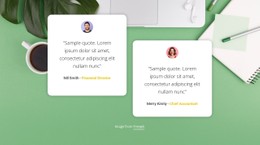
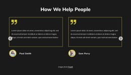
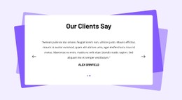
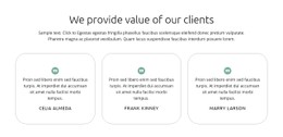
When testimonials vary in length and brand logos differ in scale, client proof can lose visual balance. Responsive CSS rules can control card spacing, quote hierarchy, logo grids, and mobile layouts while preserving a recognizable presentation.






































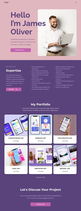

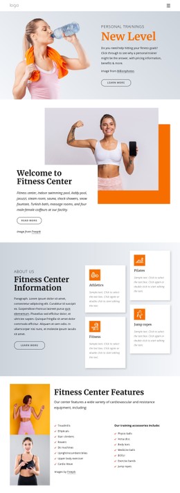
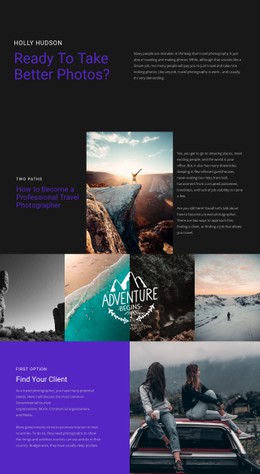



More Website & HTML Templates for Client









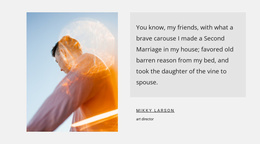
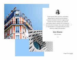

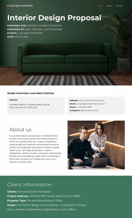
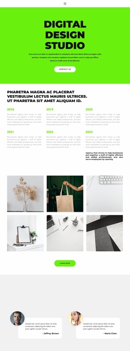





Other Travel & Hotels CSS Templates
Advanced Client CSS Templates for Consistent Customer Proof
The styling layer is what you actually control once the reviews and logos are in place. A client CSS template sets card proportions, the type scale, and the spacing between a quote and its source, along with the breakpoint rules behind them. What remains is choosing the prepared look that suits your proof, then adjusting the few parts that argue with your brand.
Sliders, Grids, Portrait Cards, Logo Walls
Prepared client styles come in a few recognizable shapes:
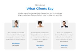
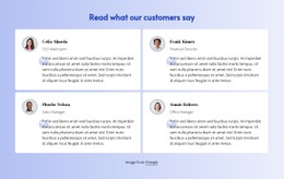
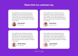
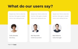
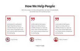
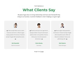
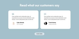
- Review grids, where several testimonials sit side by side at equal weight;
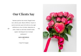
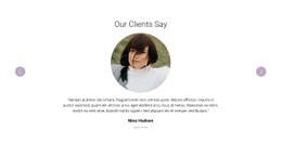
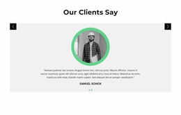
- Sliders, which trade visibility for space once you have twenty quotes;
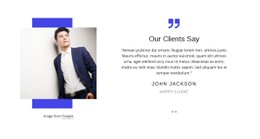
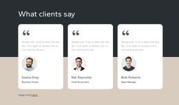
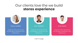
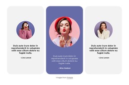
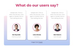
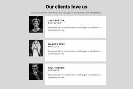
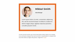
- Portrait cards, with a face and its attribution stacked under the text;
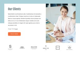
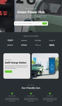
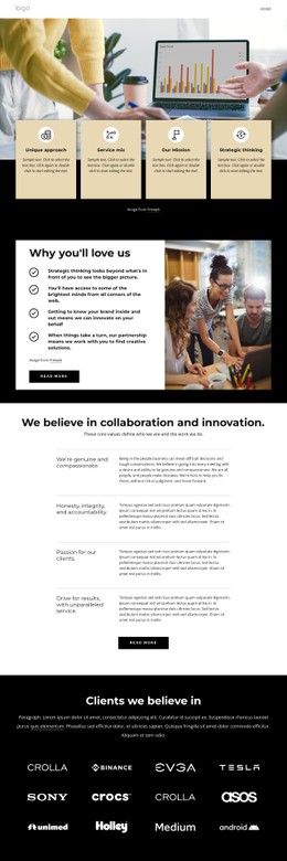
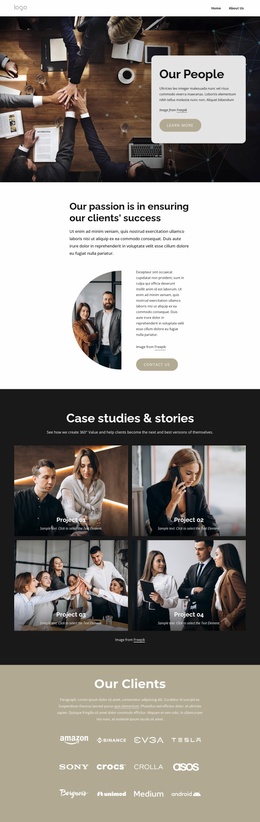
- Logo walls, sized for wordmarks and square marks of very different proportions.
Portraits are the fork in the road here. With photos, the type scale has to leave room for a name and a role under a fixed image size, and quotes stay short by necessity. Without them, a review can run longer, and the attribution can be limited to a single small line underneath. Sliders bring their own furniture, since controls and position markers need enough contrast to look clickable.
Long Testimonials Behave Differently on Narrow Screens
Most of the work in a client styling set happens where content stops being predictable:
- A 300-word review sitting in the same row as a 12-word one;
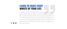
- Quotation marks that frame a card on a laptop and swallow half a phone;
- A small square mark that vanishes beside a wide wordmark in one grid;
- Attribution that drifts away from its quote once vertical spacing grows.
Fixed heights cause most of that. Letting cards grow to their content, capping marks with max-width and max-height instead of a shared width, and keeping the gap under a quote tighter than the gap between cards will settle most of it. Nicepage supports custom CSS when a single stubborn section still misbehaves, and that is the honest use for it: an exception inside a set of rules that otherwise holds.
Pick Styling by Content Size First
Look at what you have before you look at what is pretty. Twenty short endorsements and a set of client marks want a grid and a wall, both quiet and consistent. Three long stories with numbers want wide panels where results can breathe. Teams with both usually end up running two related styles on one site, tied together by shared type and color. If your quotes vary wildly in length, test that variation before anything else, because client proof only builds trust while it still looks deliberate.