
Retreat Website Templates
Retreat guests often compare itineraries, facilitators, accommodation, and practical details on a phone. A ready-made HTML foundation can keep those sections readable and logically grouped while giving the project a structured front end for later review or deployment.
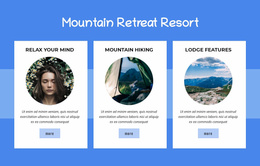
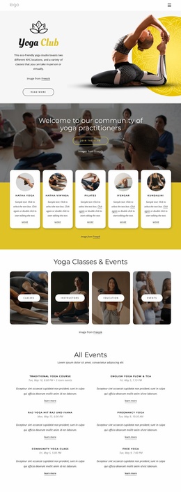

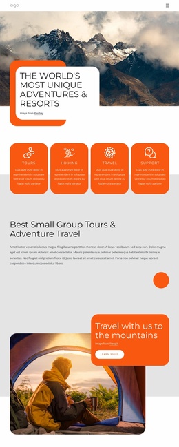
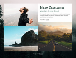

More Website Templates from Travel & Hotels Category



















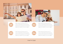
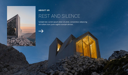
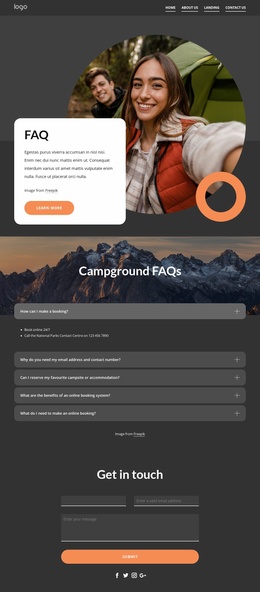



Other Travel & Hotels Website Templates
Growth-Focused Retreat Website Templates
One weekend in the mountains fits comfortably inside a single campaign. A retreat center running four programs across two countries does not. Retreat Website Templates give organizers a ready visual direction and a structure that can carry the whole business; the second part usually decides the choice.
Give Each Subject Its Own Destination
A guest comparing two programs travels a different route from someone checking room options or airport transfers. Splitting the site by decision keeps both journeys short. Guests also read in an order nobody plans for. Someone arrives at a program via a newsletter, jumps straight to accommodation, and the refund policy gets checked long before the dates do.
A retreat business normally needs room for:
- a program's overview that compares themes, dates, and destinations;
- a detailed view with enough space for itinerary, inclusions, and suitability;
- accommodation and venue material, including meals and facilities;
- travel notes, policies, and the questions that arrive by email anyway.
The category is mixed, so it is worth checking how easily a design takes new sections and blocks as the project grows. The Site Basics workflow covers managing the entire website project during that time.
Plan for a Second Program
Year one often looks modest: a home screen, one retreat, and a contact form. Year two brings a silent weekend, a corporate booking, and a venue in Portugal. That is the moment a site structure either absorbs the growth or forces a rebuild in the middle of the season.
The hero band is the least informative screen in any demo. Scroll down to the contact form and the policy section, because those quiet parts show how far a design will stretch once the business is no longer a single program.
Menus Carry Visitors Between Sections
Nicepage Website Menu links the main areas, and a shared Header keeps the logo and navigation identical wherever a visitor arrives. Everything should still feel like parts of one site rather than six small ones, which means having the same menu and the same inquiry button appear everywhere.
A single visual direction does the other half of that work. Theme Settings centralize the colors, typography, and Header, so a new destination or a second host does not look like a different company.
Pick the structure first and the decorative details second. A design that already anticipates a catalog, a detail view, and a travel section will still fit two years from now.