
World Map CSS Templates
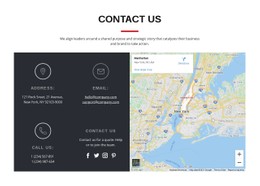
Maps with many regions, labels, or location cards need controlled spacing and clear visual hierarchy. CSS-focused templates provide a styled base you can refine for responsive map proportions, legends, regional emphasis, and supporting content.

































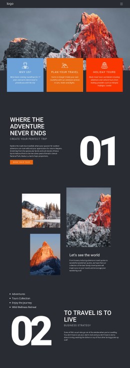
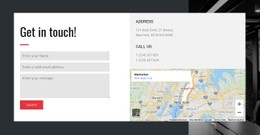




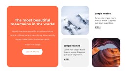
















Other Travel & Hotels CSS Templates
Customizable World Map CSS Templates With Region and Marker Styling
Picture a world map where the countries you serve glow in your brand teal, the rest fade to pale gray, and each office pin grows slightly when the cursor hovers over it. World map CSS templates hand you control over that visual layer, from fills and label positions to the states a marker passes through. Since the rules are shared, one edit to the highlight color reaches every served country.
Hover and Active Marker States
Markers are what people actually touch on a world map. A pin that ignores the cursor feels broken, and one that jumps too far looks cheap. Most world map layouts lean on a handful of visual rules:
- a hover state that enlarges a pin or adds a soft shadow beneath it
- an active state that keeps the selected office highlighted after a click
- fill and stroke colors for served countries, when the map is an SVG with separate shapes
- tooltip cards with their own background, padding, and corner radius
A white label that reads well over the Atlantic can vanish over the pale Sahara. A thin text shadow or a translucent backing plate usually fixes that better than a bigger font.
Legends With Legible Labels
A legend turns map colors into meaning, but only while its swatches match the map exactly. Shared classes and color variables allow a single value to drive both the country fill and the matching square in the key. Labels are trickier, because small Caribbean or Balkan countries leave no room for text inside their borders. A common fix is to place those labels outside the shape with a thin leader line, or to hide them at smaller widths. Beside the map, a Grid layout keeps the legend column aligned, with a single gap value setting the spacing between them.
Scaling Pins at Each Breakpoint
A world map loses most of its width on a phone held upright, while fingertips do not shrink at all. Breakpoints respond with larger tap areas, fewer labels, and a legend that drops below the map. Relative units keep marker sizes proportional across devices, so a pin does not look like a dot on a laptop and a coin on a tablet.
Map screens often carry styling that nothing else in the project uses. Nicepage documents Export Minimal CSS Per Page as an optional export mode that creates a separate stylesheet with only the rules one page needs, so heavy map styling stays out of the rest of the site.
Hover over a few pins, compare the legend with the fills, and view the layout at phone width. These checks reveal more about a world map CSS template than any screenshot.