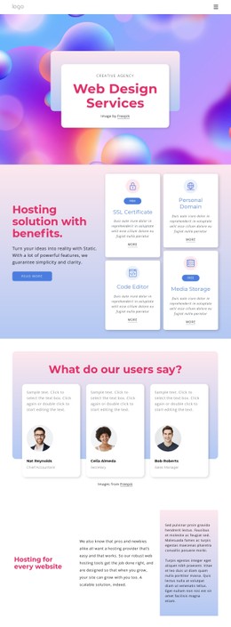
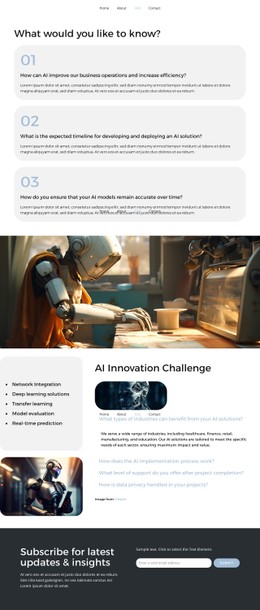
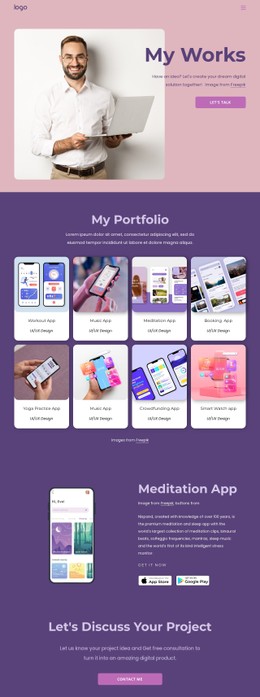
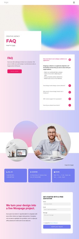
Digital Art Museum CSS Template


Edit Template Offline
2. Create new page and search for id 14287
Edit Template Online
Create Awesome Websites


Free Nicepage Builder
Keywords
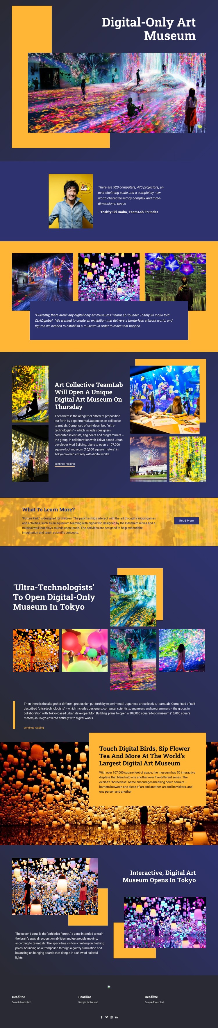
Navy Panels and Golden Accents Shape the Museum’s Styling System
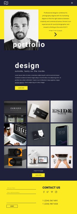
Dark navy surfaces provide the visual base for the page, giving the large white headlines enough contrast to stand apart from the vivid artwork photography. Golden yellow appears as a focused accent in text panels and geometric blocks, especially where the design introduces the museum concept or describes an immersive visitor experience. This relationship between deep backgrounds, bright type, and saturated imagery makes the palette part of the editorial message rather than a separate decorative layer.
The page also repeats several styling patterns across different section types. The opening text-on-image composition uses geometric color blocks around the museum title, while the split founder quotation places a portrait beside compact text in a more restrained arrangement. Three artwork images surround a centered quotation panel, and later galleries repeat the image-led treatment with featured artwork and additional image rows. These variations share strong contrast and deliberate spacing while allowing each section to have its own visual emphasis.
Typography supports the same system. Large white headlines create focal points for the museum, teamLab coverage, Future Park, and interactive displays, whereas compact article copy keeps longer explanations visually contained. Asymmetric image areas, narrow text panels, and full-width backgrounds create recurring alignment and spacing rules that connect the page. In a CSS-oriented implementation, these confirmed visual relationships provide concrete styling targets for adjusting colors, typography, backgrounds, borders, spacing, and image treatment without changing the editorial section sequence.
Customize with Nicepage
Open this ready-made template in the CSS Template Builder and customize it visually in the Nicepage editor. Replace demo content, edit page sections, and adapt the design to your project without rebuilding the template from scratch.
Customize This Template With CSS
Control Page-Specific Styling
Customize the visual appearance of this ready-made template directly in the Nicepage editor. Adjust typography, spacing, backgrounds, borders, colors, positioning, and other style properties using visual controls while keeping the page layout easy to manage without writing CSS manually.
Add Custom CSS When Needed
For styling requirements that go beyond the standard editor options, use Custom CSS to add targeted rules. CSS can be applied to individual elements, specific pages, or the entire website depending on the scope of the customization, while CSS classes can be used to connect custom rules with selected elements.
Export Minimal CSS Per Page
For projects where CSS size and page performance matter, Nicepage can export minimal CSS for each page. Instead of relying on one larger common stylesheet, each page can use a separate CSS file containing only the style rules required for that particular page. According to Nicepage documentation, these page-specific CSS files can be about ten times more compact, helping reduce unnecessary CSS and improve page loading performance.
This workflow combines visual styling with optional custom CSS and optimized page-specific CSS output, giving you additional control when a project requires it without making manual CSS editing the primary way to customize the template.