
Climate HTML Templates
Research summaries, program updates, reports, and public guidance often require different content structures. A ready-made HTML foundation gives climate teams reusable sections and a clear markup hierarchy that remains readable across screen sizes.

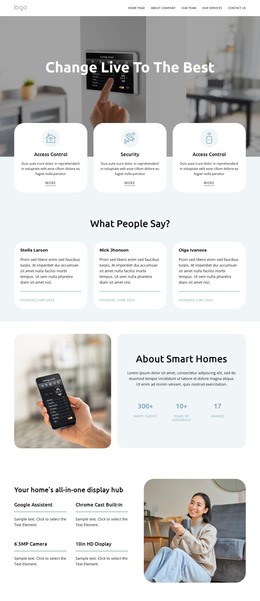
































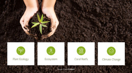










More HTML Templates from Nature Category







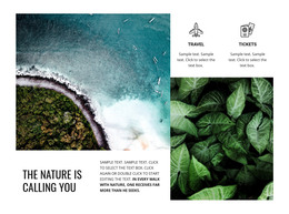
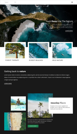









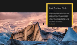

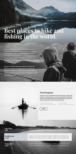




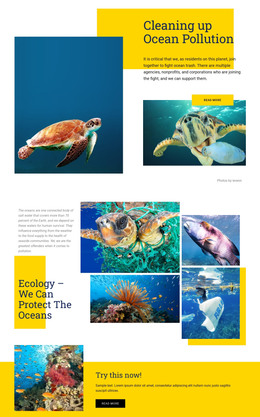





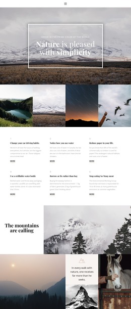
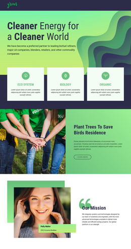
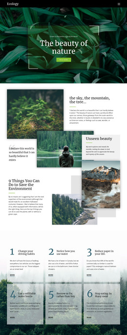







Other Nature HTML Templates
Climate HTML Templates with Editable Source Files
Open a climate HTML template, and the pages are ready to go. A hero section, project cards, and a report listing come pre-filled with placeholder content that you can swap out for your own initiative. Teams that want the files in their own hands and the freedom to publish them on their own server usually start from a package like this.
Sections a Prebuilt Layout Already Includes
Most climate packages carry a handful of blocks that do the bulk of the work:
- project cards with location, status, and a short outcome line;
- report previews holding a title, summary, and a download button;
- figure blocks where an emissions number sits next to the note explaining it;
- participation forms for volunteers, partners, or newsletter signups.
Because these blocks repeat, adding a fifth project next spring means copying an existing card and updating its text. Teams tend to underestimate educational material. An adaptation guide, a short piece on household emissions, and a page of preparedness tips all need somewhere to sit, and a package built around a single news loop will not hold them.
Swapping Demo Content for Project Data
The first day with a new package tends to go in the same order:
- replace demo headings and body text with your own program descriptions;
- drop in real report links, photographs, and figures;
- delete the sections you will never use, because every unused block is one more thing to maintain;
- publish the folder to your own hosting and click through every link once.
A developer can do the same package from the other end, editing the source directly and connecting the forms to whatever the organization already uses for submissions.
How the Files Behave on Narrow Screens
Climate pages get dense quickly. A research summary, a chart image, and its source note sit side by side comfortably on a laptop, then start to collide on a phone. Scroll the demo at a couple of widths before you commit, because a layout that keeps a figure next to its explanation on a small screen spares you a rebuild later.
Nicepage Responsive Modes step through desktop, laptop, and tablet widths. Horizontal and vertical phones get their own views, which is usually where a dense project section needs a nudge before you publish.
A package worth keeping has a tidy file structure, sections that match what you actually publish, and room to add a project or a report without unpicking half the page.