
Leaf HTML Templates
Plant catalogs, care guides, service details, and botanical galleries often repeat similar information patterns. A ready-made HTML foundation keeps those sections structurally consistent while allowing each type of plant content to retain its own hierarchy.


























































More Website & HTML Templates for Leaf













Other Nature HTML Templates
Leaf HTML Templates You Can Open and Edit
A Leaf HTML Template hands you the actual pages. Assembled sections, working navigation, and demo content sit exactly where your own material will go, and the files stay open for direct editing afterward. If you would rather open a file than click through a panel, this format fits, and the botanical demo content gives a realistic idea of how the pages behave once they fill up.
Sections Already Built Into Each File
TThisfformat's valuelies in the bpreassembled blocks Sets in this category often ship with several of these:
- a hero area sized for one wide photograph;
- catalog rows made from a single repeating item;
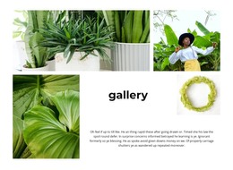
- a gallery block with captions attached to each picture;
- a contact area holding a form and address details.
Duplicating one of those rows keeps a page consistent because the copy follows the original arrangement. The block order is easy to change, too, which matters the moment a project wants its gallery above the catalog. Nicepage assembles pages from Elements and Blocks, and the exported files remain available for manual editing once a section is in place.
Editing Markup You Actually Own
With this format, you control the arrangement of elements. That covers which heading sits above which block, how one section nests inside another, and where the form lands in the reading order. Sensible heading order also helps a screen reader and a crawler work through the page, which is a fair bonus for a catalog nobody wants to rebuild twice.
Leaf sets tend to be heavy on imagery, so pay attention to how a picture and its accompanying text are grouped. That grouping is what you inherit, and it is far easier to reuse a well-arranged block than to unpick one.
How Repeated Blocks Hold Up on Small Screens
Image-led pages get awkward at narrow widths. A row of four items has to become readable, and a caption has to stay with its own picture instead of drifting toward the next one. Scroll a demo on a phone before deciding, and go well past the first screen, since the care put into a layout often thins out below the fold.
Pick based on what the file actually holds. What matters is the sections your project needs, an arrangement you can follow without a map, and behavior that survives the phone test. Whatever is missing there becomes handwork after the download.