
Climate CSS Templates
Environmental teams often present dense evidence beside public-facing explanations and project updates. A CSS-oriented template helps refine spacing, grids, typography, color, and responsive behavior while keeping the focus on climate information.

























More Website & HTML Templates for Climate




















More CSS Templates from Nature Category






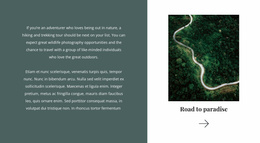








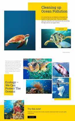




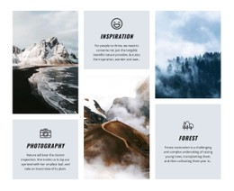

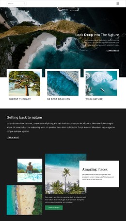
























Other Nature CSS Templates
Climate CSS Templates for Data-Heavy Environmental Sites
A climate site collects awkward material. Emissions tables, long dataset titles, and a household preparedness checklist end up on the same page, and each one wants different treatment. Climate CSS Templates hand you a ready set of visual rules for that, with classes for cards, panels, and grids that you apply to content already written and already in place.
Reusable Classes Behind Cards and Panels
The rules doing the most work on a climate site are fairly ordinary ones:
- card classes for project entries showing location, intervention type, and status;
- a research card pattern with a dataset title, date range, and the key finding;
- a guidance panel for flood or heat preparedness advice aimed at residents;
- spacing and type rules that stop a long methodology note from crowding the figure above it.
Because the same class applies to every project entry, a padding change propagates across the entire listing in one edit. Brand adjustments stay cheap for the same reason, since the font scale, card borders, and section spacing come from a few rules you can point at.
Color Choices When Numbers Carry Meaning
Color on a climate page conveys information, so a palette must distinguish a risk indicator from a neutral baseline figure before it worries about looking environmental. Green everywhere is the common trap. When every value on the screen is positive, nobody can tell which number the report was actually about.
Weight helps as much as hue. The headline impact metric can sit large and dark at the top of the card, with the methodology note small and gray underneath, and the reader gets the point without a caption explaining the difference.
Where Custom Rules Still Help
Most of a template gives way to the visual controls, and then one thing refuses. It might be a six-column indicator grid, or a campaign section in colors that sit outside the theme palette. Nicepage accepts Custom CSS Code at the element, page, and site level, so a fix for one dense block stays on that block.
Breakpoint behavior deserves a pass before launch. A three-column research listing that folds into one column on a phone should keep its gaps and its type size legible, and Responsive Modes let you check that width by width.
These templates pay off once the structure and wording are settled, and the pages still look flat. Take one that handles dense material calmly, then spend the time on the two or three sections carrying your actual numbers.