
Leaf CSS Templates
Plant collections, nursery services, garden projects, and care guides need different visual emphasis without losing consistency. A CSS-focused template lets teams refine grids, spacing, typography, colors, and responsive behavior around those content types.



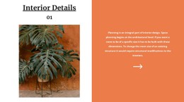
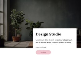








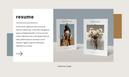
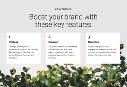



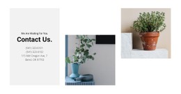
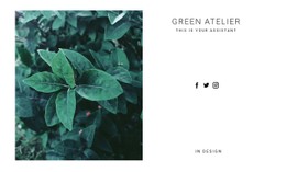





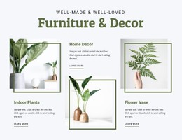
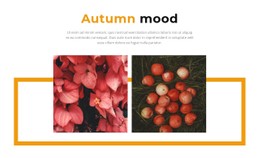


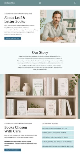
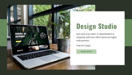












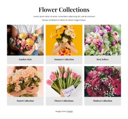
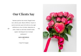

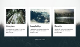
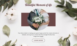
Other Nature CSS Templates
Leaf CSS Templates for Foliage-Heavy Layouts
A Leaf CSS Template arrives as a finished visual base, with green and earthy tones, roomy image areas, and type that stays quiet alongside photography. The pages and the words can already exist; what you take from here is the appearance, plus the freedom to bend it toward your own brand. Most of the work after that comes down to trading demo tones for your own and deciding how much room the photographs get.
Palette, Spacing and Card Proportions
Most of the adjusting happens in a small number of places:
- the color set, where trading two demo greens for your own tones shifts the mood of every screen;
- type sizes and line height, which decide whether a long description feels airy or cramped;
- card proportions, from the image ratio down to the padding around a caption;
- the appearance of buttons and links when a visitor hovers over them.
These are shared rules, so a single change lands everywhere the same class appears, and a long listing repaints as fast as a short one. That is also why the visual character survives customization: alter the tones and the sizing, and the template still reads as one coherent piece.
Photo Grids at Phone Size
Foliage sites lean on pictures, and pictures are what falter first on a narrow screen. Three things tell you quickly whether a template handles them well:
- how many columns does the grid keep at tablet size;
- whether a caption stays legible once its image shrinks;
- what becomes of the gaps, because a tight grid on a phone reads as clutter
Leaf photography also suffers from cropping more than a product shot does, since the shape of a frond disappears the moment a square thumbnail cuts across it. Nicepage Responsive Modes let you flip between widths while editing, so the phone view isn't a surprise on launch day.
Style Exceptions Worth Keeping Local
Sooner or later, one screen refuses the house rules. A seasonal promo wants darker cards, or a single long guide wants wider text than everything around it. Nicepage accepts custom CSS at the element, page, and whole-site levels, keeping exceptions as narrow as needed.
Visual control is why you're looking at this format at all. Judge the candidates on photography-first sections that already sit close to your idea, a palette that moves to your colors in a couple of edits, and enough headroom to override a rule where the design asks for it.