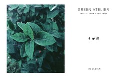
Nature CSS Templates


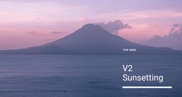


Other Nature CSS Templates
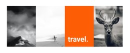
Flexible Nature CSS Templates
Nature CSS templates enable the development of calm, clear websites whose designs complement their content. These templates are responsible for color, spacing, and layout, ensuring the clarity of the website page presentation. This is relevant to websites about nature and the environment, as they often use extensive visual content. Moreover, in the context of mobile optimization, such designs will be valuable, as mobile users typically spend 4.5 to 5 hours a day on their phones; therefore, their sites should be properly optimized. With CSS, layouts become responsive and adapt any elements (text, images, galleries) without breaking structural components.
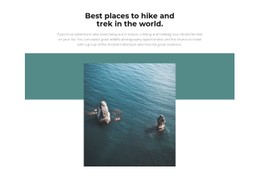
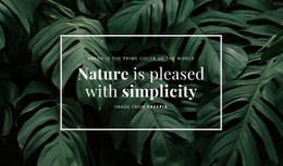
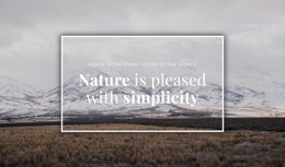
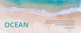
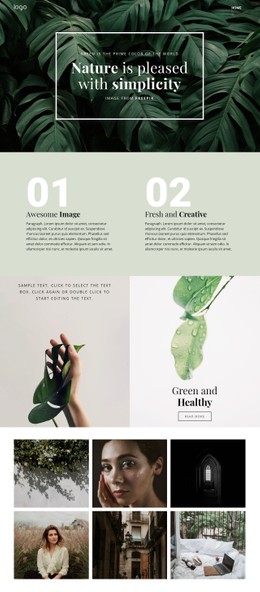
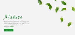
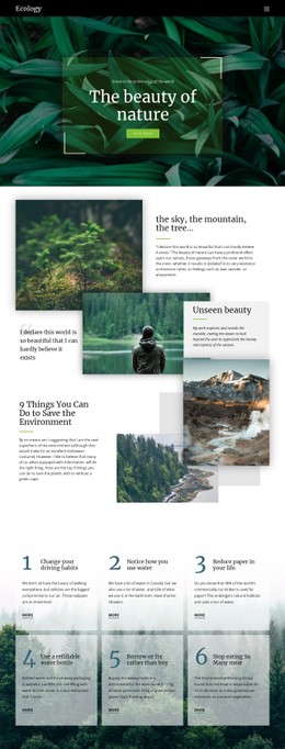
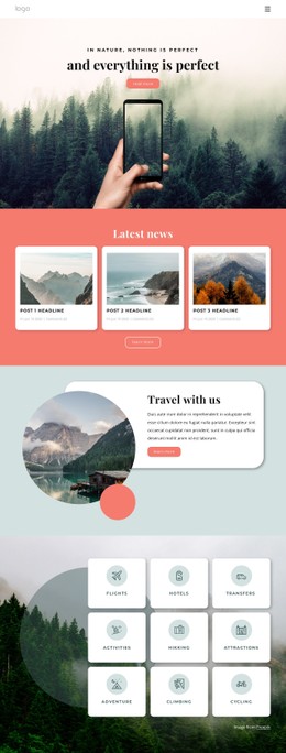
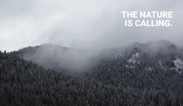
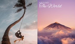
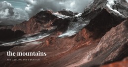
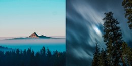
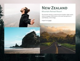
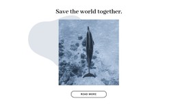
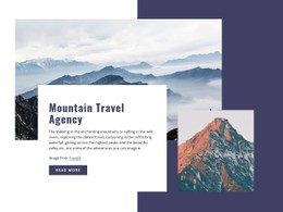
Nature-related topics are attractive and engaging to internet users, as interest in sustainability and climate issues increases annually, and the same applies to visual presentations of nature themes on social networks. Moreover, the human brain remembers and trusts the information presented in natural colors (green and blue).
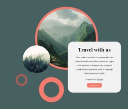
Good styling adds uniqueness to a website. Nature CSS templates offer you a chance to have good control over your visual elements while maintaining simplicity in your website structure. About 75% of people make their decision about a website based on its design, which is influenced by styling.
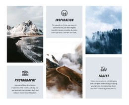
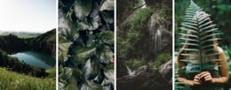
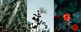
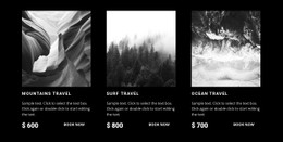
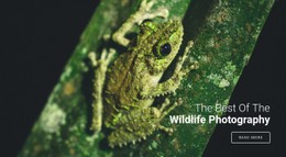
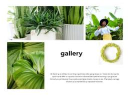
Nature templates are handy for graphic designers, web developers, and others who work with content related to ecology or the outdoors. This will enable you to easily add a specific visual look according to your requirements.
Full Control Over Visual Style
CSS templates for nature determine your site's appearance and let you customize its look without modifying the HTML code, keeping everything neat and tidy on your end.
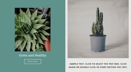
Eco CSS layouts let you modify colors, fonts, margins, and other visual components to suit your needs. If you work on a project dedicated to nature, you may opt for a soothing color palette, shadows, and gradients to create an engaging visual experience. The introduction of interactive elements can boost user interaction by 60%.
Here are the main styling features:
- Flexible grids
- Color variables
- Smooth animations
- Responsive breakpoints
- Clean stylesheets
- HTML integration
Using these characteristics, you will be able to create a cohesive look that is engaging for users without compromising flexibility or customization.
Optimized for Modern Devices
Nature styling templates optimize CSS for improved performance. Optimized styles will lead to faster page load times and a better user experience.
Over 58% of web visits are currently being made using mobile devices. Responsive green CSS design eliminates issues with mobile website adaptation.
Begin Customizing Your Design
Pick up a template, modify styles, and make your own design for your website. Nature CSS templates provide full freedom in designing your site's interface.