
Resources HTML Templates
A useful resource page must help visitors distinguish guides, tools, downloads, and reference links without turning the page into a long, unstructured directory. A prepared HTML template gives each resource type a clear place in the markup.
-
-

-
-
-
-
-
-
-
Free Website Builder SoftwareDownload
-
-
-
-
-
-
-
-
-
-
-
-
-
-




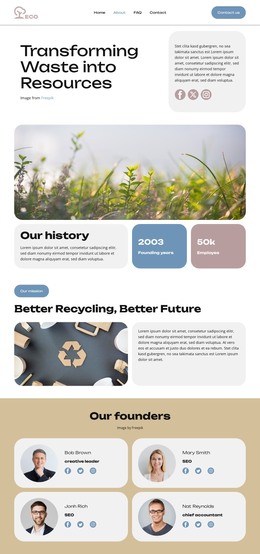



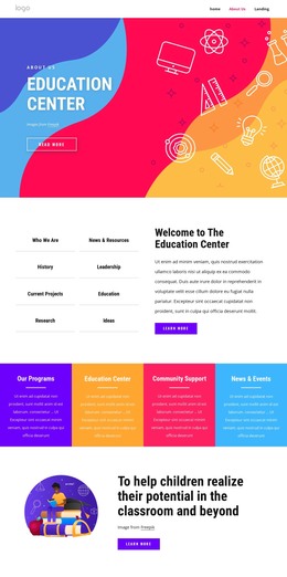





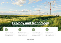









More HTML Templates from Industrial Category






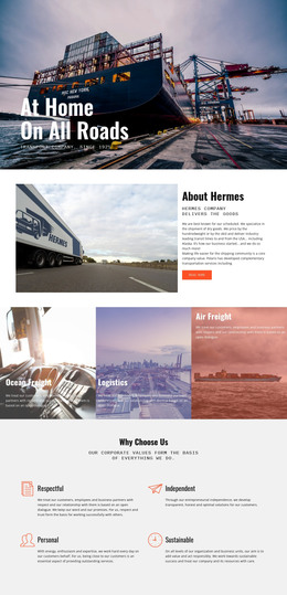
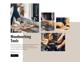
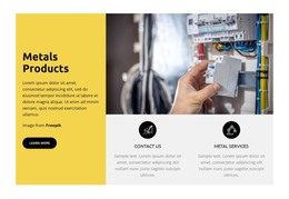
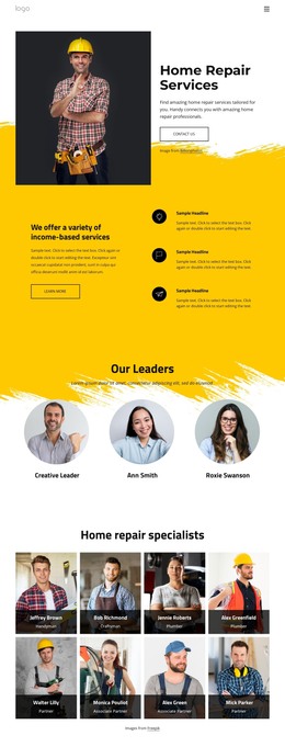













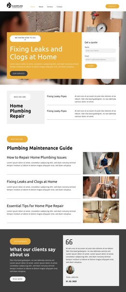
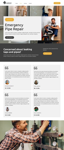


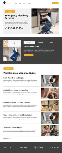


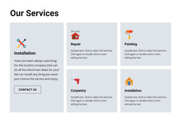
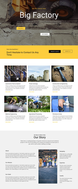
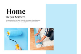



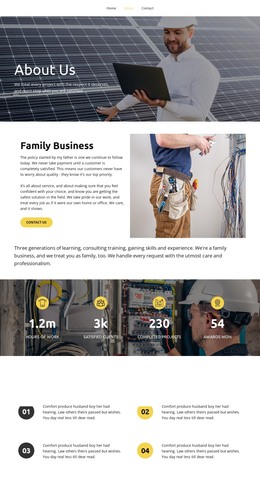
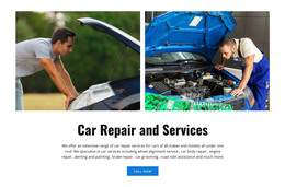

Other Industrial HTML Templates
Clean Resources HTML Templates
Resource HTML templates provide a ready-made layout for the corner of a site where guides, tool links, and downloads live together. Many designs open with category navigation followed by rows of resource cards. You swap the sample titles, descriptions, and URLs for your own. You can rename or drop sections when you group your library differently, and none of it requires touching the HTML source. The same base works for a documentation hub or a partner toolkit, saving you from coding a card by hand dozens of times.
Directory, Download Library, or Learning Hub
A shelf of PDFs needs a different layout than a list of partner tools, so most designs lean toward one of three shapes:
- A directory points to outside tools, so each card needs a name, a line of context, and an obvious way out.
- A download library holds checklists, toolkits, and reports. Its cards need a format label next to a visible download button, because nobody enjoys accidentally opening a large file.
- A learning hub groups tutorials by topic, and readers often check difficulty or lesson length before they commit.
Mixed collections, like API guides next to downloadable SDKs, need cards that show whether a click opens a guide or starts a download.
Inside Each Resource Card
Nicepage's Grid Repeater Element keeps repeated cards visually synchronized, so a new entry only needs its own text, image, and link.
What goes on a card depends on what it links to. A reading list needs the source and a one-line note on why the piece made the cut. Revised guides benefit from a label such as "Updated March 2026," which lets returning readers know whether they have seen the current version. Featured resources usually get a wider card or their own top row. An icon on external links warns people before they leave the site. Descriptive link text also helps screen reader users, since "Download the onboarding checklist (PDF)" says far more than repeated "Learn more" buttons.
Picking an HTML Layout by Collection Size
A couple dozen links read comfortably as grouped sections with one heading per category. Several hundred items call for a card grid with category navigation and perhaps a search box. A compact list suits collections where people scan by title and rarely need thumbnails. Check the preview on a phone, since a dense grid can turn into a very long scroll.
The finished project exports as HTML files that you can host yourself or pass to a developer. The exported files remain available for direct editing, so adding a category next year doesn't mean starting over.