
Pastel CSS Templates
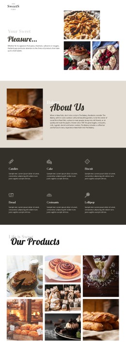
Pale colors need precise spacing and contrast when cards, images, buttons, and text rearrange across screens. Pastel CSS templates provide a styling base for responsive layouts while leaving room for targeted CSS adjustments.


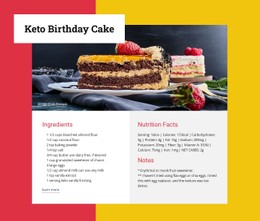

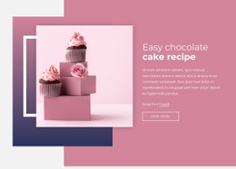


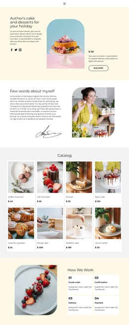



More Website & HTML Templates for Pastel









More CSS Templates from Art & Design Category


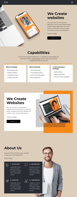



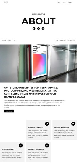




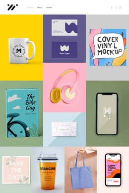
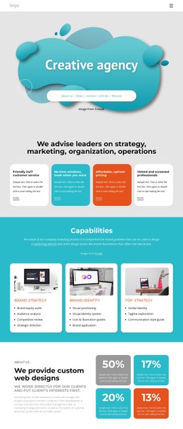
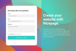

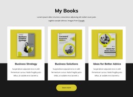

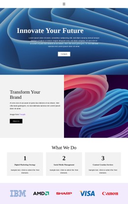















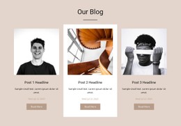
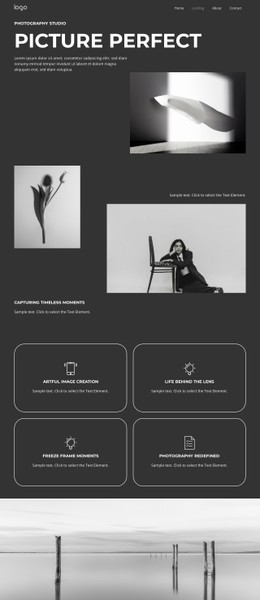









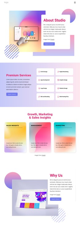
Other Art & Design CSS Templates
Pastel CSS Templates with Styles You Can Fine-Tune
A pastel CSS template keeps its soft look in variables, reusable classes, and a handful of selectors for interactive states. Change the value behind "mint" and every card, badge, and button that uses it updates at once. Hover and active states usually come predefined, so you tune values and skip writing rules from scratch.
Variables Behind Every Tint
Most pastel style sheets rest on a short set of custom properties like these:
- a pale base for backgrounds and cards;
- a secondary tint for alternating panels and small badges;
- a dark text value that stays readable on both;
- a stronger accent reserved for links and buttons.
Classes build on those values. Edit the card class once, and every card picks up the new border and shadow, and the button class works the same way. Because pastel colors sit close together in lightness, the dark text value carries most of the readability. Pale yellow needs extra care, since white text on a buttery background fails basic contrast checks.
Hover, Focus, and Disabled States
States cause the most trouble in pastel designs. A hover that moves a button from mint to a slightly deeper mint is easy to miss, and a lavender focus ring on a lilac card nearly vanishes. Careful templates signal a change with more than color, adding an outline, a firmer border, or a heavier label. Disabled buttons need the opposite treatment: a flatter fill and muted text that is still recognizable as a button. Form fields are the classic weak spot, because a pale input on a pale panel has no visible edge until its border, background, or outline gets darker.
Breakpoint Overrides With Custom Code
On narrow screens, the pastel style changes through media queries. Generous padding shrinks so a pale panel does not swallow a phone, the gap between cards tightens, and font sizes and line heights step down. If a script heading looks cramped on a phone, a breakpoint override can switch it to a plainer face. Nicepage Responsive Modes let you check each override device by device.
Nicepage also accepts Custom CSS Code for the whole site, a single page, or one element. A site-wide rule suits global fixes like a darker text value, and an element rule handles one-offs, such as a coral promo badge that has to stand out against the pastel around it. Pastel CSS templates differ most in how centrally their styles are managed. When the palette and spacing sit in shared variables, and states follow a few clear classes, you can restyle the whole design without restructuring any content.