
Vip CSS Templates
Premium experiences can look ordinary when every section receives the same visual weight. VIP CSS templates establish clearer distinctions between exclusive privileges, supporting information, imagery, and primary offer areas through deliberate styling rules.

More CSS Templates from Art & Design Category
-
-

-
-
-
-
-
-
-
-
-
-
-
-
-
-
-
-
-
-
-
Build Website with no CodingDownload
-
-
-
-
-
-
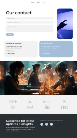
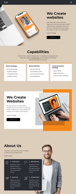













Other Art & Design CSS Templates
Customizable VIP CSS Templates
VIP CSS templates add a premium styling layer, with ready rules for color, typography, and components that carry an exclusive offer. Tier cards, VIP badges, and access buttons already have their own treatments, so changing a shared class updates all matching elements at once. That helps a lot when a client asks for a darker palette halfway through the project.
Reusable Classes Behind Tier Cards and Badges
Much of the premium feel comes from a few repeating components, and designs in this category often style them through shared classes:
- membership or pricing tiers, where the top level gets a heavier border or a soft shadow;
- small VIP badges and labels that mark exclusive seats, rooms, or perks;
- buttons with distinct hover and focus states, so the main access action stands apart from secondary links;
- booking and inquiry fields with consistent padding, borders, and error colors.
Because these rules live in classes, a new tier or badge copied from an existing one inherits the same look. Check hover states in the preview too, since a card that lifts slightly signals interactivity in the quiet way a premium brand needs.
Grid Behavior Across Screen Widths
Benefit grids and tier rows break most often on smaller screens because card text varies widely in length. Grid and Flexbox rules let columns wrap while cards keep equal heights. In Responsive Modes, it pays to watch a few details:
- how many tier cards stay side by side before the row wraps;
- whether padding and gaps shrink along with the type scale;
- whether the menu bar collapses cleanly and keeps the access button within reach.
The top tier card usually lists the most perks, so it tends to be the tallest and the first to expose weak height rules.
Palette Choices Beyond Gold Accents
Premium styling works fine without gold trim and black backgrounds. A pale palette with generous spacing and one confident accent can feel just as exclusive, and it often reads better on a phone in bright daylight. Theme Colors keep that palette consistent across cards, buttons, and badges. For the rare element that needs a local exception, such as a limited-edition badge with a shimmer effect, Custom CSS Code handles it at the element level.
Before committing to a design, paste your longest benefit list into a card and your longest tier name into a button, then preview both on narrow and wide screens. If spacing and alignment survive, the styles will carry your brand without constant fixes.