
Colorful HTML Templates
Bold portfolios, events, and creative brands need more than bright colors. These HTML templates pair expressive palettes with structured sections and responsive markup, giving visual ideas a practical foundation for real web pages.

More HTML Templates from Art & Design Category
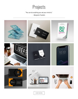



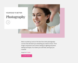
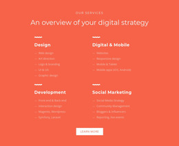

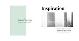







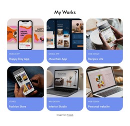
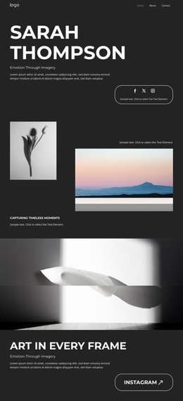
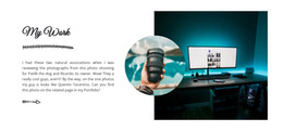



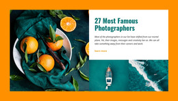


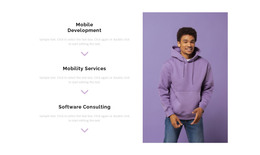
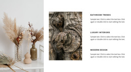

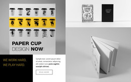




Other Art & Design HTML Templates
Creative Colorful HTML Templates
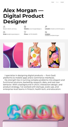
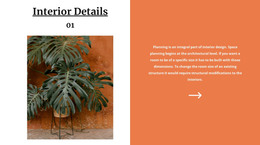
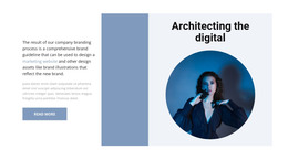
Creative agencies, event teams, and product brands often want a site that is loud on purpose. Colorful HTML templates deliver a ready-made look with a gradient hero, sections split into color blocks, and accent buttons that stand out. Underneath sit the working parts, such as project galleries, pricing tables, and event schedules, all built as editable blocks.
Where the Loudest Color Belongs
A colorful template still needs quiet sections. One or two dominant colors lead, a few accents back them up, and neutral space keeps long text readable. Each technique usually has a job:
- Gradients and bright photos carry the hero, where first impressions happen.
- Contrasting color blocks separate sections, replacing the dividers of a plain template.
- The strongest accent goes to call-to-action buttons, so the next step stands out.
- Neutral panels hold descriptions, schedules, and pricing, where people slow down to read.
Nicepage ties these roles to one palette through Theme Colors, and the Site Colors controls define that shared Color Scheme for buttons, backgrounds, and accents. Dropping your brand colors into it recolors the whole template and shows whether the demo palette was carrying the design. Yellow and lime sections need checking after the swap, since white text on them loses contrast fast.
Reusable Sections Beneath Bright Surfaces
In the markup, a colorful HTML template is a stack of separate sections, each with its own background. That separation lets a portfolio add projects to its gallery, an event site add a day to its schedule, or a launch landing page repeat a feature card in a new accent. A copied section keeps its headings, links, and color role, so the new part looks planned from the start. The markup stays editable, and you can export the finished template as HTML for your own hosting.
Vivid Designs at Phone Width
A phone forces a colorful design to simplify. Multi-column galleries stack, oversized decorative shapes shrink or drop out, and the navigation folds into a compact menu. The accent button needs the most attention, since it must stay easy to find once the surrounding gradients are cropped. Nicepage Responsive Modes let you adjust each device view separately wherever the automatic result falls short.
As you browse the category, you will see gradient-heavy agency designs, flat color-block portfolios, and illustrated event pages. The number of colors says little about which one fits. A better guide is whether the style suits your brand, whether your content fits the ready sections, and how the design looks on a phone in your palette.