
Tender Website Templates
A tender visual direction works best when soft colors, expressive imagery, collections, and editorial content stay connected across the entire site. Coordinated pages give galleries, brand stories, profiles, and contacts distinct roles without losing visual continuity.
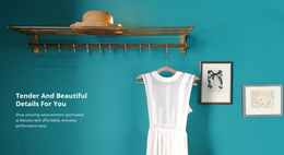
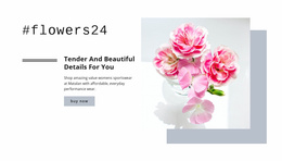
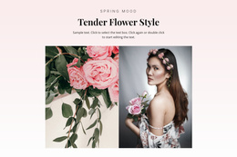
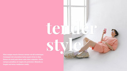
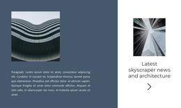
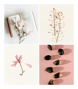
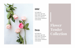
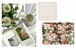
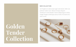
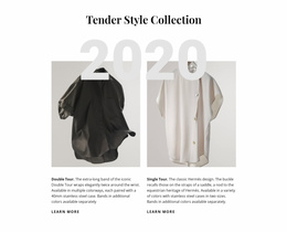

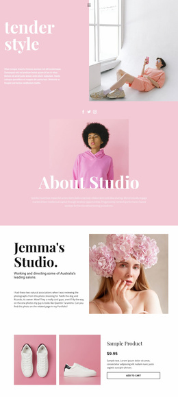
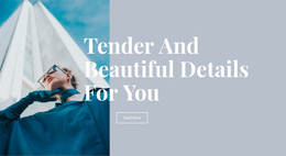


More Website Templates from Art & Design Category
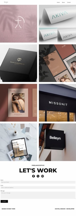
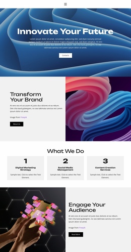
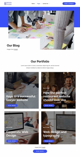




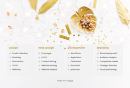
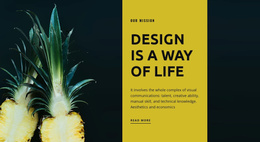


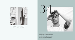
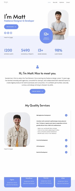



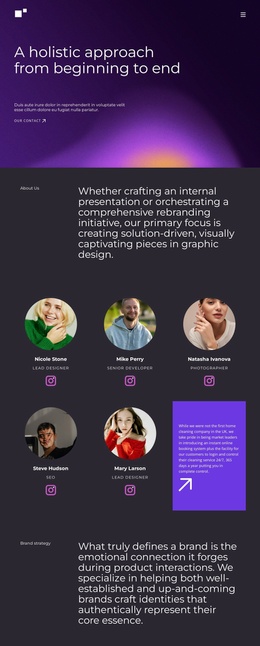

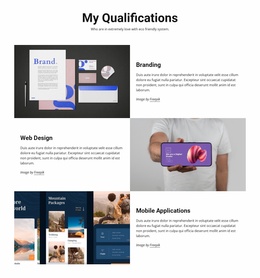
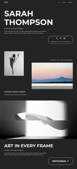

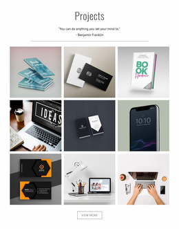
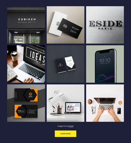





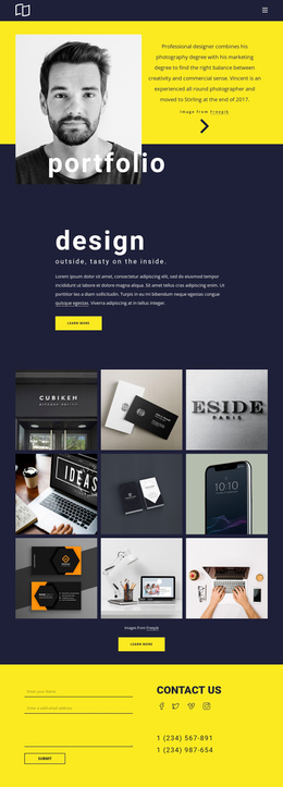
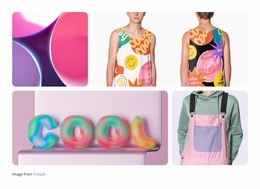
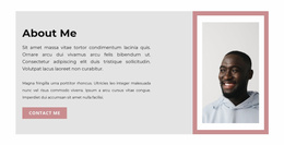
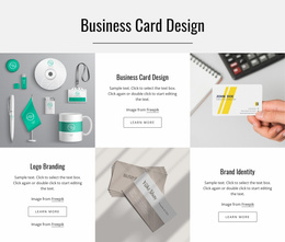
Other Art & Design Website Templates
Tender Website Templates for Multi-Page Visual Brands
One quiet page is easy to keep beautiful. Four of them, holding a collection grid, a long story, and a contact form, is where a soft look usually falls apart. A tender website template is chosen for that continuity, because the pages already agree on palette, spacing, and photo treatment, so a visitor moving from an airy homepage to a dense portfolio still recognizes the same brand.
Four Destinations, One Quiet System
A tender template usually carries four destinations, and each behaves differently inside the same palette:
- Home, which sets the tone with a few large pictures and leaves the catalog to the pages behind it.
- Collections, the densest part of the set, where controlled spacing keeps a grid from reading like a stock gallery.
- Stories or journal, where a narrow text column and a calm type scale let longer writing sit beside imagery.
- Contact, where the form stays easy to find without a loud button pulling attention off everything else.
The last one shifts with the business. A fashion label fields stockist and wholesale questions there, and a photographer fields dates, locations, and commission details.
What Keeps Density From Turning Loud
Consistency in this style is measured in small increments, such as the distance between two background tones or the spacing between a heading and the text beneath it. A photograph warmed up on one page and cooled down on the next is enough to break the spell, which is why one image treatment across the project matters more here than in a bolder design.
Theme Settings hold colors, fonts, and typography for the entire project, decided once and applied to pages added later. Identity usually slips on the contact page when a form block borrowed from another design shows up with heavy borders and a saturated button.
Opening the Site Like a Visitor Would
Nicepage Site Basics covers a project and its individual pages, and the Website Menu ties them together through the Header or Footer. Keep those labels short, since a menu competing with the photographs is the first thing that makes a soft design feel busy.
Before committing to a template, click through the demo in the order a visitor takes, from the homepage into the collections and out through the contact form. Two pages in, it becomes clear whether the design was built as one system or assembled from three attractive pages that happen to share a font.