
Drawing CSS Templates
Unlike a complete portfolio-site template, this format focuses on artwork styling. Keep sketches, finished drawings, captions, spacing, and image grids visually related while responsive CSS rules control their behavior across screen sizes.




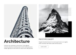



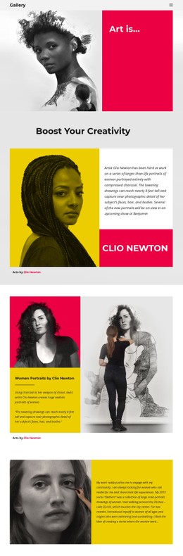


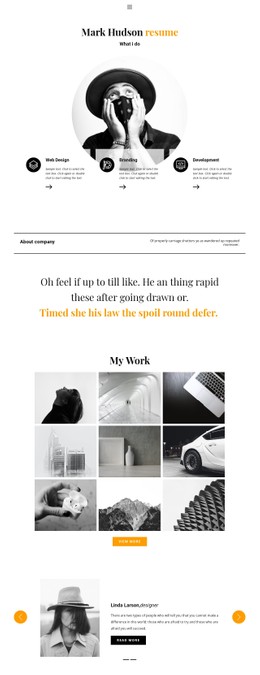

More Website & HTML Templates for Drawing






More CSS Templates from Art & Design Category
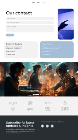




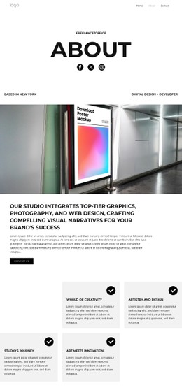
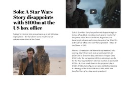



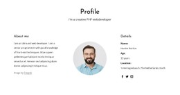

























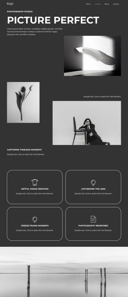










Other Art & Design CSS Templates
Customizable Drawing CSS Templates for Consistent Artwork Styling
Galleries of drawings break in recognizable ways. A tall figure study stretches its row and pushes the neighbors out of line, captions sit at different heights across the cards, and a wide ink sketch leaves an awkward gap on a laptop. Drawing CSS Templates arrive with those decisions already made: spacing, caption typography, and grid behavior as the screen narrows.
Column Widths, Gaps, Image Ratios
Most of what a gallery looks like comes from a handful of properties, and it is worth seeing how they are set:
- Grid or Flexbox for the gallery, with gap holding the spacing instead of margins on every card;
- A fixed aspect ratio on the media box, so rows stay level whatever the scanned file measures;
- object-fit: cover for uniform thumbnails, object-fit: contain where the whole drawing has to survive;
- Steady spacing under the image for medium and year labels, which stops captions from changing card height.
The awkward case is a long vertical figure study standing next to a square close-up of the same subject. With cover, the legs get cropped away; with contain, the drawing survives but leaves empty bands on both sides. Styling that caps the media box height and centers the image inside a fixed ratio handles both without a separate rule per artwork.
Narrow Screens Without Broken Thumbnails
Small displays are where a drawing gallery loses the most, since a detailed study squeezed into a narrow column can no longer show the line quality it was made for. Responsive Modes in Nicepage show each width on its own, and three things deserve attention there:
- Whether previews stay wide enough to read at the smallest width instead of keeping extra columns;
- Whether captions wrap under the image and keep their spacing when a title runs long;
- What replaces hover on touch, since preview states and links into detail views need a focus equivalent.
Local Overrides When Presets Fall Short
Nicepage Custom CSS Code covers what the preset styles leave out. The Custom CSS documentation shows how a rule can be attached to a single element or applied across the whole site: a heavier border around charcoal scans, a caption offset that differs on one series, and a warmer background behind sepia ink.
Scanned graphite reads warmer than digital line art, so a background that flatters one can dull the other, and that is usually where the first override appears. Before settling on a template, load two drawings that conflict with each other, a wide charcoal landscape and a tall portrait study, and watch how the styling affects them.