Whale watching center CSS Template
Edit Template Offline
2. Create new page and search for id 12805
Edit Template Online
Create Awesome Websites


Free Nicepage Builder
Keywords
Slate-blue Hero and Photographic Editorial Styling
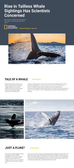
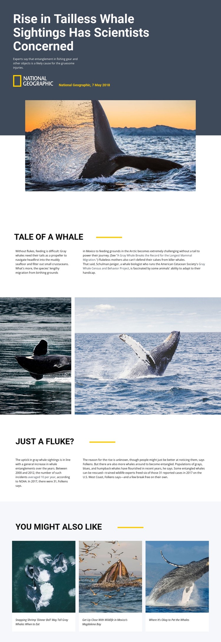
The dark slate-blue hero establishes the strongest visual rule on the page: bold white typography sits beside warm whale photography, while a thin yellow accent line adds a restrained point of contrast. That treatment gives the headline and source information clear priority without requiring a crowded interface. The same balance continues below through compact sans-serif text, wide white space, and pale backgrounds for the related-story cards.
The split sections use spacing and alignment to distinguish a narrow introductory column from a wider explanatory column. This styling choice supports the article’s shift from the whale’s feeding and migration behavior to entanglement statistics and possible causes. The wide photographic interlude then changes the visual density before the reader reaches the final three-card grid. Repeated image-and-caption units make the related stories feel connected without competing with the article body.
As a CSS-oriented design, the template is defined by these repeatable appearance rules rather than by one isolated image. Color contrast, text width, image scale, card surfaces, and accent placement can be adjusted while preserving the editorial sequence. The result is a visual system suited to science or conservation reporting where photography carries emotional weight and typography must keep complex information readable.
Customize with Nicepage
Open this ready-made template in the CSS Template Builder and customize it visually in the Nicepage editor. Replace demo content, edit page sections, and adapt the design to your project without rebuilding the template from scratch.
Customize This Template With CSS
Control Page-Specific Styling
Customize the visual appearance of this ready-made template directly in the Nicepage editor. Adjust typography, spacing, backgrounds, borders, colors, positioning, and other style properties using visual controls while keeping the page layout easy to manage without writing CSS manually.
Add Custom CSS When Needed
For styling requirements that go beyond the standard editor options, use Custom CSS to add targeted rules. CSS can be applied to individual elements, specific pages, or the entire website depending on the scope of the customization, while CSS classes can be used to connect custom rules with selected elements.
Export Minimal CSS Per Page
For projects where CSS size and page performance matter, Nicepage can export minimal CSS for each page. Instead of relying on one larger common stylesheet, each page can use a separate CSS file containing only the style rules required for that particular page. According to Nicepage documentation, these page-specific CSS files can be about ten times more compact, helping reduce unnecessary CSS and improve page loading performance.
This workflow combines visual styling with optional custom CSS and optimized page-specific CSS output, giving you additional control when a project requires it without making manual CSS editing the primary way to customize the template.