
Woodworking CSS Templates
Responsive layout rules help woodworking portfolios keep large project photos, specifications, and material details readable on every screen. Use CSS controls for gallery columns, spacing, typography, and targeted visual exceptions without turning the page into a code-first rebuild.
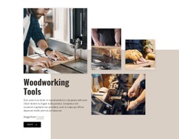
More CSS Templates from Industrial Category
-

-

-
-
-
-
-
-
-
-
-
-
-
-
-
-
-
-
-
-
-
-
-
-
-
-
-
-
-
-
-
-
-
-
-
-
Build Website with no CodingDownload
-
-
-
-
-
-
-

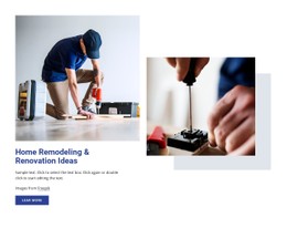
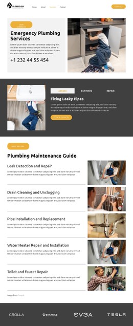

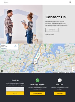

































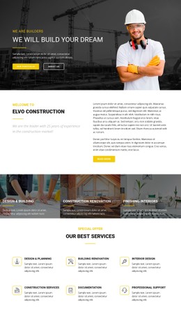


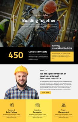


Other Industrial CSS Templates
Customizable Woodworking CSS Templates for Precise Visual Control
Spacing, typography, and image proportions determine how easily a visitor can inspect a piece of custom furniture on screen. Woodworking CSS templates provide presentation-focused styling for an existing page structure, giving you control over project galleries, specifications, and responsive behavior without making the markup itself the main concern.
Style Project Galleries Around the Work Itself
Large photographs carry most of the visual weight on a woodworking site. CSS control helps balance them with captions, specifications, and material notes so no single element overwhelms the composition. A cabinetmaker can hold kitchen installations in an even grid, while a furniture studio may prefer wider images for one-off commissions.
Grid and Flexbox layouts matter most when project cards contain images of different proportions. A few style rules do most of the work here:
- Column count and gaps decide how many finished pieces sit side by side and how much air separates them.
- Fixed aspect ratios stop a tall wardrobe photograph from towering over a wide dining table in the same row.
- Hover and focus states give a quiet cue that a project card opens a larger view of the piece.
- Caption alignment keeps the wood species and the dimensions attached to the photograph they describe.
Refine Typography, Spacing, and Material Details
Woodworking pages mix photography with practical detail. Timber species, finish descriptions, and hardware notes need type sizes and spacing that make them easy to scan. CSS gives designers control over heading scale, paragraph width, and the breathing room between a photograph and the text that explains it.
Heading scale can separate a project title from its material notes, controlled line length keeps workshop explanations readable on wide screens, and consistent row spacing turns dimensions and finishes into a clean specification block. These are presentation decisions rather than changes to the underlying content structure.
That refinement helps when project types require related yet slightly different presentations. A restoration case study may include denser explanatory text, while a page about a dining table can allow more room for close-up photography.
Adapt Styles for Different Screen Sizes
On smaller screens, a three-column furniture gallery may become a single column, while image-and-text project sections can stack without losing captions or specifications. Generous desktop spacing can be tightened on a phone as long as the craftsmanship remains visible and the specifications remain readable.
Nicepage also supports custom CSS where extra rules are required at the level of a single element, a page, or the whole site. Use a woodworking CSS template when the page structure is already suitable, and the main task is to control how that content looks, aligns, and responds across screen sizes. Test it on your own project photographs and specifications before you commit to it, because that is where flexible grids and controlled spacing either hold up or fall apart.