
Visit Templates
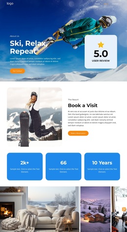
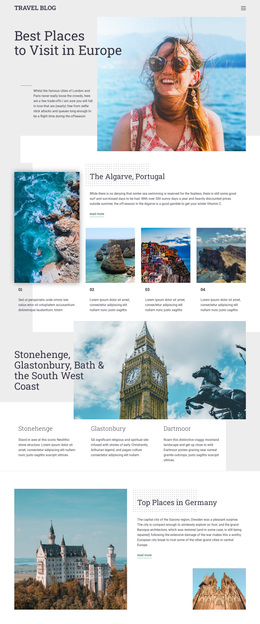
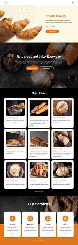
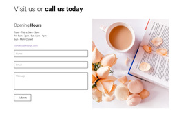
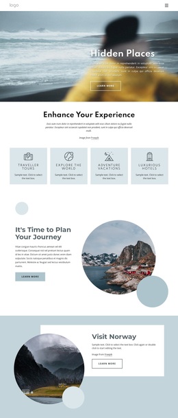
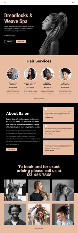
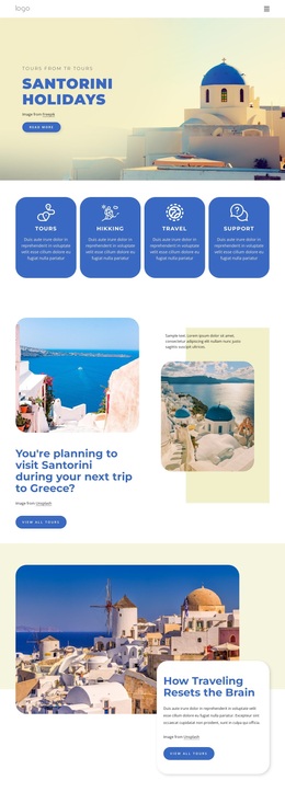
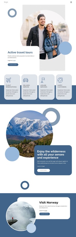
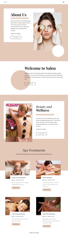
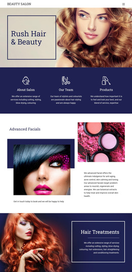
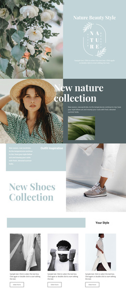
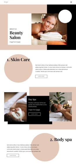
From ceramics open houses to farm-shop tastings, each invitation has its own mood. These visit templates offer different image-led, activity-first, and compact welcome layouts to compare before choosing a design.
-
-

-
-
-
-
-
-
-
-
-
-
-
Free Website Builder SoftwareDownload
-
-
-
-








More Website & HTML Templates for Visit


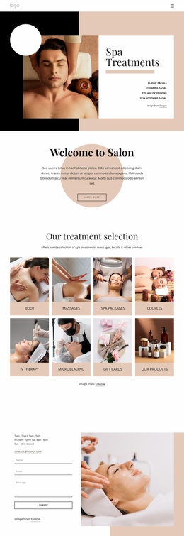
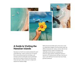
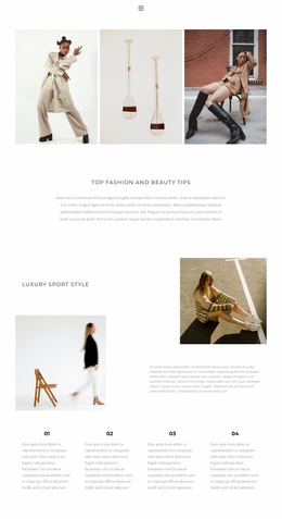
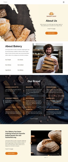
More Templates from Travel & Hotels Category
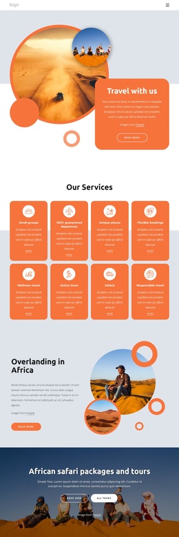
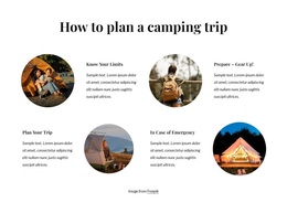

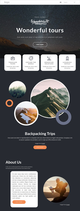
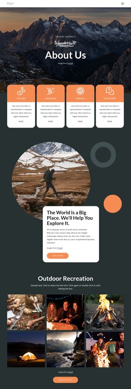


Other Travel & Hotels Templates
Innovative Visit Templates
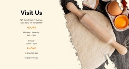
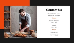
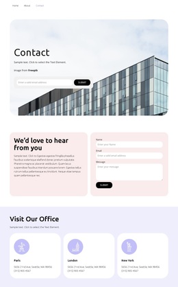
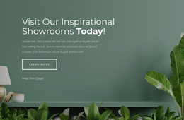
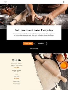
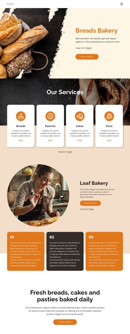
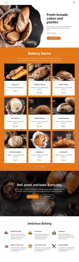
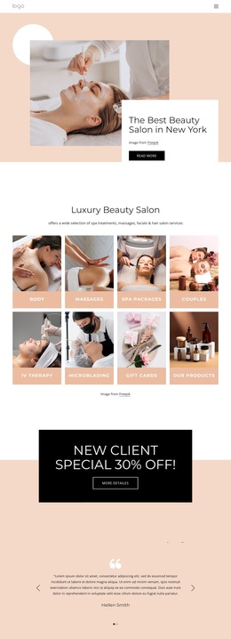
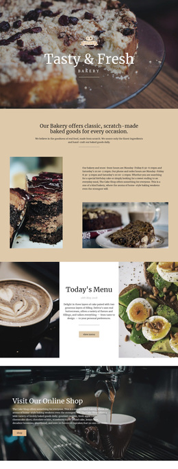
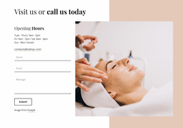
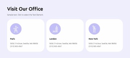
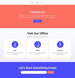
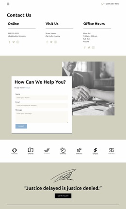
Whether you pick a ready-made page design or a single block, visit templates share one goal: getting people to show up in person. Besides Visit The Bakery, the catalog has Visit Our Office and Visit Our Shelter, which take the idea well beyond shops. What sets them apart is space for visit details like opening hours or an open house date. A shelter planning an adoption weekend has to show the yard and explain which gate to use. A bakery has an easier hook, since the pastry case does most of the inviting.
How Well Each Option Invites People In
Nicepage's Add Pages, Blocks & Elements documentation describes how Page Designs and Block Designs can be searched and filtered by subject in the Add Panel. Once you have two or three favorites, compare them on a few points:
- How quickly the opening section shows what kind of place this is
- Whether the headline tells people why they should stop by
- How fast someone can find the address or a phone number
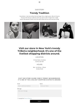
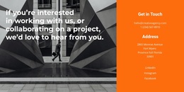
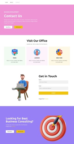
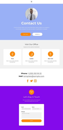
A firm using Visit Our Office mostly wants clients to book a meeting, so the contact area must be easy to find. With Visit The Bakery, the pastries can lead as long as the address stays one tap away. Be wary of layouts built around one huge photo and a single line of text. They feel cramped once a shelter has to fit an address, an event date, and visiting rules into one block. A composition with more space for text handles that better.
Fitting Your Shop into the Layout
Before deciding, try your own material in the two strongest candidates. For a small shop, that means three edits:
- Replace the demo photo with a real shot of your entrance, so people know what to look for
- Rewrite the headline as an invitation that names the shop
- Fill the contact area with your current address and phone number
Each edit can shift the composition. A short headline like "Visit The Bakery" fits neatly. "Visit Rosa's Neighborhood Bread and Pastry Shop" can wrap into a clumsy block and push the contact details out of view. If the address has nowhere good to go, add a contact block and check that its fonts and spacing match the rest of the design.
When Two Designs Tie
If both still look equally good, open them on a phone. Check that the crop still shows the entrance and that the invitation reads in a line or two. Then show both versions to someone who has never been to the place. Whichever one gets them asking for directions first has done its job.