
Motivation CSS Templates
Inspirational pages need visual contrast between bold ideas, personal stories, proof, and program details. CSS templates let you control typography, spacing, cards, and responsive layouts without making HTML structure the main task.





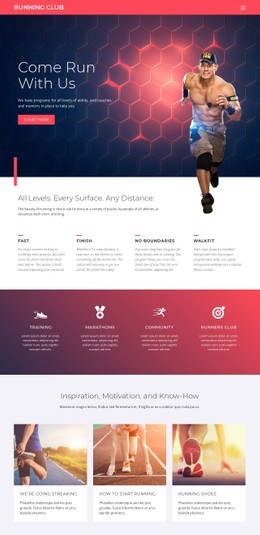

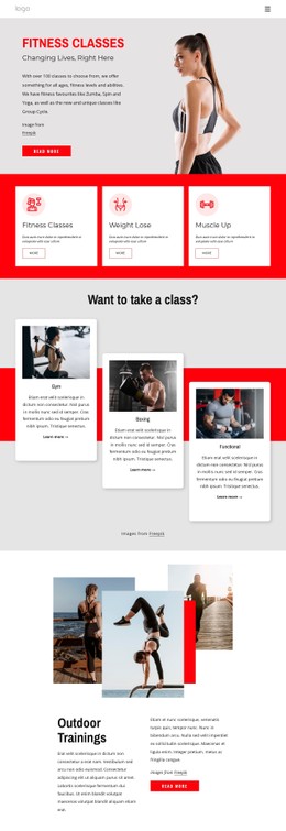
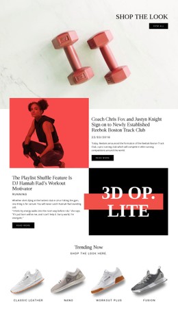
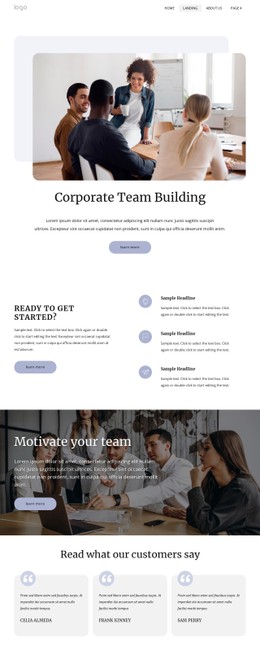

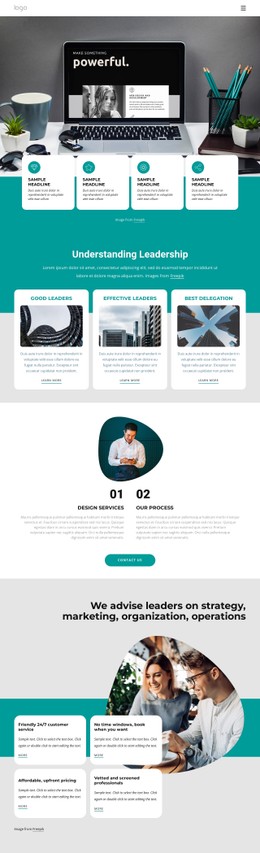
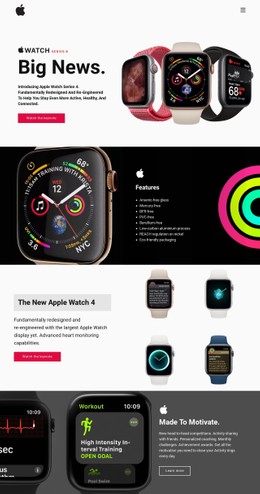
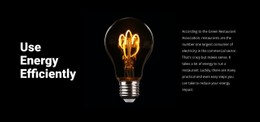
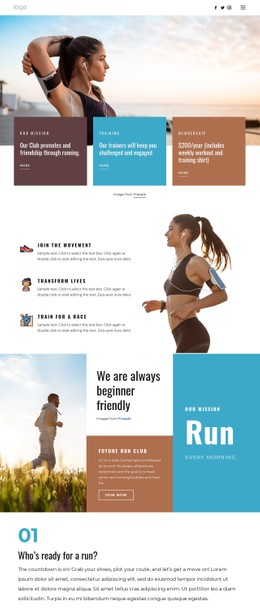
More Website & HTML Templates for Motivation
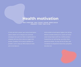
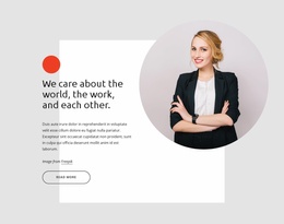
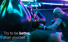


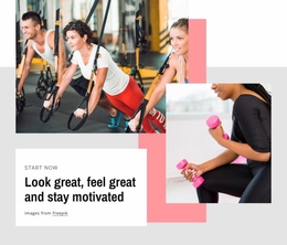

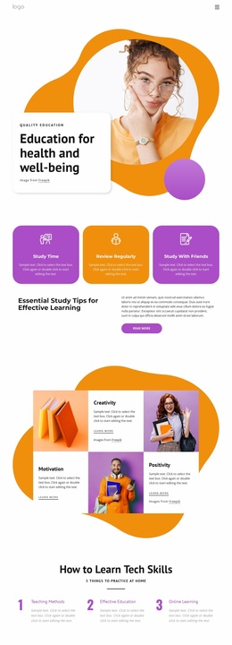
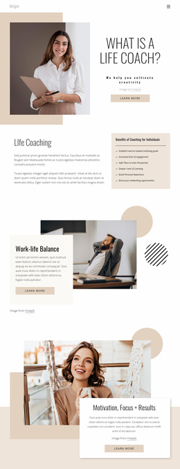
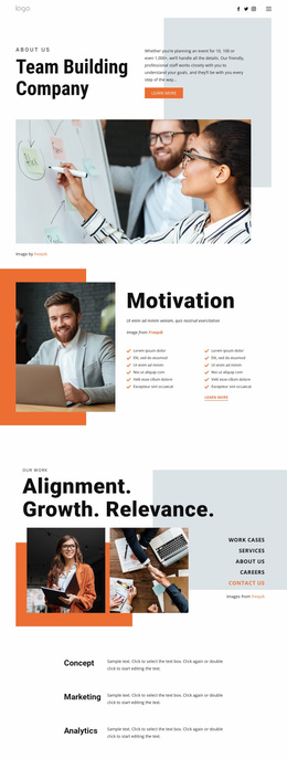
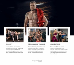
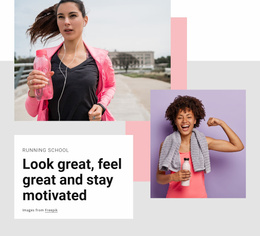
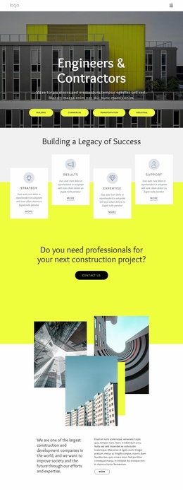
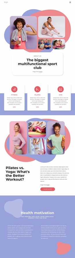


More CSS Templates from Sports Category
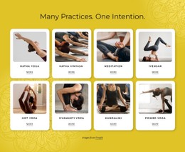
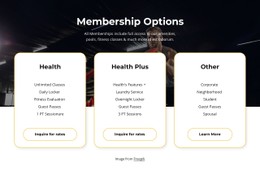


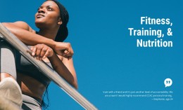
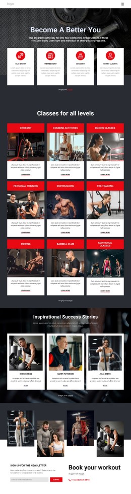
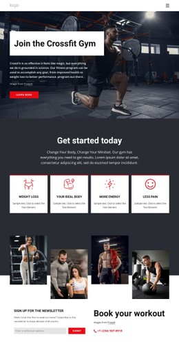
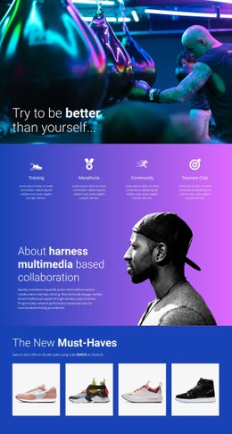
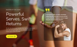
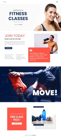
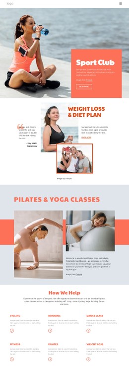
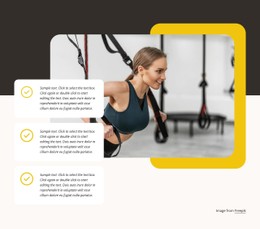

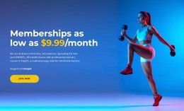
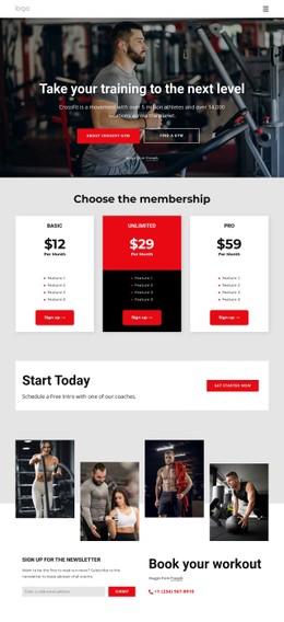
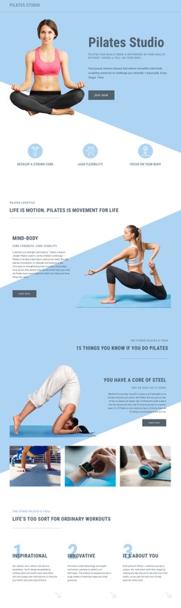
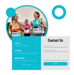
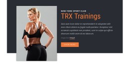
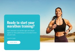
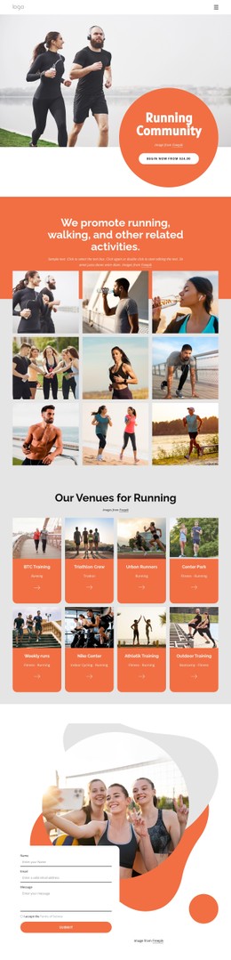
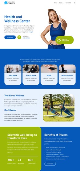

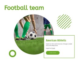
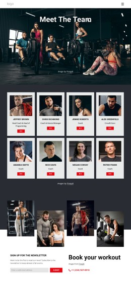
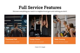


Other Sports CSS Templates
Customizable Motivation CSS Templates for Coaching and Speaker Sites
Typography, spacing, and color decide what a visitor notices first on a motivational page, and in this niche, the competition for attention is unusually fierce. A keynote line, a client quote, and a program price all want to be the loudest element on the screen. The template you choose is what settles that argument before anyone reads a full sentence.
Emphasis Levels for Inspiration and Proof
Start by checking how firmly a design keeps a few things apart:
- a headline statement and the paragraph that explains it
- a client testimonial and the coach's own promise
- a program option and the neighboring blocks on the same screen
When those pairs look similar in weight, the result feels busy no matter what you write into it. A workable type scale gives a short statement room to breathe, keeps longer text comfortable to read, and still leaves a smaller size for captions and credentials. Scale alone will not do the job either, because two blocks of the same size can still be told apart by spacing, background, or a subtle accent.
Card Styles Worth Comparing
Most visual work in this niche happens within cards. Testimonials, program options,, and speaker credentials tend to share a shape while serving very different purposes, and a strong template marks that difference through contrast, borders,, and background weight rather than flattening everything into one neutral box.
Grid and Flexbox matter here for flexibility and nothing more. They decide how gracefully a row of three program cards becomes a row of two once a longer title arrives, which is the kind of thing you discover after launch. Nicepage supports Custom CSS at the element, page, and site levels, so you can adjust a single testimonial panel without rewriting a shared rule.
Narrow Screens Keep Their Priorities
At phone width, the layout flattens, and the emphasis has to survive the change. Decorative quotation marks are usually the first detail to misbehave; a glyph that framed a quote nicely on a laptop can end up competing with the sentence it was meant to introduce. Oversized headline text has the same habit, and so do portraits that were cropped for a wide column.
Scroll the whole demo at phone width before deciding anything. A motivation CSS template is worth taking when inspiration, proof, and the offer still carry three distinct weights on a narrow screen, and when a single component can be restyled without the rest of the design shifting around it.