
Challenges Website Templates
Long-running challenges often need separate space for rules, schedules, resources, updates, and results. A connected website template keeps those pages organized under a shared navigation instead of forcing every participant's needs into a single campaign page.
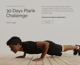
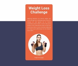
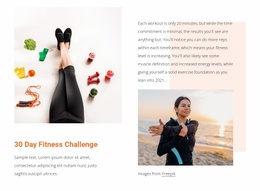
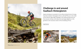










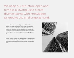

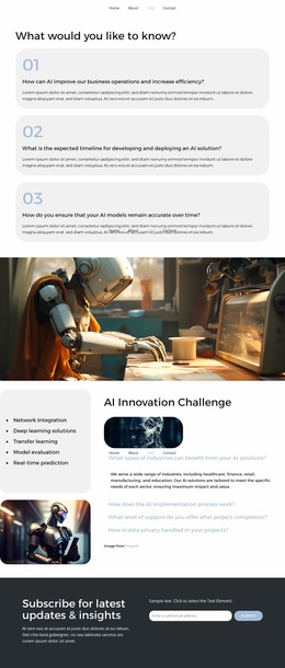


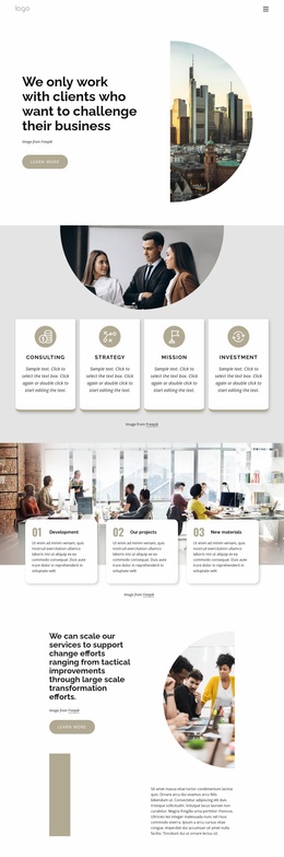
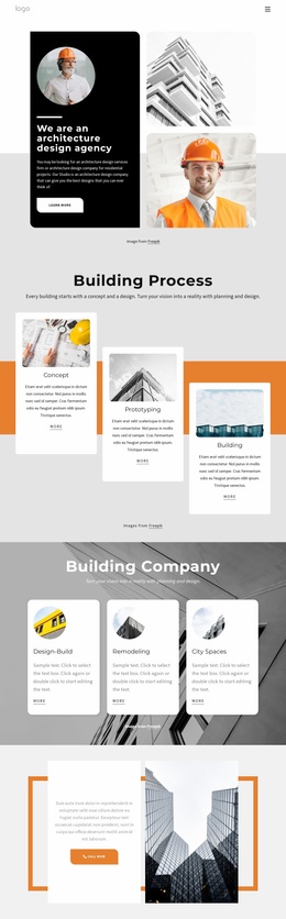
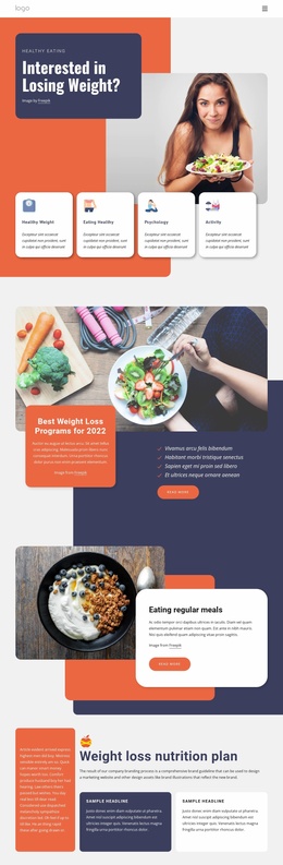

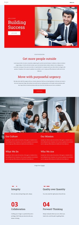


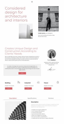


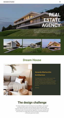











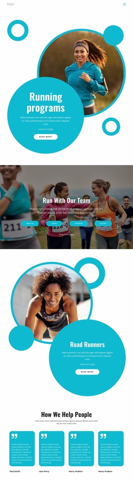
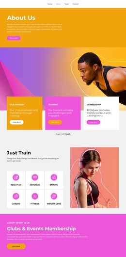
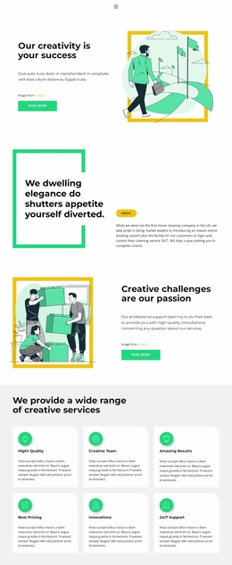





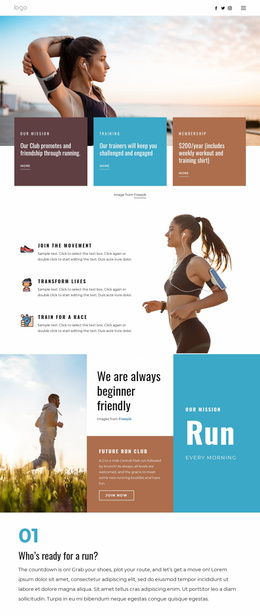











More Website Templates from Landing Page Category

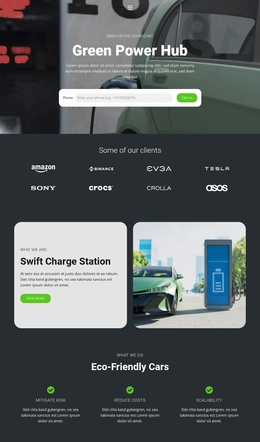

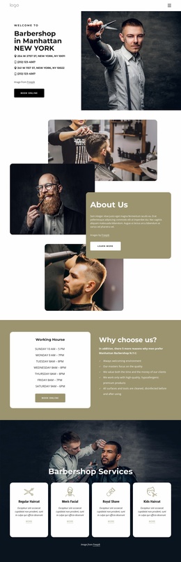
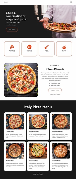


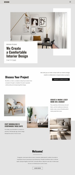

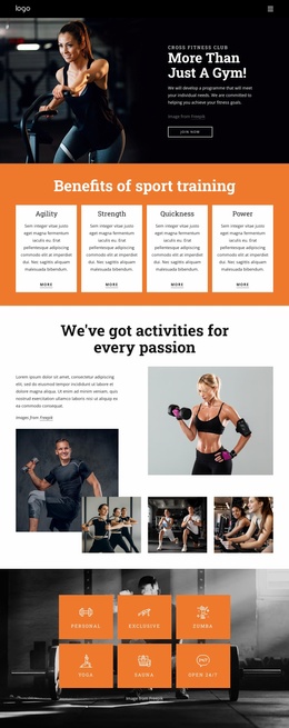

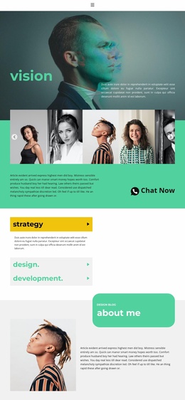

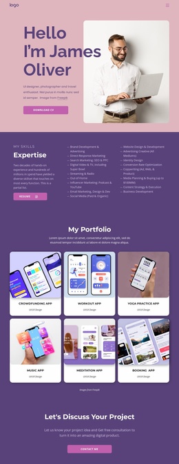

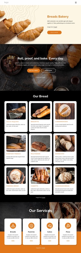
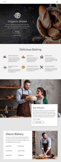

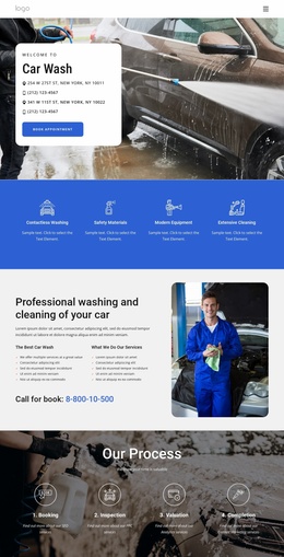
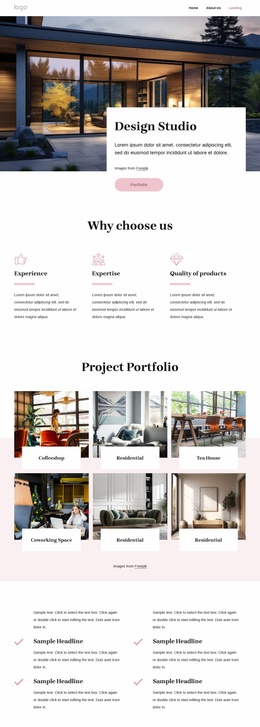

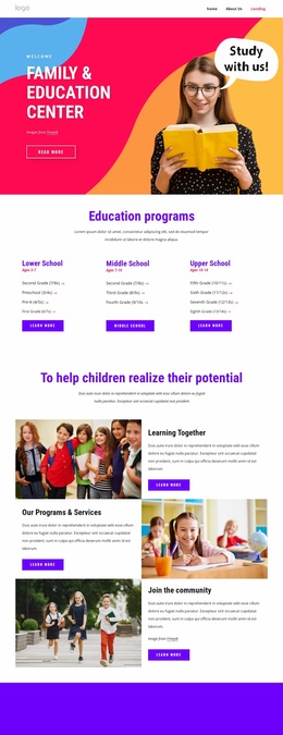
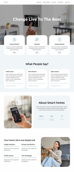
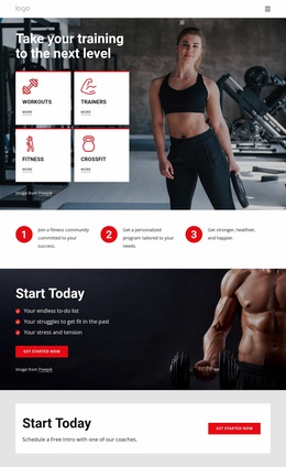
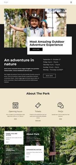

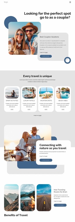



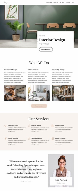
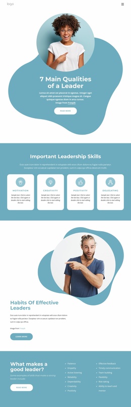

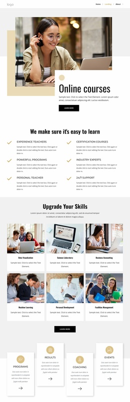
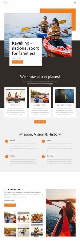

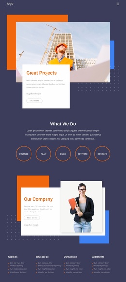

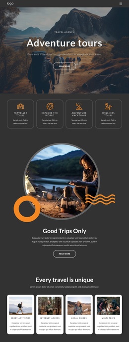
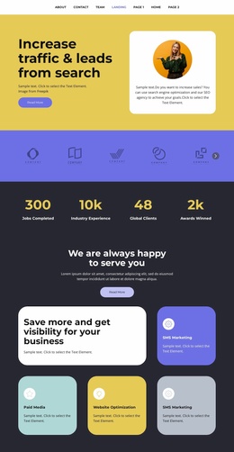


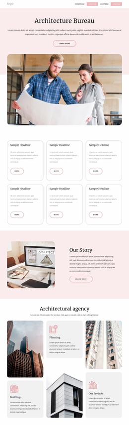


Other Landing Page Website Templates
Ready-to-Use Challenge Website Templates for Programs That Keep Going
A challenge that comes back every season quickly outgrows a single screen. Challenge website templates provide finished visual direction for the whole program: an opening view for the current edition, inner sections for rules and timing, and a place for results to live once the challenge ends. The design work is already done, so the effort after download goes into replacing demo text and images with material from your own challenge.
What Comes Ready to Customize
Before comparing designs, it helps to know which parts of a template you will actually touch:
- The visual direction, meaning colors, typography, and section spacing, which Theme Settings applies across the whole site at once;
- The demo content, swapped for your own photos, dates, and descriptions;
- How much is included in the set, since some templates cover a full site while others amount to one screen or a few blocks?
Nicepage keeps these site-wide controls together in its Site Basics guide, and they are worth setting first. Global colors and fonts spare you from editing every section by hand later, which is the part of customization that quietly eats up an evening.
Sections a Long Program Needs
A recurring challenge asks more of a site than a one-day event does, and several sections earn their keep straight away:
- Registration, open only while entries are being accepted;
- A schedule of rounds, workshops and judging dates that participants return to check;
- Standings and results, with room for an archive of previous editions;
- Participant resources such as briefs, reference materials, and preparation guides.
Standings are the section people open on their own, sometimes several times a week, which is reason enough to give them a permanent home instead of burying the numbers in an announcement feed.
Same Design Across Every Screen
A challenge site gets opened on a phone during a commute as readily as on a laptop at a desk, so it is worth walking through the demo on a narrow screen before you settle on it. Schedules and standings are where ready designs tend to strain, since tables and long lists have the least room to breathe.
Growth is the other thing to weigh. A design that already carries several inner views and a shared header will absorb a second challenge, a sponsor block or an archive of finished seasons, with far less rework than one built around a single dense screen. A one-time summer competition can stay small, while a program that returns every year is better served by a template with clear places to add the third and fourth seasons.