
Market CSS Templates
Product-heavy market pages can become crowded when cards, prices, seller details, and promotions compete for space. CSS-focused layouts keep these elements visually consistent while allowing targeted responsive adjustments for different screens.








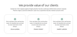







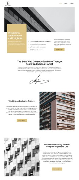





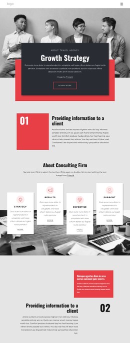


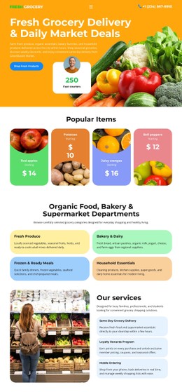

More Website & HTML Templates for Market



























More CSS Templates from Sale Category













































Other Sale CSS Templates
Adjustable Market CSS Templates
A dense product grid is where store pages usually fall apart, with names, prices, and sale badges fighting for the same corner of a card. A market CSS template arrives with those decisions already made: how tall a card stands, how much room a price gets, and how a discount label announces itself without shouting over everything else.
Visual Rules That Repeat Across Product Cards
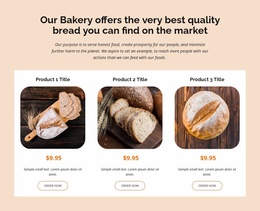
The value of a ready styling system shows up on the twentieth card. Card height, image proportion, and the space around a title are set once and applied everywhere, so a product with a two-word name and one with a long one still line up in the same row.
A market styling system usually settles a few things for you:
- image proportions, so photos of different shapes fill the same frame;
- price hierarchy, where a sale price leads and the old one steps back;
- spacing that keeps rows even across a full catalog page.
Badges, Buttons, Category Labels
Promotional information has to read as promotional. A sale badge, a new arrival marker, and a featured highlight each get their own treatment, which keeps them from looking like part of the product name. Buttons follow the same logic, with one size across the catalog, a visible hover state, and enough contrast that a quiet card gets the same attention as a loud one.
Comparing two market CSS templates comes down to a few visual questions:
- how dense the catalog looks when every card carries an image and a price;
- whether category labels are quiet text or colored elements you can scan;
- how much room promotions take before they crowd the products.
Prices Stay Readable on Phones
A wide catalog row breaks down on a narrow screen, and the price usually suffers first. A good design keeps the product name, price, and action visible after the cards stack, and lets secondary details fall away. Nicepage Responsive Modes run from large screens down to vertical phones, where a candidate gets checked before you commit.
Where ready rules fall short, Custom CSS handles the single element that needs different treatment, a badge sitting too close to a corner or a category block that reads thin next to a full row.
A market CSS template gives a catalog one visual language: cards that align despite different titles, prices that stay easy to scan, and offers that stand apart on purpose. The fine-tuning comes after, on the few components that ask for it.