
Promo CSS Templates
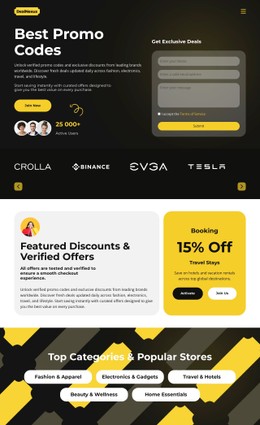
Promotional campaigns need clear visual priority for offers, prices, coupons, and calls to action. These CSS-focused layouts give those elements responsive structure and controlled styling without turning campaign updates into scattered overrides.













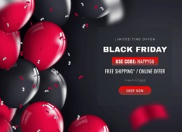









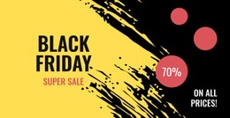


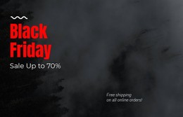
































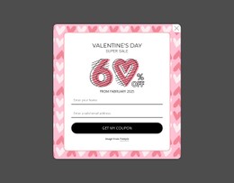





















Other Sale CSS Templates
Responsive Promo CSS Templates for Campaign Styling
Promo pages pick up one-off styles fast. A sale badge gets a local fix, the next offer card gets its own padding, and by the third campaign no two prices or buttons match. Promo CSS templates start with a single set of visual rules for badges, prices, and calls to action, and every new offer inherits them.
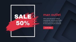
Badges, Prices, and Button States
Reusable classes in a promo template usually fall into these groups:
- Price styles for regular, sale, and crossed-out amounts, where size and color rank them so the discount registers first.
- Button states beyond hover for the main call to action, including focus for keyboard users and a disabled look for sold-out offers.
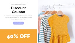
- Coupon styles that frame the code with a dashed border, set conditions in smaller type, and show a pressed state on the copy button.
In practice, they become named patterns, like a sale badge class that pins the label to the same corner of every product photo. Seasonal campaigns can still change their visual identity without rewriting every element individually. Nicepage's Site Colors documentation explains how Theme Colors and color presets can update the palette across a project, so a winter sale can switch accent and badge colors while the underlying promo structure stays consistent.
The catch is that modifiers are easy to leave behind. A winter class that outlives the winter sale starts fighting next spring's colors, and each fix needs a more specific selector than the last.
Grid Reflow Versus Plain Stacking
Previewing a promo layout in Nicepage Responsive Modes, from large screens to vertical phones, exposes two different strategies. Plain stacking drops every card into a single column at the first breakpoint, forcing tablet visitors to scroll past oversized product photos. Grid reflow is more gradual. A row of four offer cards might become two on a tablet and one on a phone, with the gap and headline size shrinking at each breakpoint. Inside each card, Flexbox keeps the badge, price, and button aligned. On phones, the button spans the full width, so the price and the action remain dominant.
Restraint Beats Another Starburst
Discount styling tends to escalate. Once one card gets a red badge, a pulsing timer, and a starburst, the rest look weaker until they match, and soon nothing stands out. The better promo templates hold back, reserving one accent color for savings and using a single badge style throughout. Brand colors and fonts stay global, and campaign rules sit on top, with one step to switch them off.
A good promo CSS template takes a new product, a deeper discount, and a different campaign without growing another layer of exceptions. If swapping the offer means writing fresh overrides, the styles were built for a single sale.