
Cart CSS Templates
Shopping carts combine product details, prices, quantities, totals, and checkout controls in a compact interface. CSS templates provide the styling layer needed to manage spacing, alignment, responsive behavior, and visual emphasis without changing the cart’s core content.





More CSS Templates from Sale Category
-

-

-
-
-
-
-
-
-
-
-
-
-
-
-
-
-
-
-
-
-
-
-
-
-
-
-
-
-
-
-
-
-
-
-
-
-
-
-
Build Website with no CodingDownload
-
-
-
-
-
-
-
-




















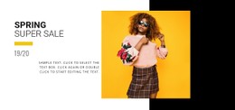


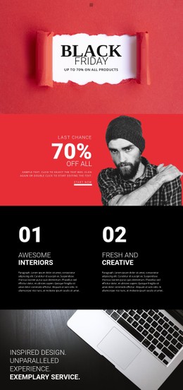










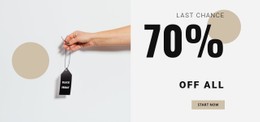



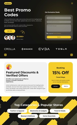







Other Sale CSS Templates
Customizable Cart CSS Templates for Store Interfaces
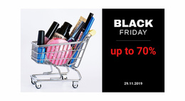
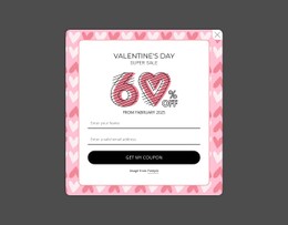
Two stores can sell the same three products and still show them in carts that look nothing alike. Most people browsing cart CSS templates want a finished look, with a stylesheet they can tune later. Each template decides how line items and prices appear and which figure draws the eye first. Many designs use sale banners and coupon blocks built around a cart graphic.
Compact Rows or Roomy Cards
Templates that show a full order differ in a few visible ways:
- Compact rows with small thumbnails suit stores where people buy many things at once, like stationery or phone accessories.
- Card-style items give each product a big photo and generous padding, which fits a furniture shop.
- The summary may sit in a side column or close the list as a bold block.
- Thin dividers, soft shadows, or tinted backgrounds set apart items.
Details Shoppers Touch Before Paying
Inside each row, the thumbnail and title lead, with the variant in smaller gray type below. Quantity, price, and the remove link usually line up on the right.
A stepper with plus and minus buttons feels natural on touch screens, while a number field or a small dropdown saves room. A careful template dims the minus button when the quantity is 1, so nobody taps it expecting a change.
In the summary, subtotal and discount lines sit in lighter type, as does a shipping estimate when there is one. The total gets the heaviest weight on the screen. The checkout button needs visible hover and focus states, and an update button can stay grayed out until something changes.
When a template's settings stop short of a detail, Nicepage's Custom CSS controls accept extra rules for one element or the whole site. That covers fixes like a tighter stepper or a heavier subtotal.
Where Prices Go on Phones
On a narrow screen, the desktop cart row has to break apart. Some templates stack the thumbnail and title above the stepper. Others pin the price to the right edge, keeping the numbers in one column. Grid and Flexbox handle this well, since a row can reflow at a breakpoint and keep prices aligned.
A name like "Merino Crew Sweater, Charcoal, Size XL" shows the difference fastest because, in a weak template, it wraps and pushes the price out of line.
A good cart CSS template leaves little to fix. Your eye lands on the total first, and the buttons look like buttons. Checkout also stays within reach on a phone, and after that, colors and fonts are easy.