
Vehicle HTML Templates
Dealerships and auto service businesses regularly change vehicles, promotions, and customer information. A WordPress theme provides a stable automotive identity, while the CMS workflow supports ongoing page and content updates.



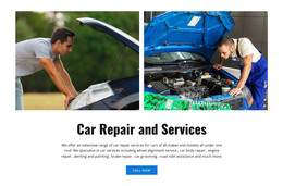
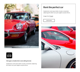
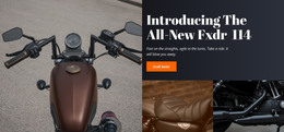


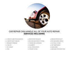
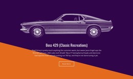
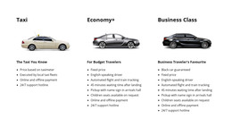
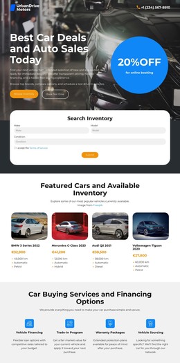





















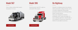



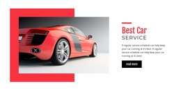

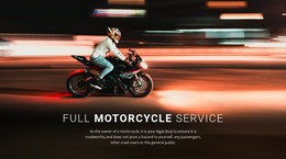
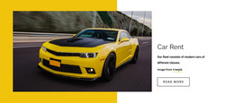

















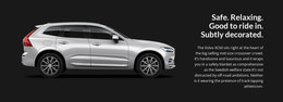


Other Cars & Transportation HTML Templates
Responsive Vehicle HTML Templates
A vehicle HTML template hands you model pages that are already designed and coded. With one, a dealer, a rental company, or a repair shop can get a site online without building every section by hand. The layout work is done so that you can focus on photos, prices, and specs. Because everything arrives as front-end files, you can edit the code directly and upload the finished pages to any host, with no CMS in between.
What Goes Into a Model Page
A typical vehicle page is assembled from a few recurring blocks:
- a model summary with the name, a price or daily rate, and one strong photo
- specifications for the engine, transmission, and dimensions
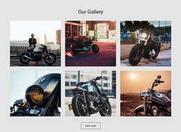
- an exterior and interior gallery
- a contact block that ends in a test drive request, a booking, or a service appointment
Which of these matter depends on the business model. A dealer page leans on stock details and a quick inquiry form. A rental design may trade detailed specs for availability and pickup points. A repair shop, in turn, cares more about its service list and opening hours than about a gallery. Trim levels have their own equipment lists, and electric models trade fuel economy for range and charging time. Once one model page looks right, the same blocks can carry the next vehicle with new photos and figures, so nobody rebuilds a page from scratch.
Spec Tables Meet Small Screens
Phones are where vehicle pages most often run into trouble. A spec table that looks tidy on a laptop should still read on a phone without sideways scrolling. Gallery photos need their model names and captions right beside them, and long equipment lists read better in short groups. For a breakdown or towing service, the phone number matters more than any photo, because the person reading is often standing next to a car that will not start.
Nicepage lets you preview every layout in Responsive Modes, from large desktop screens down to a phone held vertically. It is an easy way to see how spec rows, photos, and the call button behave at each width before the pages go live.
Thinking Past Launch Day
When comparing designs, picture the model page you will add months after launch. If the spec block, the gallery, and the inquiry form can take new photos and figures with nothing else to fix, the design will serve a whole lineup. The finished files can then go to any host, or to a developer who wants to connect live stock data or a booking system later.