
Sunglasses Website Templates
A shopper comparing aviator and cat-eye frames needs more than model photography: lens specifications, fit guidance, and return terms matter. Sunglasses website templates organize these details across collection pages and dedicated product views.




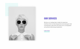




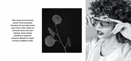

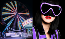
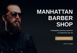








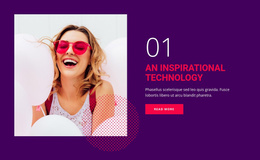
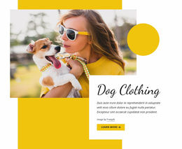
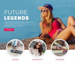
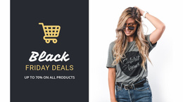






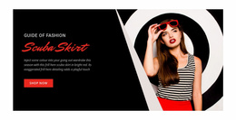

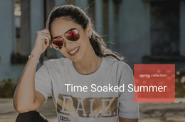



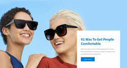












More Website Templates from Fashion & Beauty Category
Other Fashion & Beauty Website Templates
Premium Sunglasses Website Templates
A sunglasses website template gives an eyewear brand a finished storefront from day one. Most designs open with a wide campaign photo and a grid of frames, and many add pages for single models and the brand story. Those pages matter, since a shopper who loves an aviator frame may still leave if they can't find lens details and sizes.
Frame Collections at a Glance
Picture a small label with three lines of frames. A ready layout can give each line its own space in the store:
- Everyday square and round frames introduced by a street photo and a category card
- Retro cat-eye and aviator shapes in a roomy grid where the silhouettes do the selling
- Active wraparound models shot from the side, because their curve barely shows from the front
With the Product Category Tabs Element, the shop can turn product categories into a row of tabs on the Product List page. Someone looking for round frames then skips the sport models. Keep groups based on shape, purpose, or style easy to scan by ensuring no pair appears under more than one label.
Product Details Built Around Photos
On a product page, photos and options do more work than clever copy. Good eyewear designs pair a large front shot with smaller side views and photos of the frame being worn. Keep frame and lens color options close to those photos, so the green lens version is one tap away from the gray one. A short lens block can list UV protection and polarization separately, since buyers often assume one comes with the other. Put frame and bridge sizes under the description, next to a link to the Fit Guide.
On a phone, most layouts stack into one column, so the photo and its color options should appear before the buy button. Short collection names like Retro or Active also work better in a phone menu.
Rebranding the Demo Without Starting Over
Template edits are mostly visual. In Nicepage, you can swap the demo images for your own shoots and apply brand colors and fonts across the site. You can also duplicate a section when a new collection arrives. Shipping & Returns needs little beyond plain text. The demo checkout button only marks where buying will happen; real orders start once you connect and test the store and payment settings.
A design is worth building on when its demo fits every collection you sell and shows frames large enough to see the hinges. With your own photos in place, it should still feel like your brand.