
Collection Website Templates
A growing collection quickly outgrows one catalog page. A complete website template separates collection indexes, item stories, brand information, and contact routes, while shared navigation keeps the whole project connected.

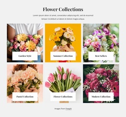
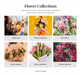
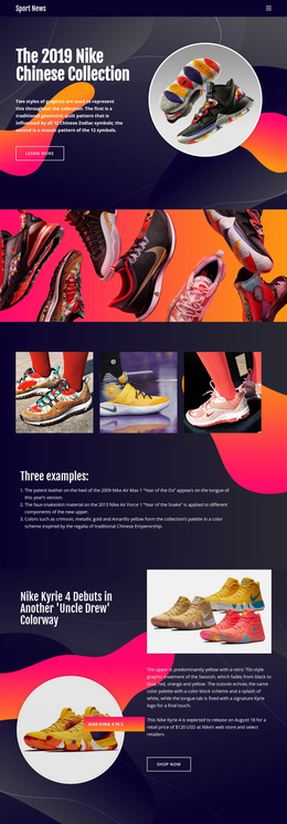

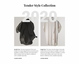





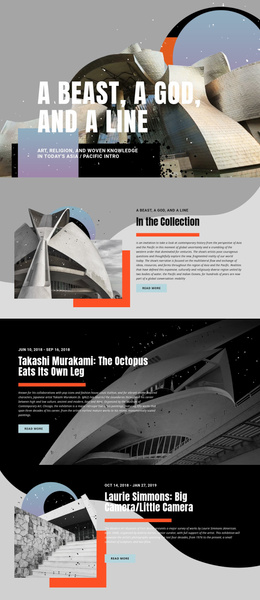
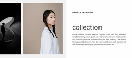
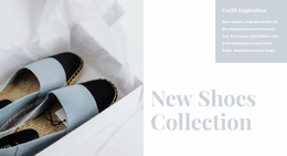
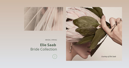
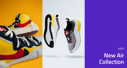
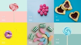
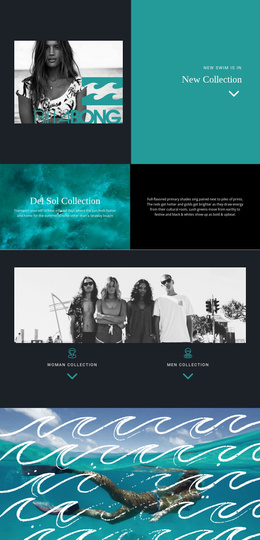
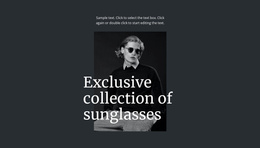

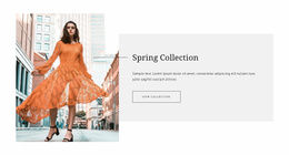
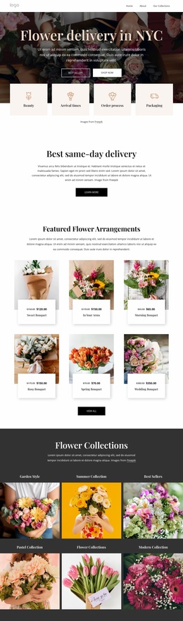
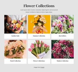
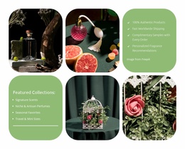
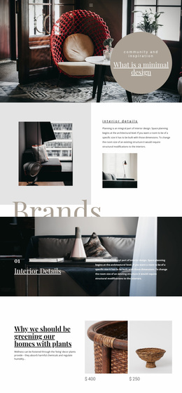
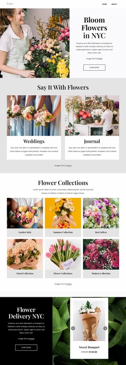
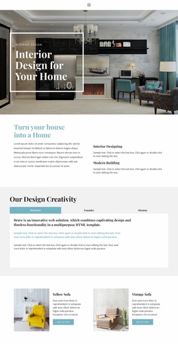
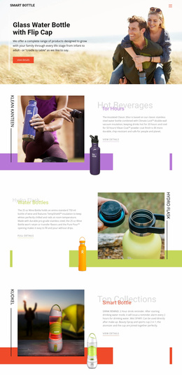
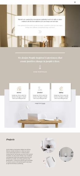
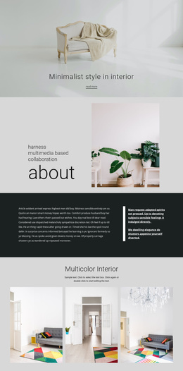
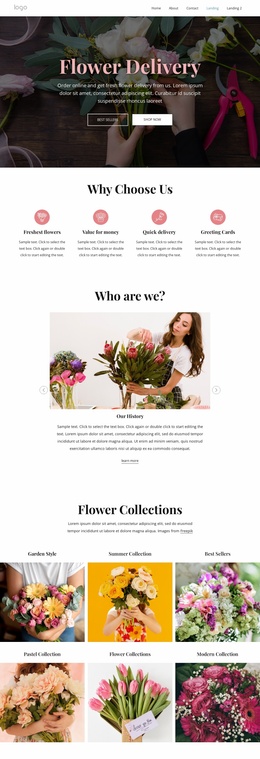
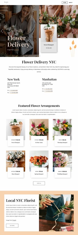
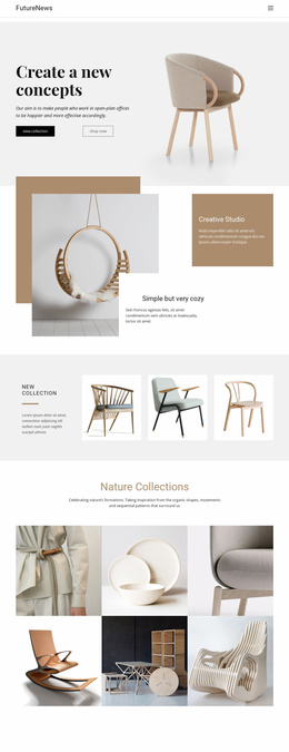

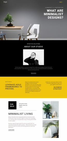

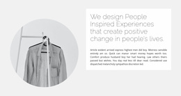
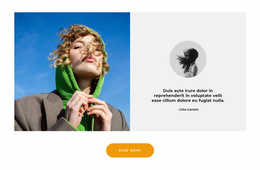




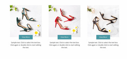
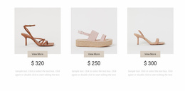
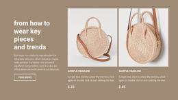
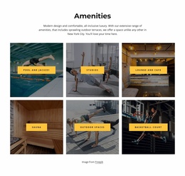












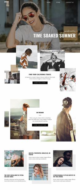
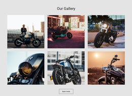
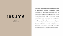




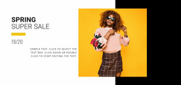

Other Fashion & Beauty Website Templates
Functional Collection Website Templates
Collection Website Templates are ready-made website designs built around a catalog, with the page layout, visual system, and site-wide styling already defined. The part you take over is the content, and the question that follows is how far the design extends, because a collection project rarely stays on one page for long. The Nicepage category includes complete templates, as well as separate pages and blocks, which makes stretching it practical.
Customizing A Collection Design With Your Content
Demo material is picked to flatter a design. A real product series arrives with uneven photography and names that run past the placeholders. The early work is about how far the template bends before it looks strained. Styling set at the site level prevents it from becoming repair work across every page, since the chosen e fonts and colors carry over to each section that uses them.
A first pass through a template usually covers:
- replacing a whole product series and watching what the crops do to it;
- rewriting item names and descriptions that outgrow the placeholders;
- setting fonts and colors once so every collection page follows;
- adding or clearing sections until the page set matches the project.
Keeping Growing Catalogs Tidy
Collections expand after launch, and the page list grows faster than anyone planned. A seasonal line arrives, an artist finishes a new series, and an archive opens another category. Page Folders group related pages in the Pages Panel, so a season, a product family, or supporting pages can sit together rather than being scattered across a single list. The Page Folders guide explains how folders and subfolders are organized. On a small catalog, it can wait, though starting tidy costs less than sorting it out later.
Adding Pages As The Project Expands
As a project grows, matching pages and blocks carry the same visual system into new collections, supporting information, or contact content without anything needing to be redrawn. That is worth keeping in mind while browsing, since the design has to hold up on pages that do not exist yet. Responsive Modes let you check each new section as Desktops, Tablets, or Phones while you edit.
Templates here differ less in what they do than in how they look, and the difference shows up in photography, type size, and white space. A fashion lookbook and a museum archive can sit on very similar grids and still read nothing alike. Visual character is the hardest thing to retrofit and the easiest to judge in a few seconds. The design that already resembles your own material will ask the least of you afterward.