
Elegance Website Templates
Visitors to a fashion atelier or interior design studio expect a considered introduction, examples of work, and an easy way to inquire. Elegance-themed website templates meet these needs with coordinated pages, consistent typography, and understated navigation.










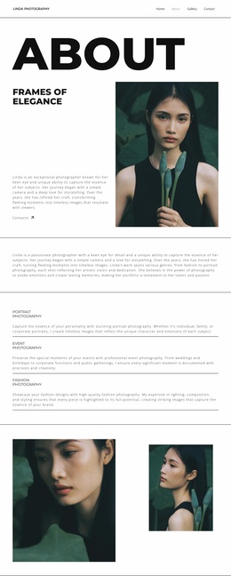
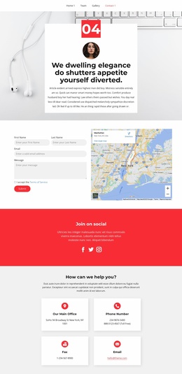













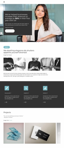
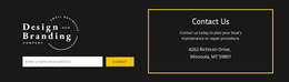
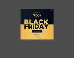
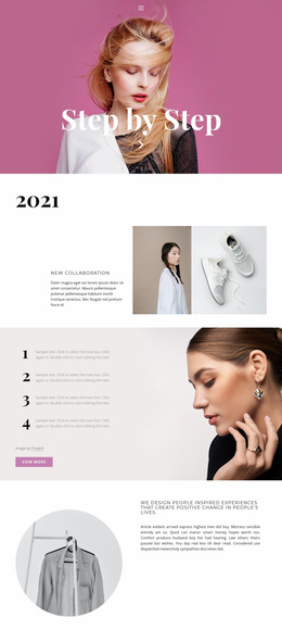




Other Fashion & Beauty Website Templates
Up-to-Date Elegance Website Templates
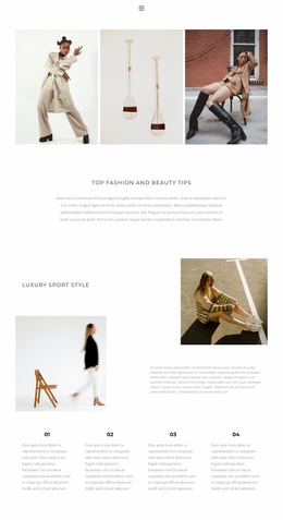
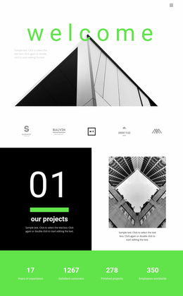
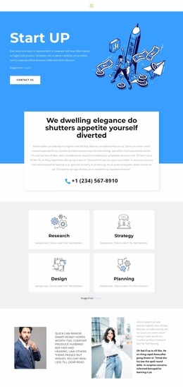
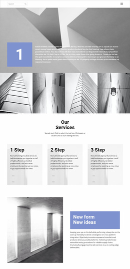
Elegance website templates give you a finished design with the sections arranged and the visual settings ready to adjust. In a good one, headings contrast clearly with body text, the grid stays tidy, and decoration remains sparse enough for photographs to set the mood. Minimalism alone does not produce that effect, since a sparse layout still looks flat when image proportions feel random. Such designs suit an architecture office or a personal portfolio as readily as a fashion label. In a demo, scroll past the opening image and check whether the style holds on the portfolio and contact screens once your own photos replace the placeholders.
Layouts That Belong Together
Picture an interior studio whose home screen, project gallery, and inquiry form read as one site. Each area places its own demands on an elegant template:
- Home: an expressive headline and one understated call to action, with free space around the hero image.
- Projects: large editorial photos for a few signature interiors, or an even grid with short captions for a longer archive.
- About: the same headings, photo placement, and quote treatment as the home screen.
- Services: offers and an inquiry button that stay easy to find without breaking the calm composition.
Two strong demos can still clash side by side, so compare type sizes and button shapes. Since the category also has separate blocks, you can often fill a missing section with one drawn in the same style.
Giving Every Color a Role
An editorial headline on the home screen, followed by a different typeface in the portfolio, can make a studio feel like two businesses. A restrained palette holds together when each color has a job, from the background and body text to a single accent for buttons. A dramatic headline face also has to work above several paragraphs of plain text. Generous spacing helps, though oversized padding only makes visitors scroll through empty bands. Nicepage's Theme Colors update the shared palette across pages at once; then revisit text readability and button contrast.
Testing Menus and Photos on Small Screens
The Menu Element connects the main sections, but a heavy bar with bold labels competes with the hero photo, so a lighter menu lets the headline lead. Long project titles may need shorter labels on a phone. Mixed aspect ratios in your own photos can break a cohesive layout. On a narrow screen, a large heading may fill the whole first view, and the main button can slip far down once sections stack. If the design stays composed with real images and long titles in place, it is a solid base for the whole site.