
Inspiration HTML Templates
Inspirational websites need more than attractive imagery: quotes, personal stories, recommendations, and visual references must stay easy to scan. A ready-made HTML foundation keeps those content blocks structured and adaptable across screen sizes.
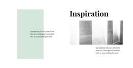
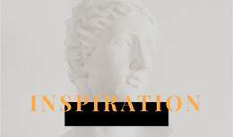
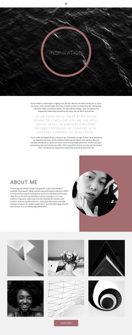

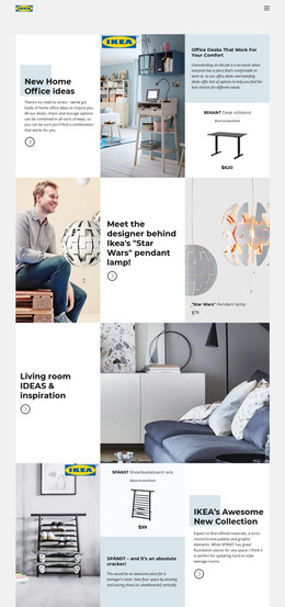



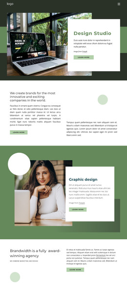


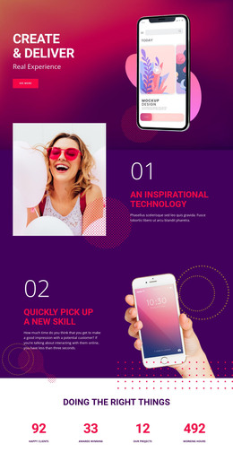
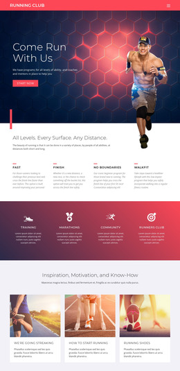
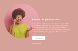
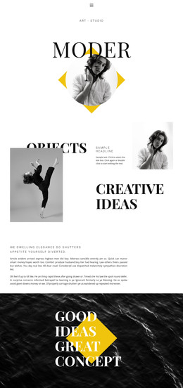
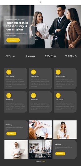
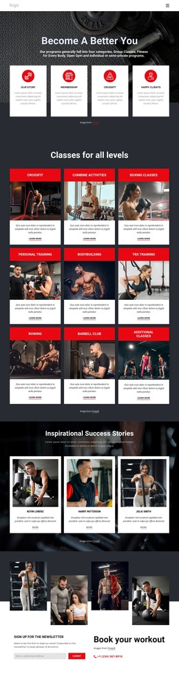
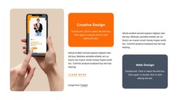
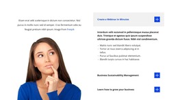
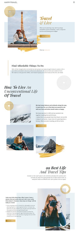


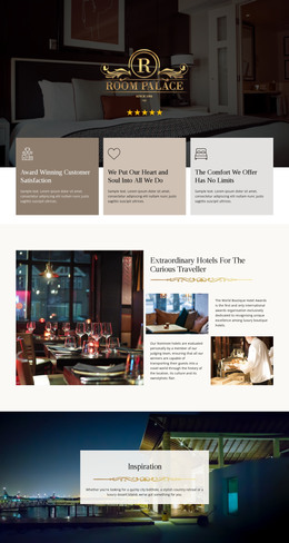
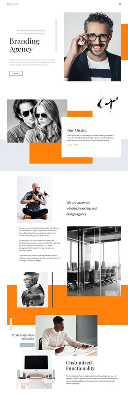
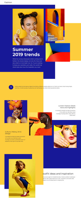
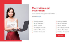







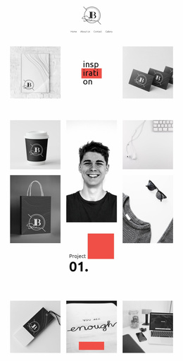




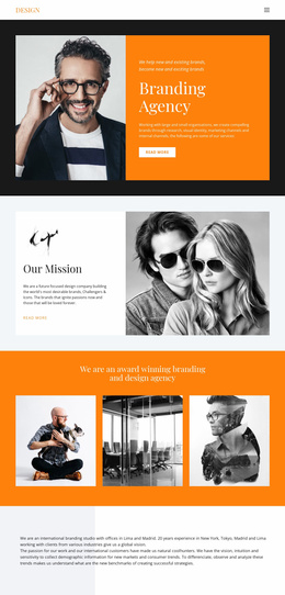

More HTML Templates from Art & Design Category
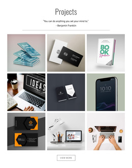
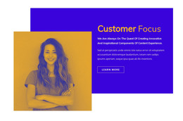




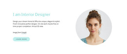
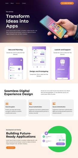
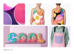
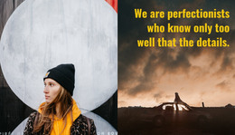

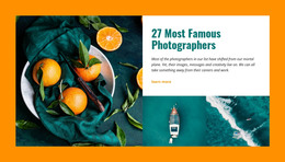
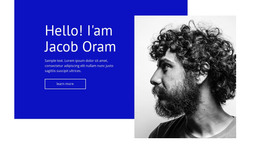

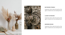

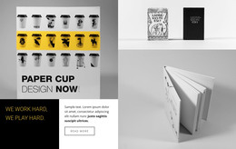


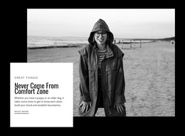
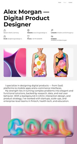
Other Art & Design HTML Templates
Adaptable Inspiration HTML Templates for Visual and Creative Projects
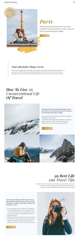
An Inspiration HTML Template arrives as a ready-made HTML page, with sections, image blocks, and content order in place before you add anything of your own. Inspiration is a broad subject in this category, and photography projects, creative portfolios, and travel stories often use the same layout. Most of the work is editing what is already there, and the exported files stay open for direct changes when the page has to fit an existing project.
Match the HTML Layout to Your Content
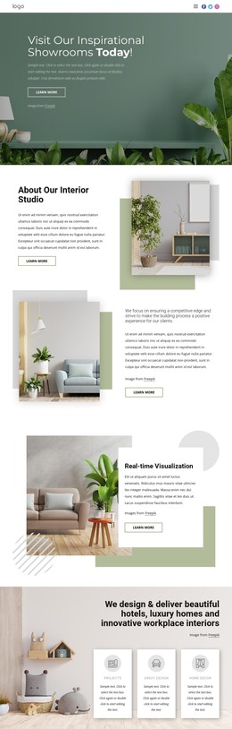
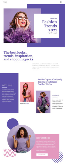
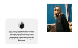
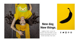
Photo-led projects and portfolios need different blocks. A gallery for interiors or fashion works with wide pictures and short captions, while a portfolio reads better when every project sits in the same repeatable block. Layouts in this category often combine a few recognizable patterns:
- a wide image-led opening section;
- repeatable project or gallery blocks;
- image-and-text rows for collections;
- editorial sections for longer stories.
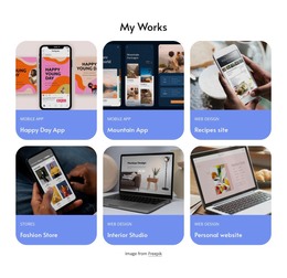
If most of your material is visual, start with a template where images already span the full width, since that is the hardest thing to add later. Grid layouts suit collections of projects or references, where every item needs the same block.
The Nicepage Grid Element holds images, text, and links within consistent cells, keeping repeated blocks aligned as the page grows. The Grid Element documentation describes how those cells behave.
Reshape a Ready-Made Page Structure
The section order in a template is a draft. Blocks can be moved, duplicated, or removed as the project takes shape, and the page keeps working after each change.
A designer might open a gallery-led layout, swap the demo images for a finished shoot, and move the intro text below the first gallery. You can then add the same page to an existing site. Demo photography in these templates is usually stronger than the pictures that will replace it, so judge the block sizes and the spacing instead.
Look for the structure that already holds most of your material, since every block you rebuild costs more time than the ones you keep.
Keep Visual Inspiration Clear on Every Screen
Image-led pages feel a width change more than text pages do. Large photographs, project grids, and image-and-text rows have to stay balanced when several columns collapse into one.
Nicepage Responsive Modes let you check the same layout from Large Screens down to phones. Watch the image crops, column count, and block order change on a narrow screen. A three-column gallery that looks calm on a desktop often reads better as a single vertical sequence on a phone, so set that order before you swap in the final images.