
Postcard HTML Templates
Travel brands, photographers, event teams, and personal creators need postcard pages that keep the image, message, sender details, and response link easy to scan. Ready-made HTML sections provide that structure across screen sizes.
-

-

-
-
-
-
-
-
-
-
-
Free Website Builder SoftwareDownload
-
-
-
-
-
-
-
-
-
-
-











More HTML Templates from Art & Design Category


























Other Art & Design HTML Templates
Clean Postcard HTML Templates for Digital Messages
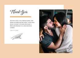
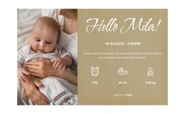
Travel brands, photographers, and event teams send postcards built around a single strong image and a few lines of text. Postcard HTML templates turn that pairing into reusable sections: an image container with alt text, a content section for the greeting, and a metadata block for sender and date. A link area usually follows. The photograph tells the story, while the surrounding sections provide context.
HTML Blocks for Image, Message, and Sender Details
One common approach mirrors the two-sided logic of a printed card: a visual face and a written face, each marked as a separate section. A side-by-side layout is another common model, with the picture in one column and the note in the next. The blocks remain the same in both models; only their arrangement changes.
These areas usually stay as separate blocks:
- an image area, with alt text that names the destination or the occasion;
- a message area for the greeting and the short story behind it;
- a caption or metadata area with location, date, and sender;
- an action area for a reply, a gallery link, or an RSVP.
Markup Choices Behind Different Postcard Scenarios
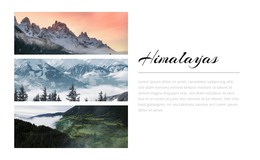
A travel card usually leads with the destination image, and the note beneath it names the place. An event card may shift the balance toward the date and registration link, so those elements should have their own containers rather than appear as a line within a caption. A seasonal greeting, a photo memory, or a short announcement reuses the same blocks with different emphasis. Some projects also mark up a reverse face when a digital version recreates a printed one, with the address zone beside the written note.
Source Order That Survives a Narrow Screen
The markup itself determines source order. It should follow the sequence a reader is meant to move through, which, for most postcards, runs from the image to the sender and then to the link. When the columns collapse into one, a tall photo can fill the first screen and push the greeting and the response out of view, so both deserve to be seen at that width. The markup defines what each block is and where it comes from; how it looks is handled by another layer.
Nicepage Responsive Modes let you check that order on desktops, tablets, and phones while the layout is still in the editor. The HTML export workflow then turns the finished design into files you can further edit or publish as-is.
A good template comes down to a few checks: the visual hierarchy stays clear, the message survives, and the sender details remain usable at any width.