
Color HTML Templates
Strong color can separate offers, categories, or content states, but the markup still needs a clear hierarchy. These HTML templates pair palette-led presentation with reusable sections and a responsive structure that stays understandable across screen sizes.











































































Other Art & Design HTML Templates
Color HTML Templates Built on a Clear Content Order
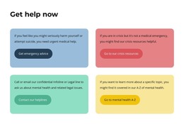
In a desktop demo, three service blocks on three different backgrounds look deliberate. The colors sit beside each other; the contrast is part of the composition, and the whole row reads at a glance. Open the same template on a phone, and those blocks become a vertical run of bright rectangles. Nothing has changed except the order in which the content arrives, and that order now carries the page.
When Columns Become Vertical Stacks
Side by side, a colored background quietly says that three items belong together. When stacked, the message disappears because the reader never sees them at the same time. An HTML color template either has something underneath to hold the grouping, or the palette does all the work.
Three checks are worth running before you settle on a file:
- Imagine the backgrounds are gone and see whether the sections still separate. If they exist only as color, they do not exist at all.
- Read the phone view from top to bottom and confirm the sequence tells the story you want, with the desktop composition out of the picture.
- Look for anything distinguished by color alone: categories, availability, featured items. A visitor should be able to tell them apart from the words, too.
Markup That Survives Reordering
Headings carry grouping through a layout change. When each service or case study opens with its own heading, and comparable items repeat the same structure, the grouping survives. A reader knows where one item ends and the next begins even on a plain background. Nicepage Grid Element puts text, images, and buttons into cells that rearrange on smaller screens, and Responsive Modes let you check the phone view separately from the desktop one.
Three things are worth a look in that narrower view:
- Every colored block still opens with a heading, including the ones far below the hero.
- Comparable cards keep the same internal structure instead of turning into three custom variants.
- Text stays legible on whichever accent it lands on once the stack forms.
A Grayscale Thought Experiment
Here is the fastest way to judge an HTML color template. Picture the page with every background set to white and every accent set to gray. Can you still tell which sections there are, which items belong together, and what comes first? If the answer is yes, the palette is free to be as loud as the project needs. If the page falls apart, color was holding up a structure that nobody built.