
Emergency CSS Templates






More CSS Templates from Medicine & Science Category
-

-
-
-
-
-
-
-
-
-
-
-
-
-
-
-
-
-
-
-
-
-
-
-
-
-
-
Build Website with no CodingDownload
-
-
-
-
-






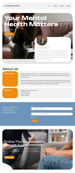
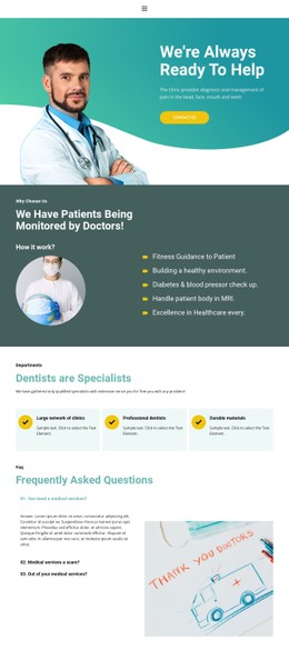
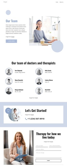




Other Medicine & Science CSS Templates
Quick-Start Emergency CSS Templates for Urgent Services and Rapid Response Websites
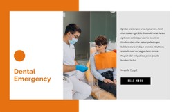
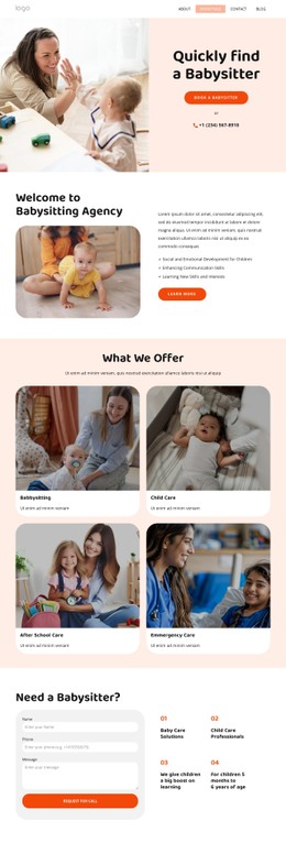
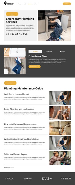
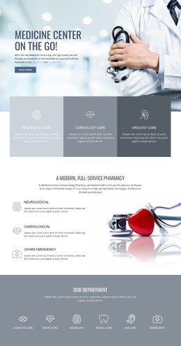
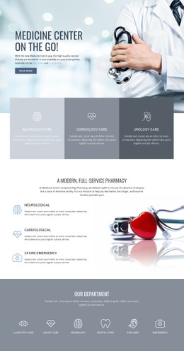
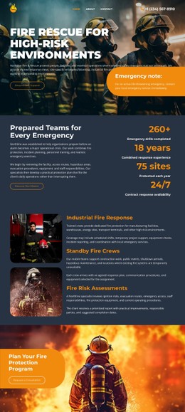
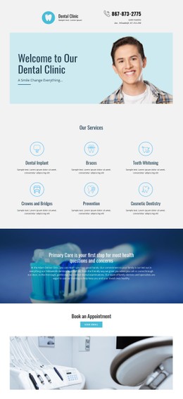
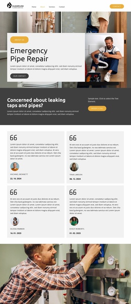
Emergency CSS templates allow emergency website owners to organize visual content for users who might not spend a lot of time reading. According to the CDC, 155.4 million cases occur in the US emergency departments, with 43.5 million of them being injuries. Not more than 40.6% of patients get seen in less than 15 minutes. It is understandable why an urgent message has to be visible before visiting, calling, or sending a request. This page will be useful for medical, roadside, plumbing, security, veterinarian, and local rescue services. Using CSS elements allows differentiating warning from other content, making contact buttons bigger, increasing the readability of the text, and keeping forms workable on mobile devices. The Nicepage template collection has emergencies for medicine, plumbing, dentistry, pipe repair, fire departments, and household assistance. A user can pick up a page design, download it, change the style system, and customize every page for an emergency service.
Flexible CSS Rules for Clear Emergency Signals
For an emergency website to work well, the design of the site must include a visual language that will allow users to instantly identify the key actions. This can be accomplished by colors, typography, buttons, space and states of interactivity.
The list of useful options starts with:
- A distinct hierarchy of alert messages.
- Big buttons on phones.
- Legible fonts on mobile phones.
- Focus indicators for keyboard navigation.
The number or button used to call for help should be consistent throughout the headers, services, and even the mobile view.
Instant Checks for Forms and Navigation
An emergency website needs to stay user-friendly even when the person using the site is under stress or distraction or is using the site on a small mobile screen. Before publication, review the core options that affect access and trust.
- Breakpoints designed around real phone screen sizes.
- Enough space around emergency instructions to keep them readable.
- Clear error messages that show users what needs fixing.
- Less animation for a calmer, more focused experience.
- Reusable styles for pages covering different service locations.
- Strong contrast that makes hotline details stand out.
- Short menus with clear section labels.
The mobile menu has to be fast, and the emergency contact menu has to remain easily accessible. Error messages in the form have to clearly specify which field is causing an issue and what needs to be done to fix it. The text has to be readable on alert colors, photos, maps, and the service card background.
Display Emergency Styles That Guide Visitors
Browse through the Nicepage gallery and pick a style system that suits the type of services you offer. Get an emergency CSS template, adopt its colors, fonts, notifications, and interface states, and create a webpage that guides users towards the appropriate support.