
Crazy CSS Templates
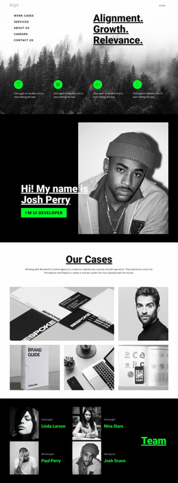
Experimental projects can push grids, typography, overlaps, and spacing far beyond conventional layouts. CSS-focused templates give those visual choices controllable styling rules so the composition can respond to real content and smaller screens.

More Website & HTML Templates for Crazy














More CSS Templates from Medicine & Science Category





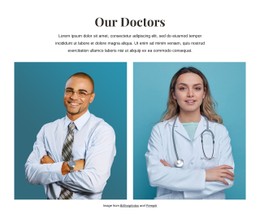

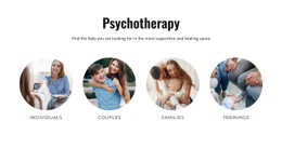
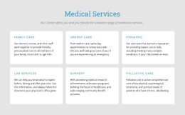

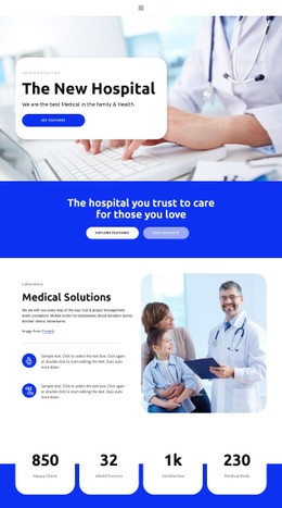

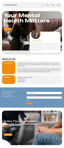
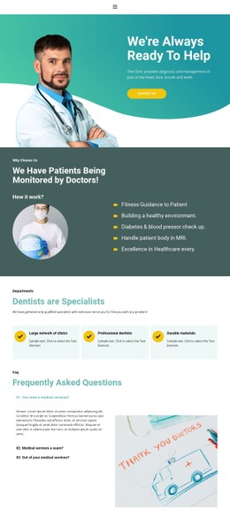


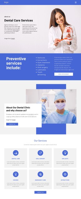






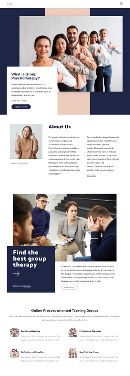


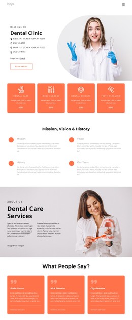
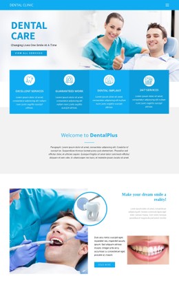
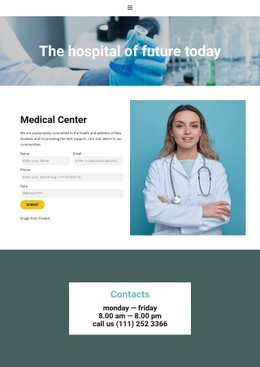
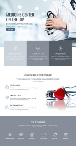
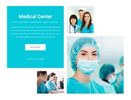
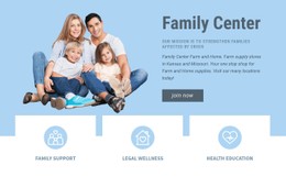
Other Medicine & Science CSS Templates
Flexible Crazy CSS Templates for Custom Styling
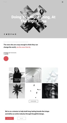
Crazy CSS templates focus on the styling layer behind expressive layouts. They earn their place when the plan is to adjust colors, typography, and spacing, as well as backgrounds, borders, and responsive behavior, without rebuilding the underlying content. A poster-like layout can keep its oversized heading and overlapping images while the palette, spacing, and type scale change for a different brand.
Colors, Spacing, Typography
Most of the work sits in a short set of visual rules:
- color pairs for backgrounds, body copy, and accents;
- spacing between sections, columns, and cards;
- type scale and letter spacing in titles;
- borders, shadows, and overlay strength on images.
Component styles come next. Buttons, cards, and badges usually take their look from the same declarations, so a change made in one place tends to show up wherever that component appears. Body copy deserves more attention than the display headings here. A color pair that looks brilliant behind a huge headline gets tiring in a long paragraph, and that is the sort of thing a demo never shows.
Adjust Responsive Styles Per Screen
The styling layer earns its keep at this point. An oversized title needs to be scaled down on a phone, an image parked over a paragraph needs to be repositioned, and columns fold into a single sequence. Heavy overlap usually decreases at the same time, so the text underneath remains readable. Nicepage handles this through Responsive Modes, which allow many layout and styling values to be set separately for different screen sizes.
A festival page shows how far that goes. Layered posters and angled type look right at full width, while on a phone, the layers have to separate into a plain sequence, with the tilt kept on the title alone so the original idea still comes across.
Custom CSS for Local Exceptions
Visual controls cover many common changes, and Custom CSS is useful when a particular effect or exception needs a rule of its own. It can be applied to a single element, to one page, or across the whole site: an animation timing, an unusual background under one section, a spacing exception in a single block. Keeping those rules local also keeps the design workable for whoever opens the project next.
Choose this category when the visual system is the main thing you expect to customize. Colors, type, spacing, responsive behavior, and the occasional targeted override are what this kind of template is really for.