
Bridge CSS Templates
Bridge contractors often display panoramic construction photos beside narrow technical diagrams. Bridge CSS templates help these contrasting visuals feel cohesive through color choices, image treatments, and responsive spacing, without obscuring the structures.



More CSS Templates from Architecture & Building Category
-
-

-
-
-
-
-
-
-
-
-
-
-
-
-
-
-
-
-
-
-
-
Build Website with no CodingDownload
-
-
-
-
-
-
-



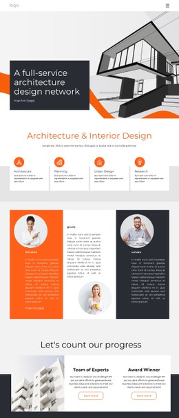

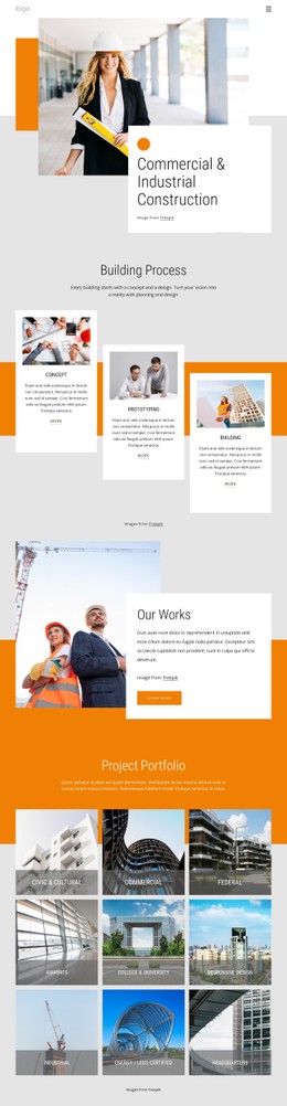
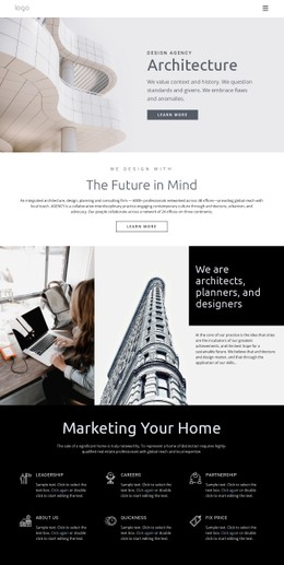
















Other Architecture & Building CSS Templates
Clean Bridge CSS Templates
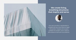
A bridge CSS template arrives with its look already settled. The type and colors are chosen, and the text has a fixed spot on the photo. In We Build Bridges, a single block features a condensed white heading in the upper left of a muted blue-gray shot of a suspension bridge. Nicepage gives you these designs as pages and blocks with styling attached, ready to adapt to your pictures and brand. The choice then comes down to visual style and how easily it bends.
Telling Designs Apart at a Glance
A few visual traits narrow the field before any editing:
- How the heading is set, from its typeface and size to the room it leaves for a long name.
- Which accent colors carry the design and whether they come from a shared palette.
- How much air the block leaves around its heading and paragraph.
Two designs here show the main split. We Build Bridges puts its words straight onto the photo, so any replacement needs a calm patch of sky or water behind them. We Build Bridges and Roads places its text and a "read more" button in an orange panel overlapping a construction photo. The panel stays legible over busy scenes, while the open layout favors one striking span.
Shared Palettes and Targeted Tweaks
Most changes happen through ordinary settings. Theme Colors define a palette for every page, so headings and buttons that use it shift together once you enter your brand shade. A custom color stays on the one element where you apply it. When the standard controls fall short, Custom CSS can apply to one element with its own class, a single page, or the whole site. Their effect shows up only in Preview because the editor canvas doesn't run these rules.
Panoramas Squeezed onto Phones
A panoramic bridge photo behaves differently on a phone. As the block narrows and the crop tightens, a heading that rested on open sky may land across a tower. Responsive Modes let you adjust font sizes and margins for tablets and phones. Work down from the desktop view, since larger modes pass their changes to smaller ones. Watch for text spilling out of its box or gaps collapsing between elements. Contrast also fades when the heading slides over a lighter part of the image.
The fairest test of any bridge CSS template is to drop in your own photo and brand palette, then look at the phone view. Whatever still feels off should take a few setting changes or a short Custom CSS rule, with the block left as it is.