
Urban CSS Templates
City pages often combine maps, project imagery, schedules, addresses, and service details in tight spaces. Urban CSS templates provide a styling foundation that controls grids, spacing, breakpoints, and page-specific rules as layouts adapt.








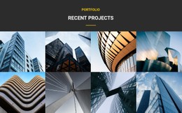


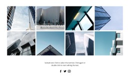
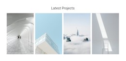




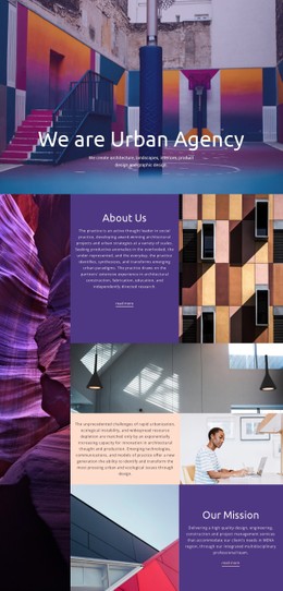

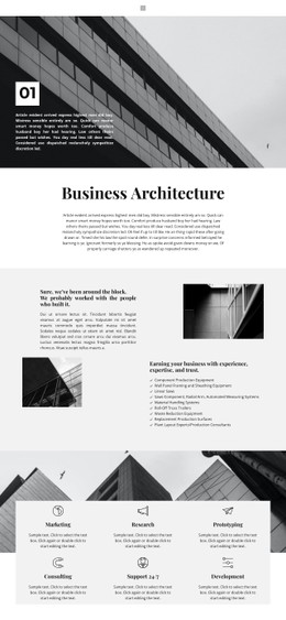

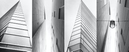
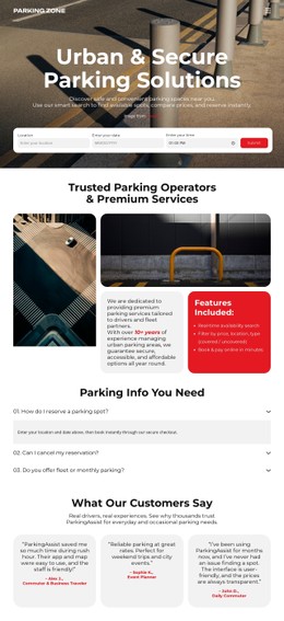



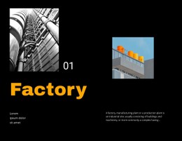






More Website & HTML Templates for Urban






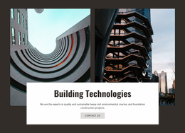
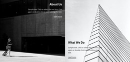



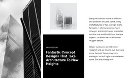
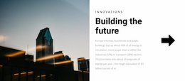




















Other Architecture & Building CSS Templates
High-Performance Urban CSS Templates
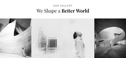
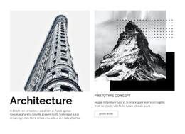
The stylesheet of an urban template decides how a full-width street photo meets a compact block of addresses, dates, and prices. Urban CSS templates come with those rules already written, from grid behavior to type scale and component styles. A gallery of modern architecture might lean on thin dividers and quiet grays, while a city tours page goes for bold color blocks and large route numbers. Both depend on the same kinds of rules.
Visual Patterns Behind City Character
A few visual patterns show up in most urban stylesheets, and each one is a set of CSS rules you can edit:
- Modular grids built with CSS Grid, where tour or project cards share one width and one gap.
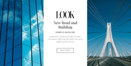
- Fixed aspect ratios for photos, which let a vertical street shot and a wide skyline panorama share one gallery without uneven gaps.
- Compact metadata rows arranged with Flexbox for district, duration, or price, set in small uppercase type with wide letter spacing.
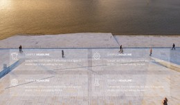
- Overlays that separate a dense block of facts from a busy photo, such as a dark translucent layer behind white text.
Because these patterns repeat, they belong in shared classes. One card class can serve tours, projects, and events, while a modifier class changes only what differs, such as a muted look for sold-out dates. Hover and focus states live in the same rules, so a card reacts the same way wherever it appears.
Breakpoints Set Per Component
Good breakpoints come from watching individual components shrink. The metadata row on a tour card usually gives out first, long before the photo has any trouble, and a media query can let it wrap under the title. The meeting point panel comes next. On phones, it typically moves under the photo, and a shorter photo keeps the address on the first screen. Condensed headlines need watching too, since they can break into one word per line. Nicepage Responsive Modes show each layout from large screens down to phones, with spacing and font sizes adjustable for each mode.
Custom Rules Kept Rare
Some urban details need a custom rule, such as a grayscale filter that lifts on hover or a dashed divider that echoes road markings. Nicepage accepts custom CSS for a single element, one page, or the whole site. The content itself stays untouched while its appearance changes. To compare urban CSS templates, count how many page types the shared classes can serve. If tours, galleries, and contact details reuse the same few components, overrides remain rare, and the stylesheet is easy to maintain.