
Agent CSS Templates
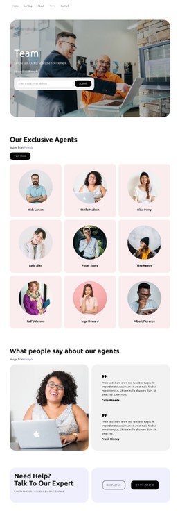
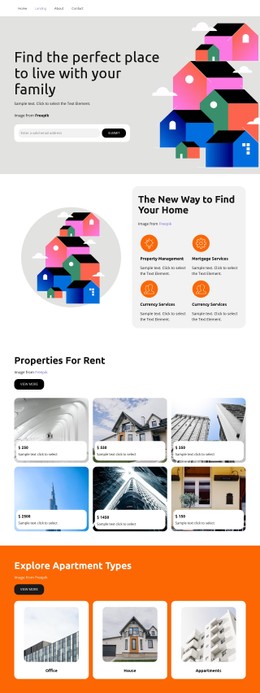
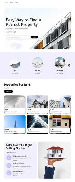
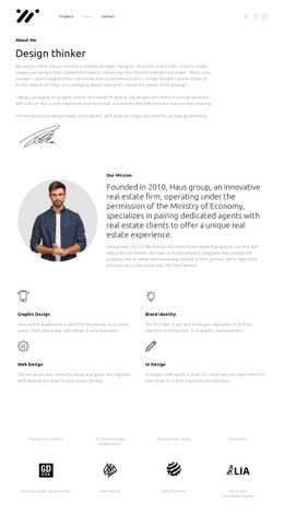
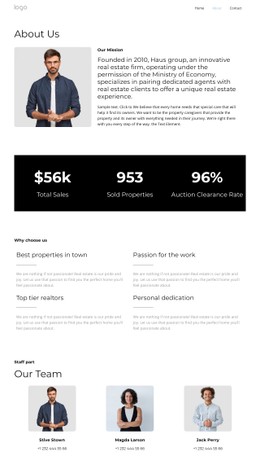
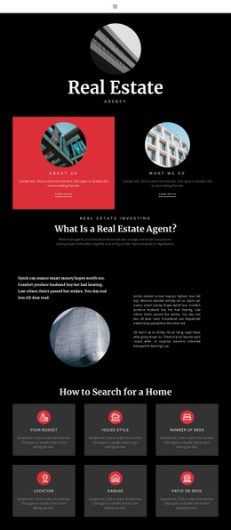
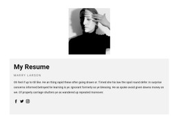
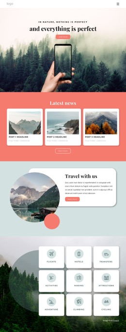
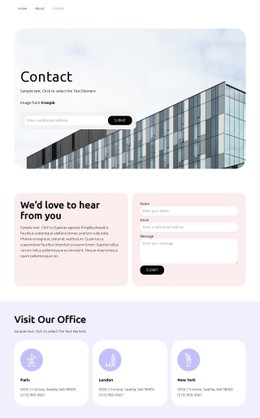
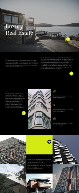
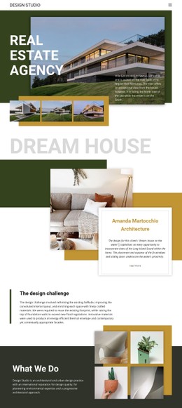
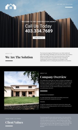
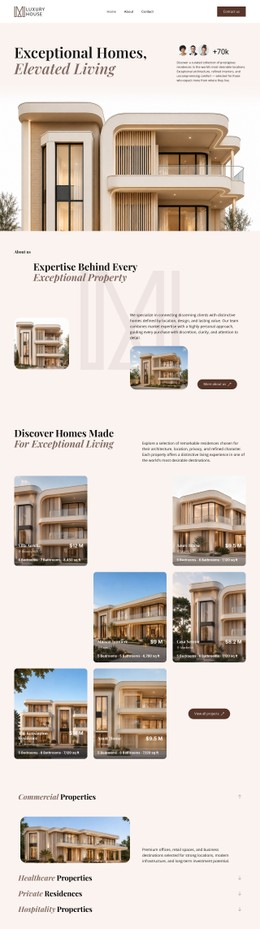
Agent directories need clear visual differences between names, specialties, and contact actions. Agent CSS templates support consistent portrait crops, readable location badges, and mobile card layouts, so clients can scan multiple professionals without missing key details.
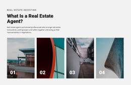


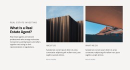


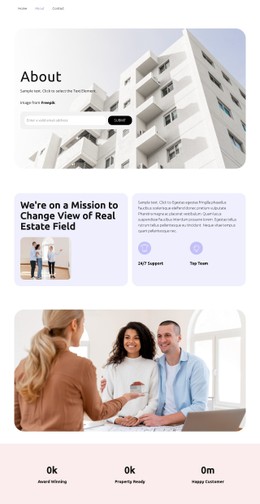








































More Website & HTML Templates for Agent
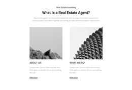


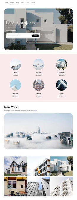
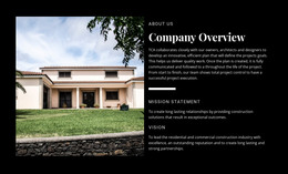

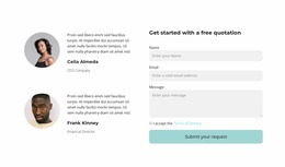
















Other Architecture & Building CSS Templates
Modern Agent CSS Templates
Type, color, and spacing decide whether an agent's profile reads as credible or as a crowded business card. Agent CSS templates include styling for portraits, specialty tags, and contact buttons, which is much faster to adapt than writing every rule yourself. The catalog covers realtors, insurance agents, and management firms, so the tone ranges from formal to photographic.
Comparing Visual Styles Between Designs
Most agent designs fall into a few visual families, and each suits a different kind of practice:
- Restrained layouts with soft palettes and generous spacing for insurance agents
- Uniform card grids with equal gaps and matching portraits for agency teams
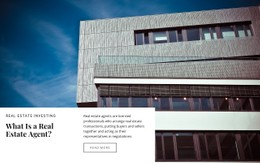
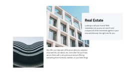
- Styles built around large property photos and bold accent buttons for realtors
A solo agent's profile often works better with one large portrait and a prominent contact area. In any family, the name needs the strongest type, while title and specialty read as quieter lines. A consultation button should stand apart from a secondary profile link through size and contrast. Its hover, focus, and active states should also look distinct. On insurance profiles, coverage tags look calmer in muted colors because a row of bright pills can start to resemble a sale banner.
How Cards Behave With Real Content
A grid with fixed card heights may look tidy with sample text, but it can fall apart once real biographies arrive. A title like senior commercial leasing agent may not fit a narrow card, and one realtor may list three suburbs where a colleague lists a single district. Fill a few cards with your own team details and watch for these points:
- Long text wraps and the card grows while buttons stay aligned at the bottom
- Portraits share one aspect ratio and a safe crop as columns shrink
- Labels over photos stay readable, since a pale tag on a bright portrait can vanish on a phone outdoors
- Buttons stay large enough to tap, with no specialty detail hidden behind hover
Good templates use CSS Grid and Flexbox here, so a row of cards reflows into one column with even gaps.
Adjusting Colors and Spacing in Nicepage
Most changes need no code, since Nicepage's visual controls cover colors, font sizes, and spacing. Responsive Modes let you correct tablet and phone layouts separately. When those settings run out, you can add custom CSS to a single element, one page, or the whole site. Narrow rules keep a fix from restyling unrelated sections. The safest agent CSS templates keep their hierarchy with long titles and uneven photos and let you change fonts without reworking every card.