
Arabic Style Website Designs
Arabic-inspired websites need more than decorative motifs. A clear visual system coordinates pattern, calligraphic influence, typography, color, imagery, and spacing so that expressive details remain consistent and readable across the site.









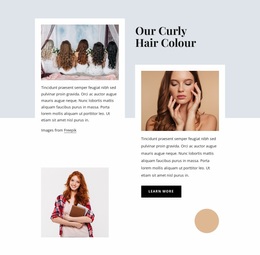
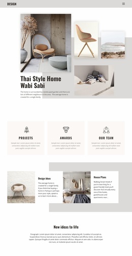
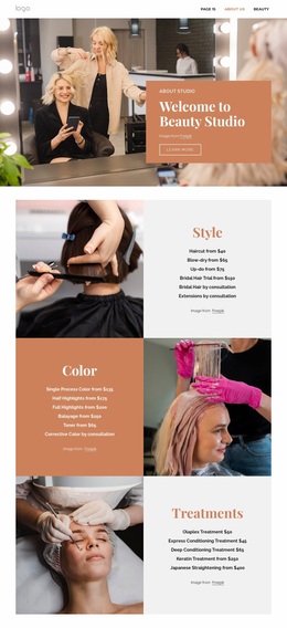
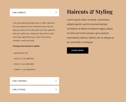










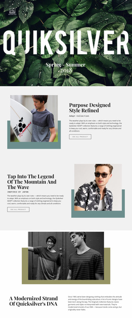
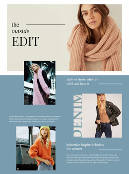


Other Art & Design Website Designs
Creative Arabic-Style Website Design for a Distinct Visual Identity
Arabic-style website design works on three layers at once: a right-to-left interface, Arabic typography that carries the brand voice, and a visual language that feels culturally at home. Hospitality brands and cultural institutions fall into the same trap: Arabic poured into a composition originally designed for English.
Build the Layout for Right-to-Left Reading
Mirroring a finished Latin design rarely survives real content, so check these details before anything goes into production:
- Navigation, breadcrumbs, and card order start at the right edge, and the primary call to action sits where the eye lands.
- Arrows, chevrons, and pagination controls flip direction. A play icon or a logo does not.
- Mixed content keeps its own direction: Latin brand names, phone numbers, and dates stay left to right inside Arabic sentences.
- Forms need labels aligned to the right, correct input direction, and room for an Arabic name beside a Latin email.
Arabic headlines are usually shorter and denser than their English counterparts, so draft the Arabic version first, then the English one. The two should match in structure and rhythm while their proportions differ. Mobile drawers and sliders expose any remaining RTL mistakes.
Set Typography and Interface Hierarchy
Type carries most of the voice in Arabic copy, and a family that looks confident in a hero can fall apart elsewhere. Test it across the interface:
- Give display headings real character, then pair them with a quieter face and generous line height for service descriptions, since diacritics need vertical room.
- Read the small sizes before deciding: captions, form hints, and table labels are where a decorative Arabic face stops being legible.
- Keep weights distinct so headings, buttons, and navigation labels never compete at a glance.
Holding that system together across screens is the harder part. Nicepage Site Settings manage Font Schemes and Typography Styles at the project level, and the Site Fonts documentation shows how to apply them as a single set of rules.
Keep Cultural Motifs Under Control
Geometric forms, calligraphic accents, and warm regional palettes earn their place when each one has a job. The common failure is an ornamental pattern behind Arabic body copy, which sacrifices readability and adds little value; the same pattern works in a hero band, a section divider, or an empty state.
Two briefs show the contrast. A luxury hotel wants restraint, letting architecture and spacing do the talking. A heritage foundation can push expressive lettering and dense ornament because the ornament is part of the subject.
A good result is easy to judge: culturally relevant, natural to read from right to left, and comfortable in both languages.