
Red Website Templates



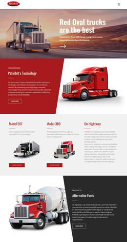










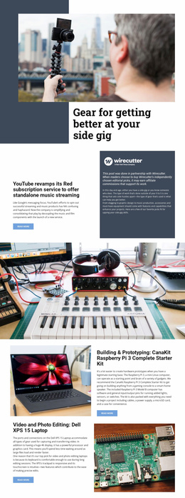

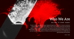






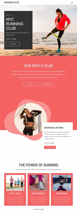











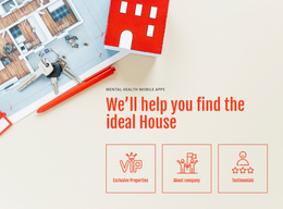






























Other Art & Design Website Templates
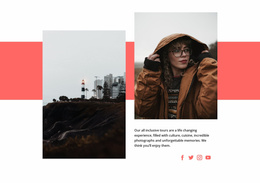
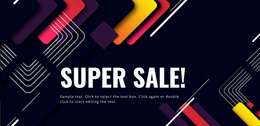
Create Bold Online Experiences With Simple Red Website Templates
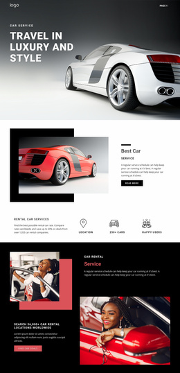
Red is one of those colors people notice almost immediately. It can make a page feel really energetic or urgent, even before the visitor has read a single sentence. That is why it appears so often in restaurant branding and entertainment projects. Red website templates help businesses build around this strong visual direction while keeping the content clear and the navigation comfortable.
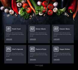
These templates can work for highly different industries. A sports brand may use red website templates to draw attention to new products, upcoming events, and community activities through dynamic sections. A restaurant might use the color more selectively around menu highlights, current offers, and reservation buttons. A technology company has another set of priorities. The website can look bold in each case, but it should still feel appropriate for the actual brand.
These layouts simplify development processes in many ways. You can now launch a fully functional site without any experience. Moreover, some users claim that it’s possible to do so in less than 1 hour if you have content ready, of course.
Practical Layouts for Modern Brands
Red-themed websites often feature several types of content. If every element receives the same visual weight, the website can start to feel loud rather than confident. A well-defined markup can give a color a really clear purpose and allows quieter areas to support the main content.
There are many great things about pre-made templates. Let’s take a closer look at them:
- Responsive layouts for desktop and mobile users.
- Flexible sections for products, services, and content.
- Organized navigation for content-rich websites.
- Adaptable pages for campaigns and promotions.
- Customizable layouts for different industries.
- Scalable structures that support future growth.
Using Color to Strengthen Brand Presence
Memorability is one of the main reasons companies choose a bold palette. A visitor may not remember every sentence on a page, but they can definitely remember the website's overall feeling. A consistent red accent can make buttons, headings, and campaign elements easier to recognize. The important part is consistency. When the shade, spacing, and visual rules change from page to page, the brand starts to feel much less deliberate.
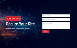
Visitors may use the same website in completely different ways. A well-organized website supports all possible routes. The red visual system remains recognizable, but it does not force everyone to follow the same path. Strong color can also help clarify actions when it is used with some restraint. A reservation button, registration link, or purchase action becomes much easier to spot when the surrounding design is calmer.
Create Websites That Make a Strong First Impression
A memorable website doesn’t need to shout from the first section to the last. You can use red website templates to create a clear visual idea and enough control to use it properly. Try them out today and launch a portal that stands out among the competition.