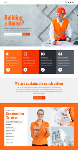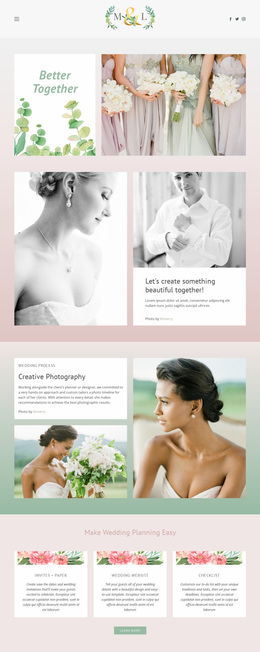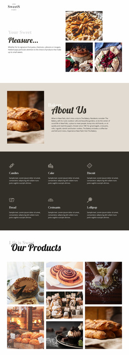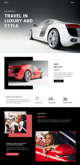
Accordion Website Designs
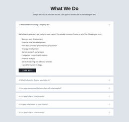






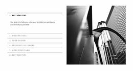
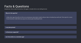

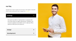
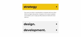
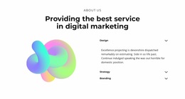

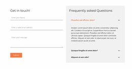
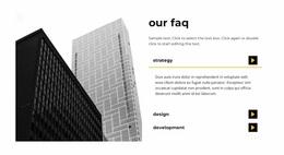

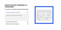




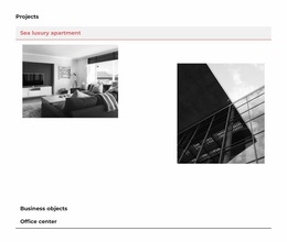
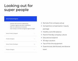
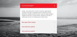

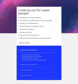

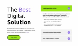

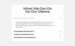
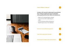

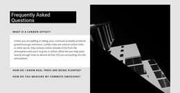
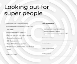


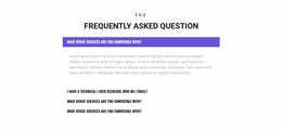


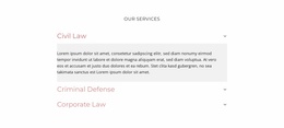
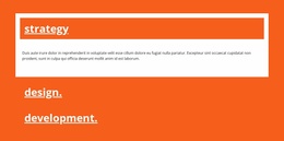
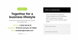
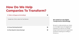
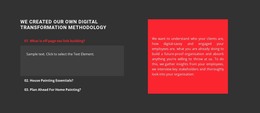
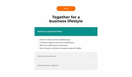
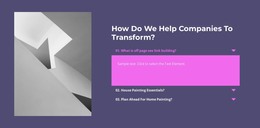
Consistent Accordion Website Design for Reusable Site-Wide Interaction
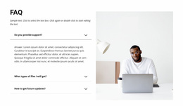
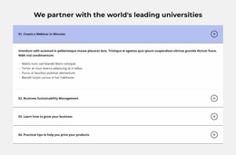
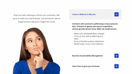
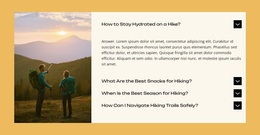
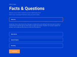
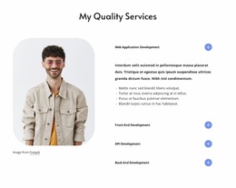
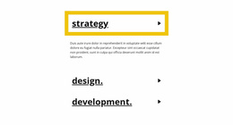
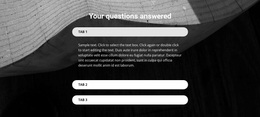
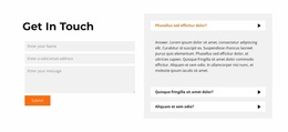
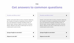
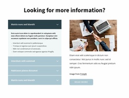
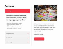
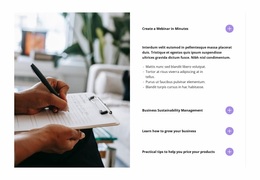
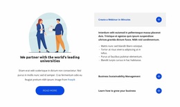
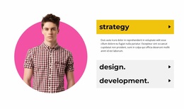
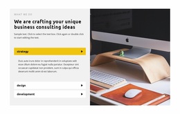
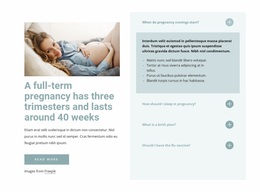
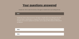
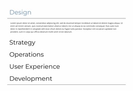
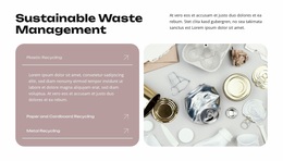
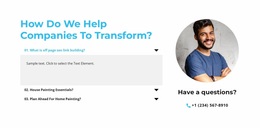
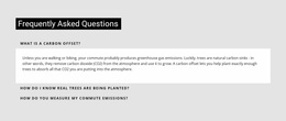
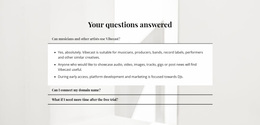
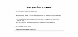
Accordion Website Design isn't just about how one expandable section looks in isolation. Across a multi-page site, the stronger goal is to make stacked headings, reveal states, spacing, and interaction cues feel familiar wherever Accordion appears. Visitors should recognize the pattern quickly even when the panel content changes from one page to another.
Create a Recognizable Accordion Design Language
An Accordion still works through vertically stacked headings paired with expandable bodies. At the website level, however, repeated use raises a consistency question: which visual and interaction decisions should stay stable across pages?
A practical site-wide Accordion system can keep several elements aligned across different pages:
- Heading treatment should use a recognizable typography and emphasis pattern.
- Open and closed states should communicate interaction in the same visual language.
- Panel spacing and boundaries should feel related across placements.
- Reveal cues or icons should follow the same logic for opening and closing panels.
- Reveal behavior should remain predictable as visitors move through the site.
The content itself can change substantially. A service page may use Accordion for process details, while a product or policy page uses it for specifications or conditions. The headings and bodies differ, but the component should still feel like the same site-wide Accordion.
Keep Accordion Consistent Across Different Pages
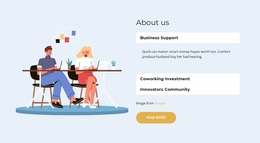
The Accordion Element provides the core expand/collapse interaction in Nicepage. When the same pattern appears in several parts of a website, adapt each section to its local content without redesigning the interaction from scratch.
Consistency does not require identical blocks. One placement may contain four substantial panels, and another may use six shorter items. What should remain recognizable is the interaction vocabulary: heading treatment, reveal cue, panel boundaries, spacing rules, and clear open/closed states.
This makes the Accordion feel like part of the website rather than a collection of unrelated widgets.
Coordinate Accordion Styling With the Wider Website
Website Design concerns the visual language shared across multiple pages. For Accordion, that means defining reusable component rules rather than focusing on what happens immediately above or below one particular placement.
When reviewing an Accordion in that broader system, ask:
- Does its heading style relate to other interactive elements?
- Do panel boundaries fit the site's general use of lines, cards, or surfaces?
- Does the expanded body preserve the same reading comfort as surrounding content?
- Can visitors recognize the same interaction on another page without relearning it?
These checks keep the section distinctive enough to be usable without making it visually disconnected from the rest of the site.
Website Design vs Web Page Design for Accordion
The two angles overlap, but the design scope is different.
Accordion Website Design focuses on consistency across the broader site: repeated styling logic, recognizable interaction states, and a coherent design language across pages.
Accordion Web Page Design focuses on one page: how the expandable stack fits nearby sections, affects vertical rhythm, and supports the local content hierarchy.
Tabs remain a different interaction pattern. They use persistent controls to switch among parallel views in a shared area, while Accordion supports vertical scanning and selective disclosure through stacked items.
Accordion Website Design FAQ
Should every Accordion on a website look identical?
No. Different pages may need different item counts, content depth, or section proportions. Keep the interaction and core visual language recognizable while adapting the block to its local content.
What should stay consistent across Accordion sections?
Prioritize heading treatment, panel boundaries, spacing logic, and clear open and closed states. These recurring cues help visitors recognize how the section works across the site.
How is Website Design different from Web Page Design?
Website Design looks at the Accordion as part of a broader site-wide visual system. Web Page Design focuses on the section's relationship with the hierarchy, spacing, and flow of one specific page.
Can Accordion and Tabs use the same site styling?
They can share typography, colors, and other design-system choices, but their interaction cues should remain distinct. Accordion uses stacked expandable items; Tabs use persistent controls linked to parallel content views.
Build Accordion Into the Website Design System
Choose an Accordion direction that fits the site's established visual language, then adapt its headings and panel bodies in the Nicepage editor. Keep the stacked expand/collapse pattern recognizable across pages, while allowing each placement to respond to its own content and surrounding layout.