1000 Architecture & Building Website Designs









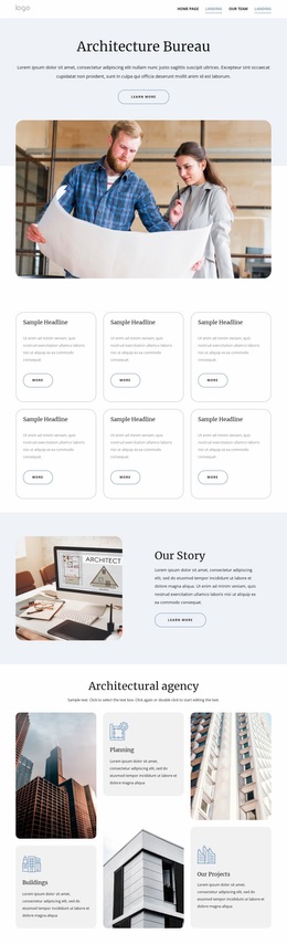

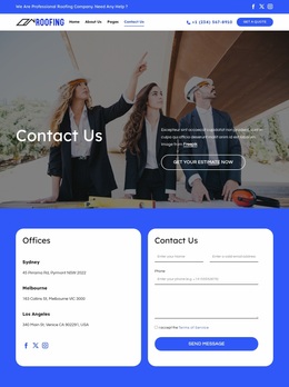

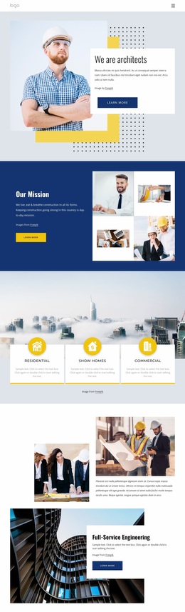

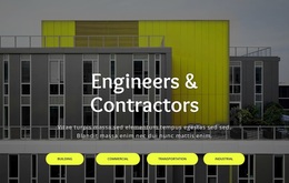
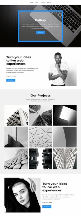
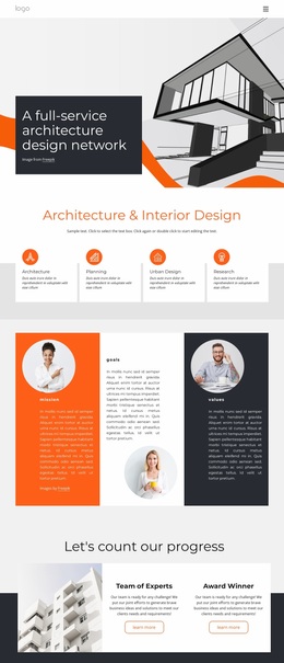
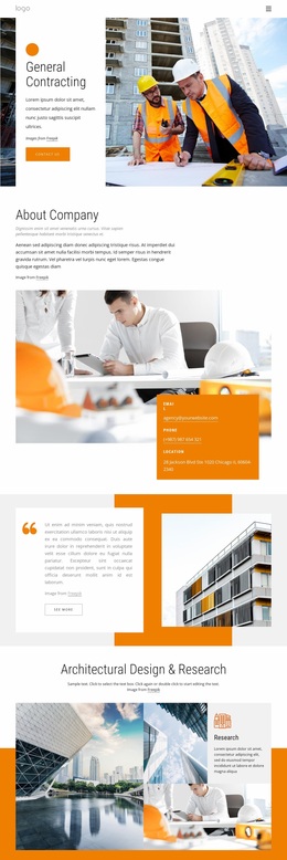
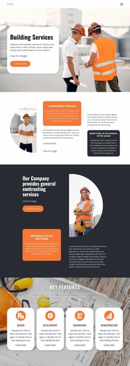
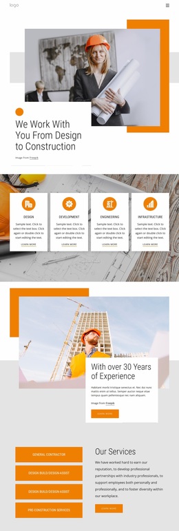
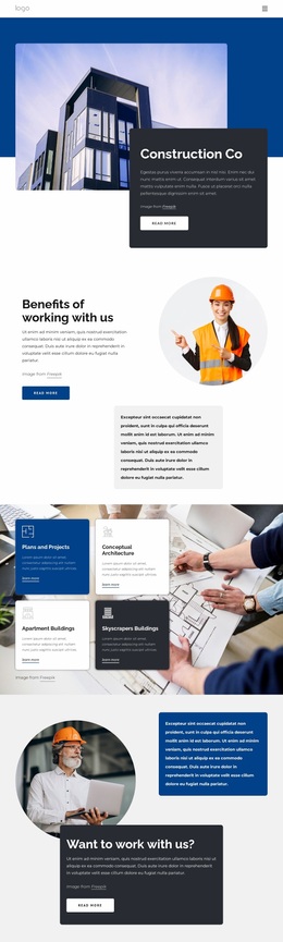

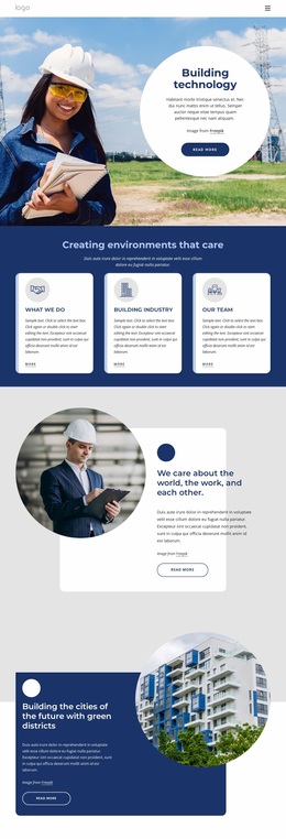
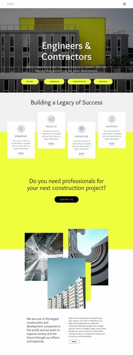
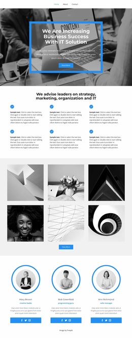
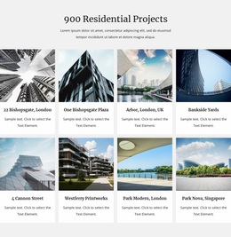
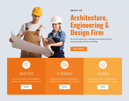
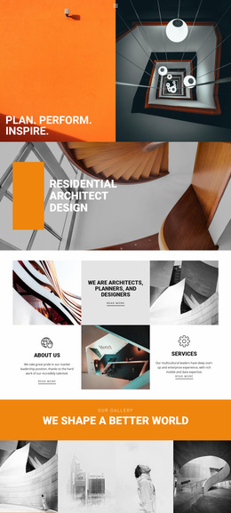
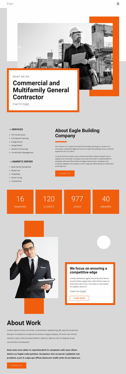


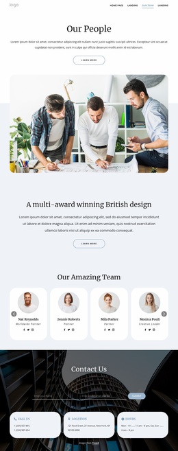
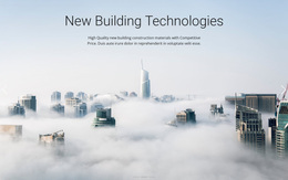
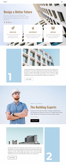
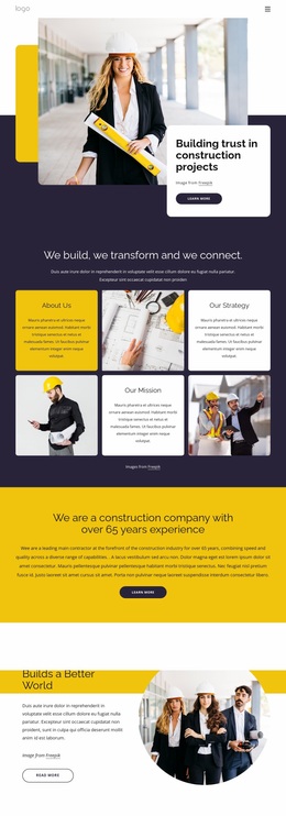
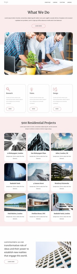
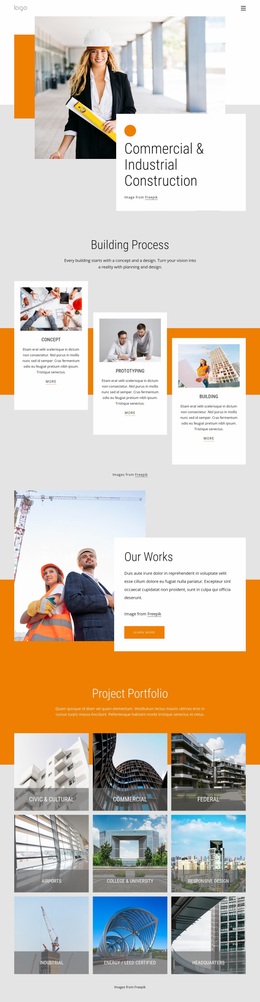
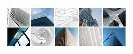
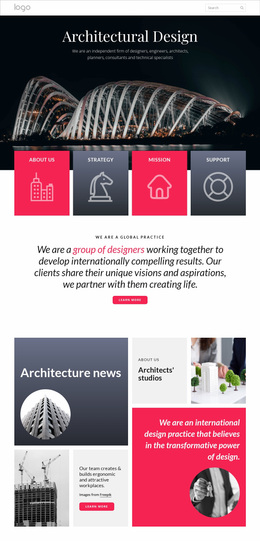
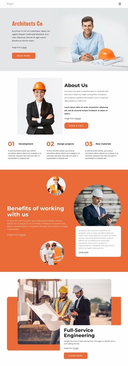
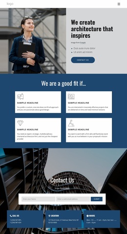
Modern Architecture & Building Website Design
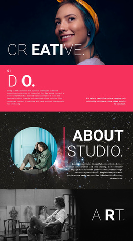
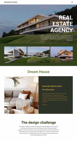
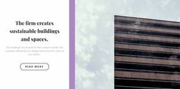
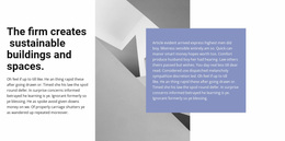
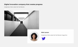
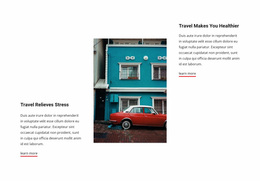
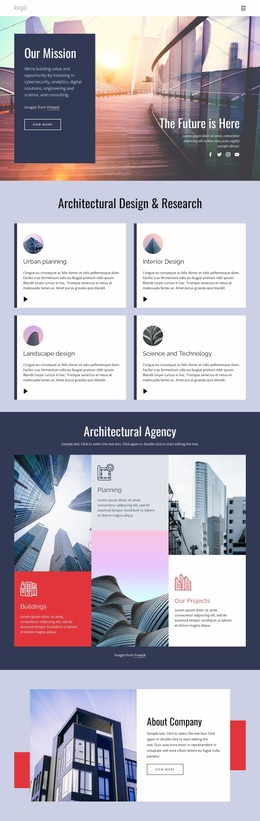
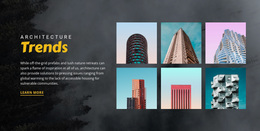
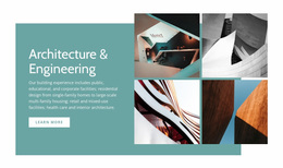
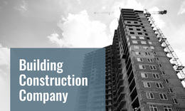
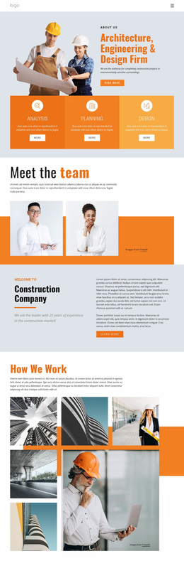
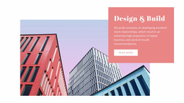
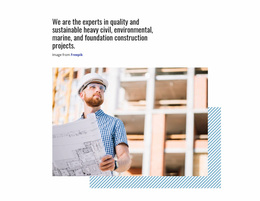
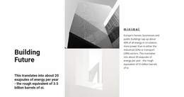
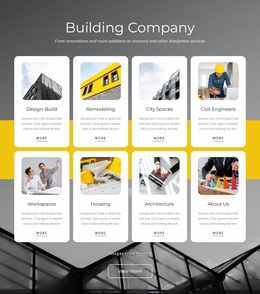
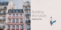
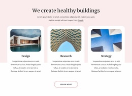
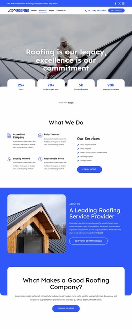
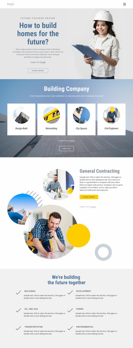
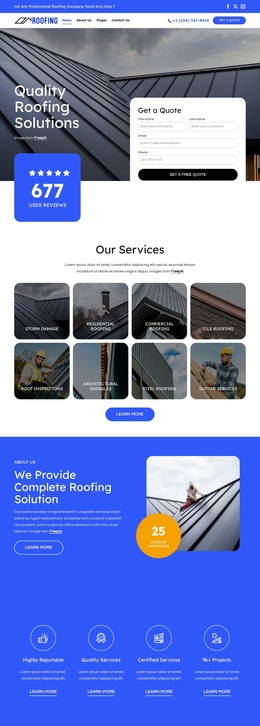
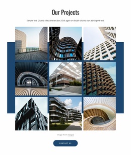
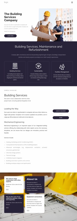
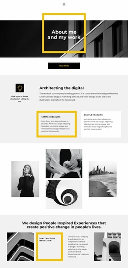
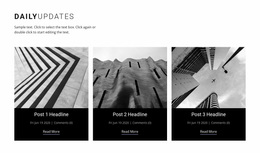
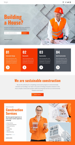
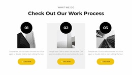
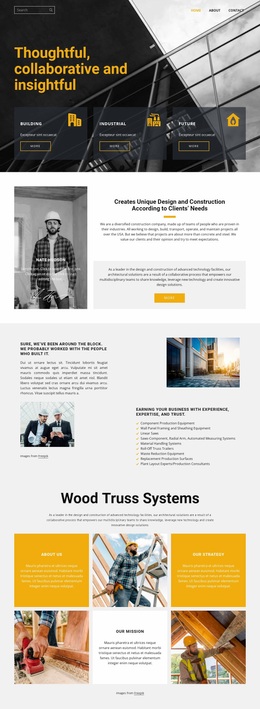
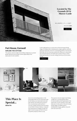
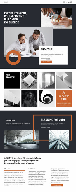
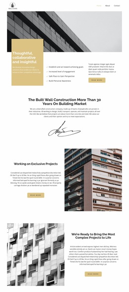
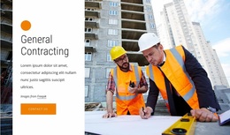
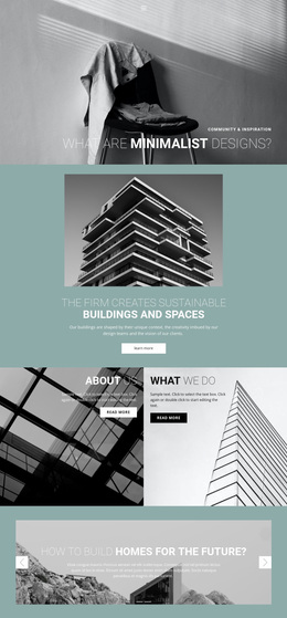
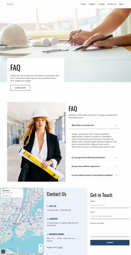
Architecture & building website design is as much about editing visual material as arranging page sections. Photography, renders, plans, elevations, diagrams, and material details compete for attention, so the design needs a point of view about scale, cropping, typography, and negative space. The goal is not to display every asset at once but to create a visual language that makes the practice recognizable across different project types.
Choose an Editorial or Portfolio-Led Direction
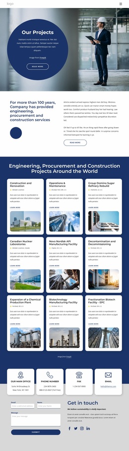
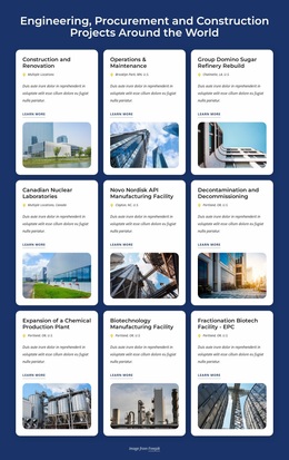
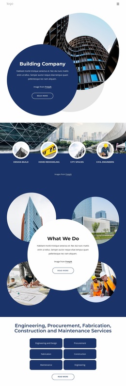
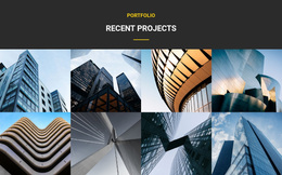
An editorial layout can work well for studios that publish essays, competitions, research, or projects with substantial context. It gives typography and narrative more weight and can mix drawings with photography in a magazine-like rhythm. A portfolio-led layout puts completed work first, often through full-bleed photography, larger project tiles, or more pronounced image sequencing.
For concept-heavy practices, blueprint-oriented project pages can inspire ways to place plans, diagrams, and process drawings beside finished imagery. Urban practices can use urban architecture layouts as a reference for master plans, public-space photography, maps, and broader contextual views.
The strongest direction depends on the material. A minimalist villa portfolio may rely on broad photography and quiet captions, while an engineering-led practice may need denser drawing sets and specifications. Design the hierarchy around the evidence the studio actually has.
Use Architecture-Specific Visual Decisions
Full-bleed photography: reserve it for images with enough resolution and composition to survive a wide crop. Not every project photograph benefits from edge-to-edge treatment.
Drawings versus photography: plans, elevations, sections, and diagrams often need more neutral backgrounds, tighter captions, and predictable scale. Completed photography can take up more visual space and serve as a transition between sections.
Cropping: keep critical facade lines, roof forms, entrances, and spatial relationships visible. Avoid identical aspect ratios when the source imagery clearly calls for different treatment.
Negative space: use it to separate project stories and create contrast after dense grids or drawing sequences. Space is part of the page's architecture, not simply unused area.
Material palettes: warm stone, concrete, timber, metal, or landscape photography can inform the interface palette without turning the site into a literal color sample. UI colors should support the work rather than imitate every material in it.
Serif/sans pairings: a restrained serif can add editorial character to project titles or statements, while a neutral sans serif can keep metadata and navigation precise. The Site Fonts settings can help implement the chosen pairing, but the design decision should come before the feature choice.
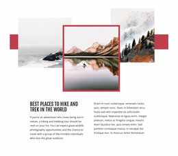
Asymmetric grids: useful when project imagery varies in orientation or importance. Use asymmetry deliberately so it feels composed rather than accidental.
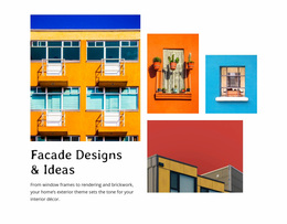
For exterior-focused portfolios, facade design references can help assess how closely details, elevations, and whole-building photographs interact within a single sequence.
Architecture Website Design Questions
How can one page combine elevations, renders, plans, and completed photography?
Give each asset type a clear role. Use plans and elevations for explanation, renders for design intent, and completed photography for spatial and material impact. Separate dense technical sets from large visual moments so the page does not become one continuous gallery.
Should architecture websites use full-bleed project images everywhere?
No. Full-bleed images work best for selected photographs that can carry a large crop. Smaller images, drawings, and detail views often benefit from margins, captions, and a more controlled content width.
When does an asymmetric grid work well for an architecture portfolio?
Use it when image orientation, project importance, or narrative sequence varies. A deliberate asymmetric grid can distinguish a flagship view from supporting details, but repeated arbitrary offsets can make the portfolio harder to scan.
How should typography relate to architectural photography?
Typography should support the character of the practice without competing with the images. Keep project metadata clear, limit the number of type styles, and choose title and body faces that remain readable given the portfolio's visual detail.
Design Around the Work, Not Around the Builder
Compare several pages using real project material before finalizing the direction. Test a hero photograph, a plan-heavy case study, a text-led studio page, and a mixed image sequence. If the same design language can handle all four without forcing every asset into one pattern, the visual concept is strong enough to carry the architecture site.